

今天要來做的事人物的介紹,呈現形式有點類似限時動態,固定時間後會自行跳往下一則動態
引入 fontAwesome 的cdn,並選擇第一個all.min.css
https://cdnjs.com/libraries/font-awesome
準備3張大頭照
| 知識點 | 使用說明 |
|---|---|
| line-height | 設置行高 |
| text-align | 這裡值為justify,使每行寬度相等 |
| object-fit | 區塊填滿設定,常用於圖片或影片 |
| animation | 透過「關鍵影格 keyframe」製作進度條的進度 |
| transform | 在此使用scaleX調整縮放比例 |
| 知識點 | 使用說明 |
|---|---|
| setInterval | 設定固定時間跳往下則動態 |
 <div class="container">
        <div class="progressBar"></div>
        <i class="fas fa-quote-right fa-quote"></i>
        <i class="fas fa-quote-left fa-quote"></i>
        <p class="testimonial">
            I've worked with literally hundreds of HTML/CSS developers and I have to
            say the top spot goes to this guy. This guy is an amazing developer. He
            stresses on good, clean code and pays heed to the details. I love
            developers who respect each and every aspect of a throughly thought out
            design and do their best to put it in code. He goes over and beyond and
            transforms ART into PIXELS - without a glitch, every time.
        </p>
        <div class="user">
            <img src="https://randomuser.me/api/portraits/women/46.jpg" alt="user-image" class="user" />
            <div class="user-details">
                <h4 class="username">Helen Lon
                </h4>
                <p class="role">Marketing</p>
            </div>
        </div>
    </div>
* {
  box-sizing: border-box;
}

body {
  background-color: #f4f4f4;
  margin: 0;
  padding: 10px;
  display: flex; /*讓內容水平垂直置中*/
  justify-content: center;
  align-items: center;
  height: 100vh;
  overflow: hidden;
}
外部容器
.container {
  background-color: #476ce4;
  color: white;
  border-radius: 15px;
  margin: 20px auto;
  padding: 50px 80px;
  position: relative;
}
引號
.fa-quote {
  color: rgba(255, 255, 255, 0.3);
  font-size: 28px;
  position: absolute;
  top: 70px;
}
.fa-quote-right {
  left: 40px;
}
.fa-quote-left {
  right: 40px;
}
以上都設好,呈現如下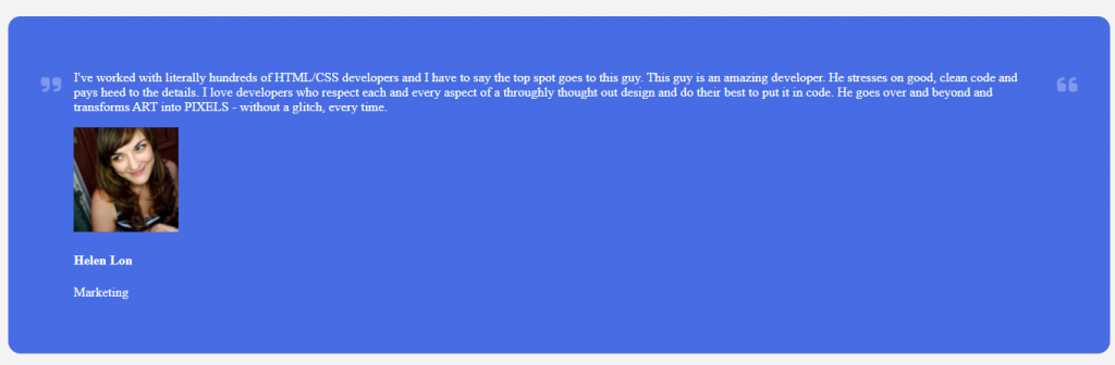
主體
/*主體的容器*/
.testimonial {
  line-height: 28px;
  text-align: justify;
}
/* 大頭貼容器 */
.user {
  display: flex;
  align-items: center;
  justify-content: center;
}
/* 大頭貼 */
.user .user-image {
  border-radius: 50%;
  height: 75px;
  width: 75px;
  object-fit: cover;
}
.user .user-details {
  margin-left: 10px;
}
/* 名字 */
.user .username {
  margin: 0;
}
/* 職業 */
.user .role {
  margin: 10px 0;
}
進度條
.progressBar {
  background-color: #fff;
  height: 4px;
  width: 100%;

  /* name duration timing-function iteration-count  */
  animation: grow 10s linear infinite;
  /*Transform-origin元素的原始位置(參考點)*/
}
@keyframes grow {
  0% {
    transform: scaleX(0); /*代表以x軸為基準縮放0倍*/
  }
}
以上設置好,呈現如下,進度條從中間開始進行,這是因為transform-origin預設值為元素中心點(50%,50%)的關係
所以我們加上以下這行,就可以了,把中心點置換到左邊
transform-origin: left;
可以注意一下,animation和關鍵影格 keyframe的搭配使用,只設定0%代表我只需要在最一開始設置動畫效果就好,剩下的就讓它自己去慢慢跑,不需要在其他時間%數在加入任何效果,若想理解更多animation的設置,可以點此
const testimonialsContainer = document.querySelector(".container");
const testimonial = document.querySelector(".testimonial");
const userImage = document.querySelector(".user-image");
const username = document.querySelector(".username");
const role = document.querySelector(".role");
內容
const testimonials = [
  {
    name: "放入人名",
    position: "放入職業",
    photo:"放入網址",
    text: "放入人物介紹",
  },
  //後面都一樣的格式,所以省略
 ];
跳往下一則介紹
let idx = 1;

function updateTestimonial() {
  const { name, position, photo, text } = testimonials[idx];

  testimonial.innerHTML = text;
  userImage.src = photo;
  username.innerHTML = name;
  role.innerHTML = position;

  idx++;

  if (idx > testimonials.length - 1) {
    idx = 0;
  }
}

setInterval(updateTestimonial, 10000);
附上codepen連結 https://codepen.io/hangineer/pen/eYrrjYP?editors=0010
若有解說不夠詳盡或是錯誤歡迎指教,感激不盡!那明天見囉
50 Projects In 50 Days - HTML, CSS & JavaScript

 iThome鐵人賽
 看影片追技術