今天要來說明Compose中的導覽欄位 NavigationBar,一樣是一個非常便利的功能元件,對比以往建立導航欄時的步驟還要簡潔許多。
以下可以看到NavigationBar中有六個參數,當中可能最常碰到的除了modifier以外,我自己是比較常去使用containerColor和contentColor這兩個改變外觀顏色的參數,其他的參數我自己是不太常使用到。
NavigationBar 內部說明的用處吧
Color.Transparent 沒有顏色。containerColor 的匹配內容顏色,或者如果containerColor 不是主題中的顏色,則預設為當前的LocalContentColor。containerColor為ColorScheme.surface時,半透明的原色疊加層將應用在容器的頂部。 較高的色調高度值將導致淺色主題中顏色較深,深色主題中顏色較淺。NavigationBarItems
fun NavigationBar(
    modifier: Modifier = Modifier,
    containerColor: Color = NavigationBarDefaults.containerColor,
    contentColor: Color = MaterialTheme.colorScheme.contentColorFor(containerColor),
    tonalElevation: Dp = NavigationBarDefaults.Elevation,
    windowInsets: WindowInsets = NavigationBarDefaults.windowInsets,
    content: @Composable RowScope.() -> Unit
) {
    Surface(
        color = containerColor,
        contentColor = contentColor,
        tonalElevation = tonalElevation,
        modifier = modifier
    ) {
        Row(
            modifier = Modifier
                .fillMaxWidth()
                .windowInsetsPadding(windowInsets)
                .height(NavigationBarHeight)
                .selectableGroup(),
            horizontalArrangement = Arrangement.spacedBy(NavigationBarItemHorizontalPadding),
            content = content
        )
    }
}
這個 NavigationBarItem 是包在 NavigationBar 中使用的,無法直接在外面使用,以下是按下Alt+滑鼠左鍵進入查看內部程式碼的資訊。
@Composable
fun RowScope.NavigationBarItem(
    selected: Boolean,
    onClick: () -> Unit,
    icon: @Composable () -> Unit,
    modifier: Modifier = Modifier,
    enabled: Boolean = true,
    label: @Composable (() -> Unit)? = null,
    alwaysShowLabel: Boolean = true,
    colors: NavigationBarItemColors = NavigationBarItemDefaults.colors(),
    interactionSource: MutableInteractionSource = remember { MutableInteractionSource() }
) {
    // ...其他內部的function及Item的預設排版
}
Params:
selected - whether this item is selected
onClick - called when this item is clicked
icon - icon for this item, typically an Icon
modifier - the Modifier to be applied to this item
enabled - controls the enabled state of this item. When false, this component will not respond to user input, and it will appear visually disabled and disabled to accessibility services.
label - optional text label for this item
alwaysShowLabel - whether to always show the label for this item. If false, the label will only be shown when this item is selected.
colors - NavigationBarItemColors that will be used to resolve the colors used for this item in different states. See NavigationBarItemDefaults.colors.
interactionSource - the MutableInteractionSource representing the stream of Interactions for this item. You can create and pass in your own remembered instance to observe Interactions and customize the appearance / behavior of this item in different states.
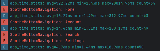
Search 是true,反之 Profile 是false狀態。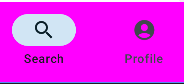
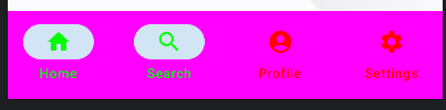
false 時,該元件將不會響應使用者輸入,並且它將顯示為視覺上停用並且對輔助服務停用。NavigationBarItemColors 將用於解析該項目在不同狀態下使用的顏色。 請參閱 NavigationBarItemDefaults.colors 。NavigationBar(
modifier = modifier,
contentColor = Color.White,
containerColor = Color.Magenta
) {
// 複數的Item排列成約莫3~5個Item列
NavigationBarItem(...)
NavigationBarItem(...)
NavigationBarItem(...)
}
NavigationBar(
    modifier = modifier,
    contentColor = Color.White,
    containerColor = Color.Magenta
) {
    NavigationBarItem(
        icon = {
            // 設定Icon圖示
            Icon(
                imageVector = Icons.Default.Home,
                contentDescription = null
            )
        },
        label = {
            Text(
                text = "顯示文字"
            )
        },
        selected = true,
        onClick = {
            // ...點擊事件
        },
        colors = NavigationBarItemDefaults.colors(
            // 選擇時的文字與Icon顏色變化
            selectedIconColor = Color.Green,
            selectedTextColor = Color.Green,
            // 非選擇時的文字與Icon顏色變化
            unselectedIconColor = Color.Red,
            unselectedTextColor = Color.Red
        )
    )
}
上面有了基本的元件概念後接著要來建立一份導航欄的實作程式碼撰寫了。
const val TAG : String = "SootheBottomNavigation"
// 底部導覽條
@Composable
private fun BottomNavigation(modifier: Modifier = Modifier, context:Context) {
    val resources = context.resources
    NavigationBar(
        modifier = modifier,
        contentColor = Color.White,
        containerColor = Color.Magenta
    ) {
        NavigationBarItem(
            icon = {
                Icon(
                    imageVector = Icons.Default.Home,
                    contentDescription = null
                )
            },
            label = {
                Text(
                    text = stringResource(R.string.bottom_navigation_home)
                )
            },
            selected = true,
            onClick = {
                Log.e(TAG, "SootheBottomNavigation: Home" )
                Toast.makeText(context, "Home", Toast.LENGTH_SHORT).show()
            },
            colors = NavigationBarItemDefaults.colors(
                selectedIconColor = Color.Green,
                selectedTextColor = Color.Green,
                unselectedIconColor = Color.Red,
                unselectedTextColor = Color.Red
            )
        )
        NavigationBarItem(
            icon = {
                Icon(
                    imageVector = Icons.Default.Search,
                    contentDescription = null
                )
            },
            label = {
                Text(
                    text = stringResource(R.string.bottom_navigation_Search)
                )
            },
            selected = true,
            onClick = {
                Log.e(TAG, "SootheBottomNavigation: Search" )
                Toast.makeText(context, "Search", Toast.LENGTH_SHORT).show()
            },
            colors = NavigationBarItemDefaults.colors(
                selectedIconColor = Color.Green,
                selectedTextColor = Color.Green,
                unselectedIconColor = Color.Red,
                unselectedTextColor = Color.Red
            )
        )
        NavigationBarItem(
            icon = {
                Icon(
                    imageVector = Icons.Default.AccountCircle,
                    contentDescription = null
                )
            },
            label = {
                Text(
                    text = stringResource(R.string.bottom_navigation_profile)
                )
            },
            selected = false,
            onClick = {
                Log.e(TAG, "SootheBottomNavigation: Account" )
                Toast.makeText(context, "Account", Toast.LENGTH_SHORT).show()
            },
            colors = NavigationBarItemDefaults.colors(
                selectedIconColor = Color.Green,
                selectedTextColor = Color.Green,
                unselectedIconColor = Color.Red,
                unselectedTextColor = Color.Red
            )
        )
        NavigationBarItem(
            icon = {
                Icon(
                    imageVector = Icons.Default.Settings,
                    contentDescription = null
                )
            },
            label = {
                Text(
                    text = stringResource(R.string.bottom_navigation_Settings)
                )
            },
            selected = false,
            onClick = {
                Log.e(TAG, "SootheBottomNavigation: Settings" )
                Toast.makeText(context, "Setting", Toast.LENGTH_SHORT).show()
            },
            colors = NavigationBarItemDefaults.colors(
                selectedIconColor = Color.Green,
                selectedTextColor = Color.Green,
                unselectedIconColor = Color.Red,
                unselectedTextColor = Color.Red
            )
        )
    }
}
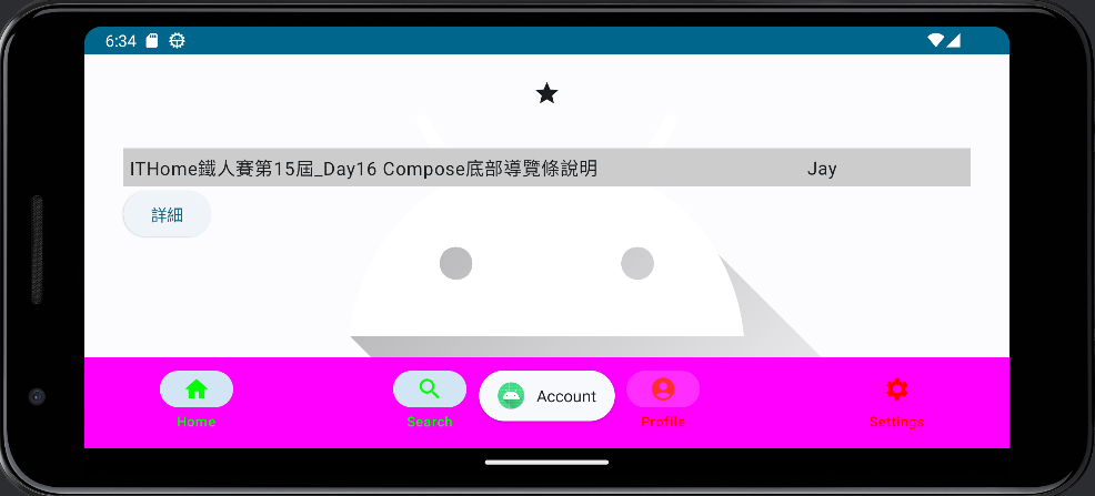
這邊可以看到我們不需要再將畫面事先組合排版,這邊直接使用Scaffold的方法來填入bottomBar底部欄位使其為剛剛所設定的底部導航欄的function。
class MainActivity : ComponentActivity() {
    override fun onCreate(savedInstanceState: Bundle?) {
        super.onCreate(savedInstanceState)
        setContent {
            Compose_MaterialTestTheme {
                // A surface container using the 'background' color from the theme
                Surface(
                    modifier = Modifier.fillMaxSize(),
                    color = MaterialTheme.colorScheme.background
                ) {
                    // 就是下面這個方法引入並padding前天組合而成的版面。
                    // 使用Scaffold將底部欄位的參數設為剛剛建立的導覽條函式
                    Scaffold(
                        bottomBar = { BottomNavigation(context = this) }
                    ){padding ->
                        GreetingBackground()
                    }
                }
            }
        }
    }
}

// 預覽
@Preview(showBackground = true)
@Composable
fun GreetingPreview() {
    val context = LocalContext.current // 獲取context在Preview中顯示
    Compose_MaterialTestTheme {
        Scaffold(
            bottomBar = { BottomNavigation(context = context) }
        ){padding ->
            GreetingBackground()
        }
    }
}
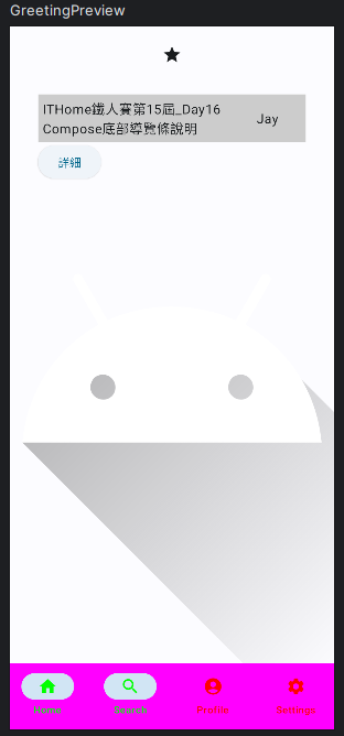
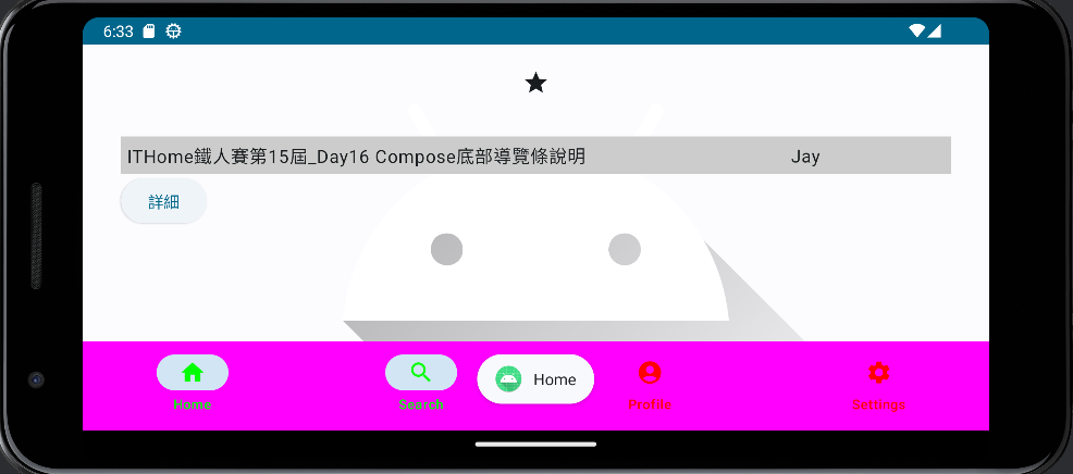
以上是今天在Compose中使用底部導航欄的使用說明以及導航欄和導航欄Icon的參數說明。

 iThome鐵人賽
 看影片追技術