今天要來講Compose中的EditText功能元件
在Compose中也有EditText的輸入框元件,詳細請往下看其程式碼及呈現的效果。
TextField 元件就是在Compose中的EditText,今天就來說明如何使用以及當中有哪些實用的小功能。
TextField(
    //... 可以使用的參數如下
    value: String,
    onValueChange: (String) -> Unit,
    modifier: Modifier = Modifier,
    enabled: Boolean = true,
    readOnly: Boolean = false,
    textStyle: TextStyle = LocalTextStyle.current,
    label: @Composable (() -> Unit)? = null,
    placeholder: @Composable (() -> Unit)? = null,
    leadingIcon: @Composable (() -> Unit)? = null,
    trailingIcon: @Composable (() -> Unit)? = null,
    supportingText: @Composable (() -> Unit)? = null,
    isError: Boolean = false,
    visualTransformation: VisualTransformation = VisualTransformation.None,
    keyboardOptions: KeyboardOptions = KeyboardOptions.Default,
    keyboardActions: KeyboardActions = KeyboardActions.Default,
    singleLine: Boolean = false,
    maxLines: Int = Int.MAX_VALUE,
    interactionSource: MutableInteractionSource = remember { MutableInteractionSource() },
    shape: Shape = TextFieldDefaults.filledShape,
    colors: TextFieldColors = TextFieldDefaults.textFieldColors()
)
這邊講幾個可能比較常使用的參數好了:
"唯讀",若為true就是無法修改當中的文字PasswordVisualTransformation 建立一個密碼文字欄位。 預設情況下,不套用任何視覺轉換。範例撰寫如下:
TextField(
    value = name,
    onValueChange = {
        name = it
    },
    leadingIcon = {
        Icon(
            painter = painterResource(id = R.drawable.ic_launcher_edit_foreground),
            contentDescription = null,
            modifier = Modifier.width(40.dp)
        )
    },
    colors = TextFieldDefaults.textFieldColors(
        focusedIndicatorColor = MaterialTheme.colorScheme.surface,
        unfocusedIndicatorColor = MaterialTheme.colorScheme.surface
    ),
    placeholder = {
        Text(stringResource(id = R.string.enter_message))
    },
    visualTransformation = PasswordVisualTransformation(),
    modifier = Modifier
        .padding(16.dp)
        .fillMaxWidth()
)
@Composable
fun enterMessage(
context: Context
){
var message by remember{ mutableStateOf("")}
var name by remember{ mutableStateOf("")}
Box(Modifier.fillMaxSize()){
Column(modifier = Modifier.align(Alignment.Center)) {
// 帳號輸入
TextField(
value = message,
onValueChange = {
message = it
},
leadingIcon = {
Icon(
painter = painterResource(id = R.drawable.ic_launcher_edit_foreground),
contentDescription = null,
modifier = Modifier.width(40.dp)
)
},
colors = TextFieldDefaults.textFieldColors(
focusedIndicatorColor = MaterialTheme.colorScheme.surface,
unfocusedIndicatorColor = MaterialTheme.colorScheme.surface
),
placeholder = {
Text(stringResource(id = R.string.enter_name))
},
modifier = Modifier
.padding(16.dp)
.fillMaxWidth()
)
// 密碼輸入
TextField(
value = name,
onValueChange = {
name = it
},
leadingIcon = {
Icon(
painter = painterResource(id = R.drawable.ic_launcher_edit_foreground),
contentDescription = null,
modifier = Modifier.width(40.dp)
)
},
colors = TextFieldDefaults.textFieldColors(
focusedIndicatorColor = MaterialTheme.colorScheme.surface,
unfocusedIndicatorColor = MaterialTheme.colorScheme.surface
),
placeholder = {
Text(stringResource(id = R.string.enter_message))
},
visualTransformation = PasswordVisualTransformation(),
modifier = Modifier
.padding(16.dp)
.fillMaxWidth()
)
// 建立按鈕送出輸入的帳號密碼資料,以及清除輸入內容
Row(
Modifier
.fillMaxWidth(),
horizontalArrangement = Arrangement.SpaceAround
) {
// 送出
ElevatedButton(onClick = {
if (message.isNotEmpty()) {
Log.e("Send", "enterMessage: "+message+"\nName"+name )
showLog(context, message = message, name = name )
message = ""
name = ""
}else{
Toast.makeText(context, "尚未輸入訊息", Toast.LENGTH_SHORT).show()
}
}, modifier = Modifier
.weight(1f)
.padding(16.dp)) {
Text("送出")
}
// 清空
ElevatedButton(onClick = {
if (message.isNotEmpty()) {
message = ""
name = ""
}else{
Toast.makeText(context, "請輸入訊息", Toast.LENGTH_SHORT).show()
}
}, modifier = Modifier
.weight(1f)
.padding(16.dp)) {
Text("清除")
}
}
}
}
}
// 點擊送出訊息後傳入並回傳Toast
fun showLog(
context: Context,
message: String,
name: String
){
Toast.makeText(
context,
"Message: $message\nName: $name",
Toast.LENGTH_SHORT
).show()
}
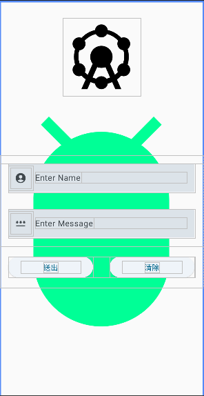
// 組合背景圖案
@Composable
fun getImage(
context: MainActivity
) {
val image = painterResource(id = R.drawable.ic_launcher_abd_foreground)
Box(modifier = Modifier.fillMaxSize()) {
Image(
painter = image,
contentDescription = null,
contentScale = ContentScale.Crop,
modifier = Modifier.fillMaxSize()
)
Icon(painterResource(
id = R.drawable.baseline_attractions_24),
contentDescription = null,
modifier = Modifier.padding(32.dp).align(Alignment.TopCenter))
enterMessage(context)
}
}
// 預覽圖程式碼
@Preview(showBackground = true)
@Composable
fun GreetingPreview() {
JetpackCompose_KotlinTheme {
getImage(context = MainActivity())
}
}
class MainActivity : ComponentActivity() {
    override fun onCreate(savedInstanceState: Bundle?) {
        super.onCreate(savedInstanceState)
        setContent {
            JetpackCompose_KotlinTheme {
                // A surface container using the 'background' color from the theme
                Surface(
                    modifier = Modifier.fillMaxSize(),
                    color = MaterialTheme.colorScheme.background
                ) {
//                    Greeting("Android")
                    getImage(context = this)
                }
            }
        }
    }
}
這邊我是在drawable中建立圖案來使用,現在就來說明如何建立內建的圖示並使用吧。
首先到如下的位置drawable按下滑鼠右鍵後指到Image Asset後點擊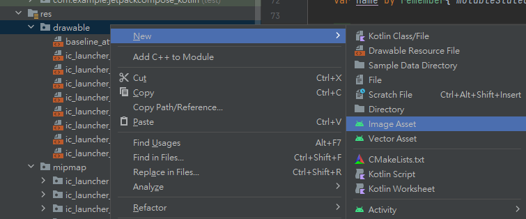
點擊後會跳出以下的畫面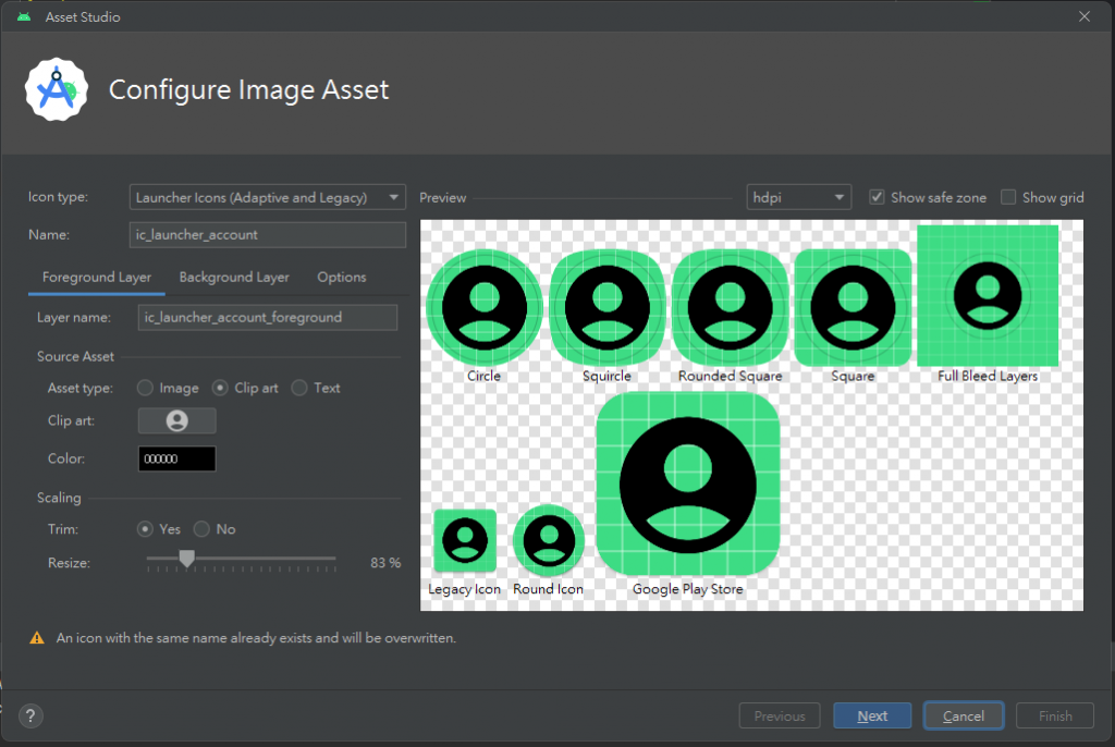
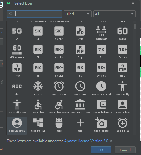
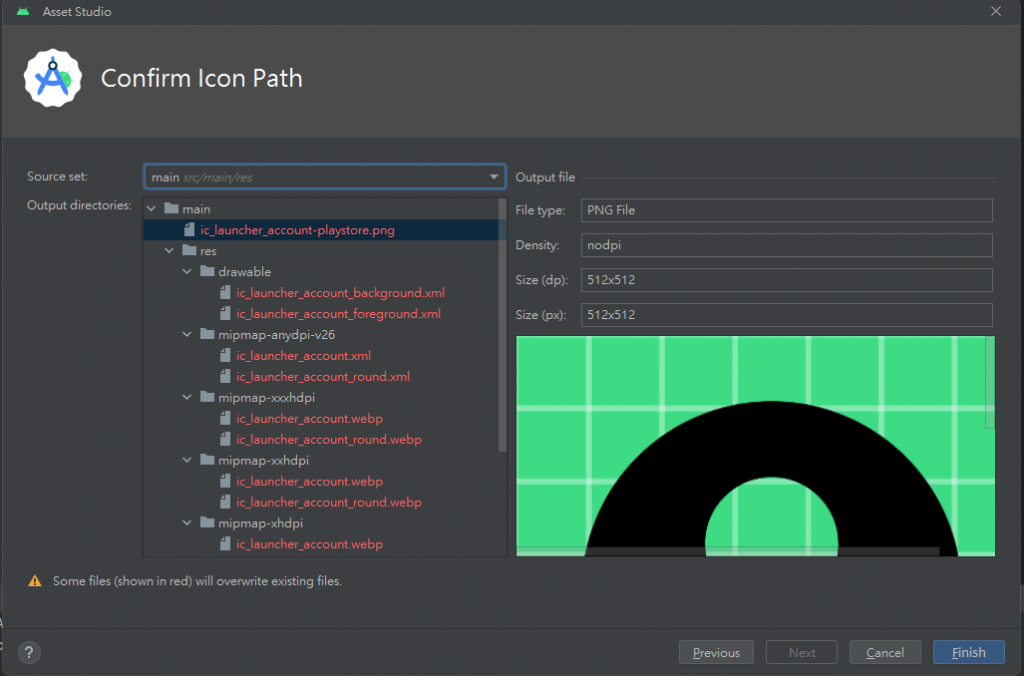
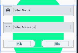
Finish就完成一個Icon圖示的建立了。Icons.Default."需要的圖片名稱"可以取得Icon,但我這邊不知道為何無法正常取得,所以就使用了土法煉鋼的方式置入Icon。直向輸入截圖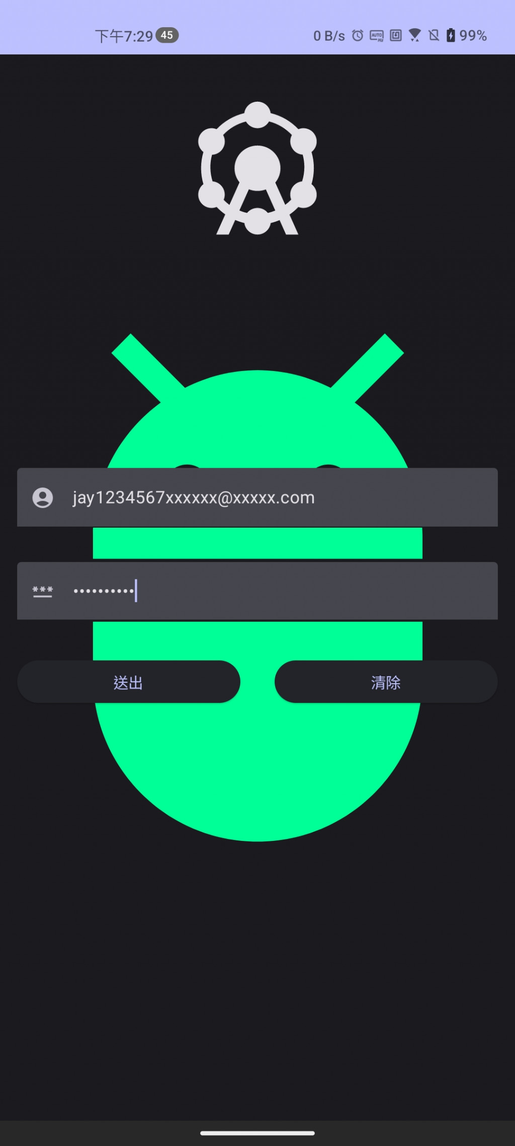
直向送出截圖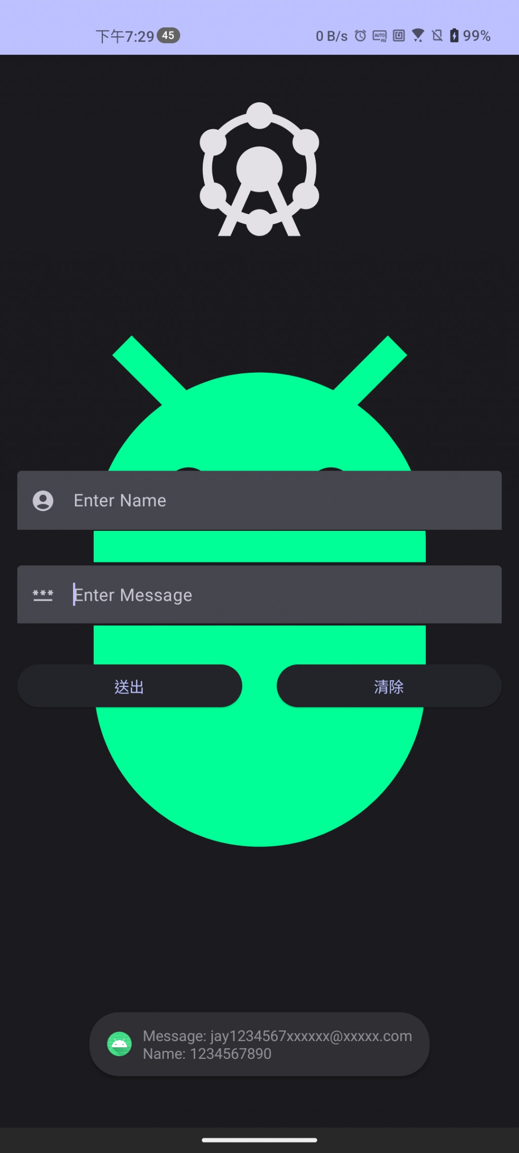
橫向輸入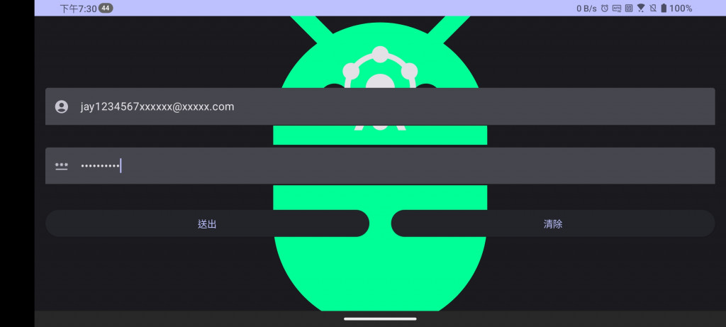
橫向送出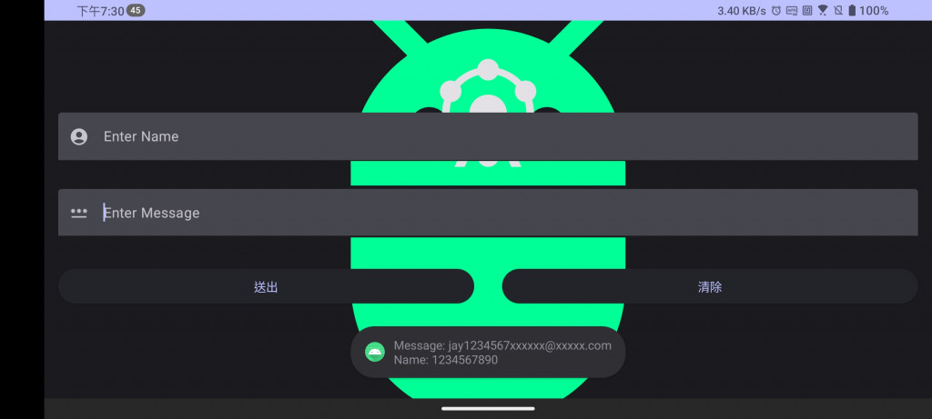
今天所作的說明是在Compose中建立TextField,也就是如同EditText一般的輸入文字的元件。
在這邊我使用了前置的Icon去作標示,這邊我覺得這個功能十分方便,以往想要在XML建立一個登入主頁面並放入Icon來標示帳號密碼,需要再建立一個ImageView並依附在EditText旁邊才有類似的效果。


 iThome鐵人賽
 看影片追技術