我們在看一組資料時常會以統計觀點來評斷,例如最大最小值、平均值、標準差等,以圖表則會用直方圖(histogram)來觀察資料的分布。今天就來練習畫histogram。
首先來做計算統計數據的function,分成兩部分一個是最大最小值、平均值、標準差,另一個是histogram的分bin。
在計算最大最小值、平均值、標準差時最麻煩的反而是最大最小值(如果不掛其他套件),因為原生Math.max和Math.min無法處理浮點數,所以我們就用loop寫個簡單土炮版本的,其餘平均值、標準差就用array的reduce照公式寫:
	let totalNumber = data.length;
	let dataMin = "";
	let dataMax = "";
	for (let i = 0; i < totalNumber; i++) {
		let tempData = data[i];
		if (dataMin) {
			if (tempData < dataMin) {
				dataMin = tempData;
			}
 		}
		else {
			dataMin = tempData;
		}
		if (dataMax) {
			if (tempData > dataMax) {
				dataMax = tempData;
			}
 		}
		else {
			dataMax = tempData;
		}
	}
	let sum = data.reduce((preValue, curValue) => preValue + curValue);
	let dataMean = sum / totalNumber;
	let squrSum = data.reduce((preValue, curValue) => preValue  + (curValue - dataMean)** 2);
	let dataSTD = (squrSum / totalNumber) ** 0.5;
接下來是分bin的部分,我們做了兩種option,可以選擇切bin的總數,或是bin的寬度,再用if條件判斷換算完後,我們是從最小的值開始,往上加上bin寬度,然後計算區間內的數量為y值,區間範圍的中心點為x值,組成{x, y}的物件(這個長條圖也能吃喔),然後依序往上,而最後要注意的是再加bin的寬度時會有誤差,而在最高bin時要涵蓋最大值的那個計數,所以我們用if條件判斷特別處理最高的那個bin,是用小於等於資料的max值計數:
	let botValue = dataMin;
	let topValue;
	if (Number.isInteger(binNumber)) {
    binWidth = (dataMax - dataMin) / binNumber;
	}
	else if (!Number.isNaN(binWidth)) {
		let dataSwing = dataMax - dataMin;
		binNumber = Math.ceil(dataSwing / binWidth);
		botValue = botValue + 0.5 * dataSwing - 0.5 * binWidth * binNumber;
	}
    let dataset = [];
	for (let i = 0; i < binNumber; i++) {
		topValue = botValue + binWidth;
		let subList;
		if (i === binNumber - 1) {
			subList = data.filter(function(item) {
				return (item >= botValue) & (item <= dataMax);
			});
		}
		else {
			subList = data.filter(function(item) {
				return (item >= botValue) & (item < topValue);
			});
		}
		dataset.push({x: (topValue + botValue) / 2, y: subList.length})
		botValue = topValue
	}
接下來是圖表的設定(可以參考裡面一系列的說明範例),我們初始化的設定如下面的code所示,部分是空的或是註解的是特別標記給上面的function計算後填入參數,另外其中比較重要的設定是options.scale.x.type設定linear、data.dataset的categoryPercentage和barPercentage和要設定為1,這樣長條圖間的縫隙才會連起來:
const data = {
	datasets: [
		{
			label: 'DATA',
			data: [],
			borderColor: CHART_COLORS.blue,
			backgroundColor: RGBwithA(CHART_COLORS.blue, 0.8),
			borderWidth: 1,
			barPercentage: 1,
			categoryPercentage: 1,
		},
	]
};
const config = {
	type: "bar",
	data: data,
	options: {
		scales: {
			x: {
				type: 'linear',
				offset: false,
				grid: {
					offset: false,
				},
				ticks: {
					//stepSize: ,
				},
				//min:
				//max:
			},
			y: {

			},
		},
		plugins:{
			legend:{
				display: false,
			},
		}
	},
};
最後我們用一個function可以random建data測試,然後將上方所寫的計算結果更新進chart中,其中設定options.scales.x.min、options.scales.x.max和options.scales.x.ticks.stepSize就能將格線與切bin對齊:
		let histData = calculateHistogram(data, binWidth, binNumber);
		chart.data.datasets.forEach(dataset => {
			dataset.data = histData.dataset
		});
		chart.options.scales.x.min = histData.histMin;
		chart.options.scales.x.max = histData.histMax;
		chart.options.scales.x.ticks.stepSize = histData.binWidth;
		chart.update();
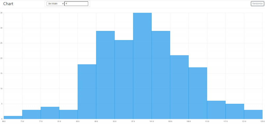
成果如下,以一組200個點的常態分佈亂數資料:
用Number of bin=16: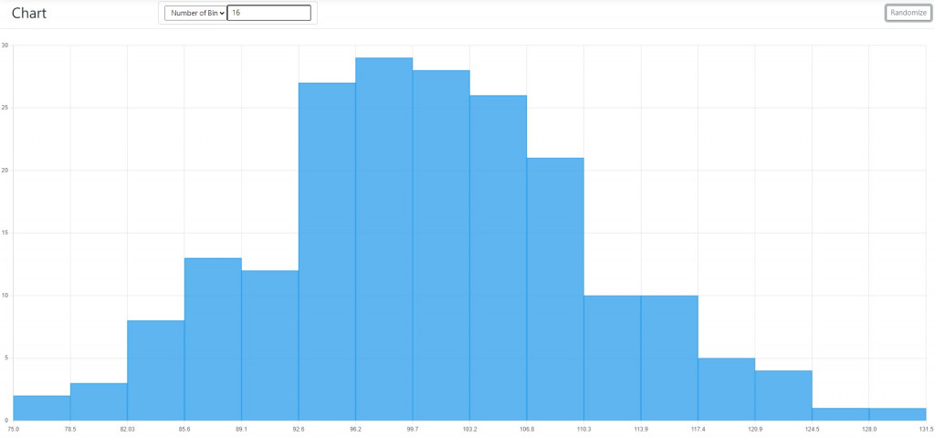
用Number of bin=32: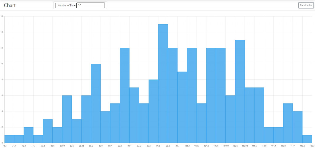
用Bin width=2: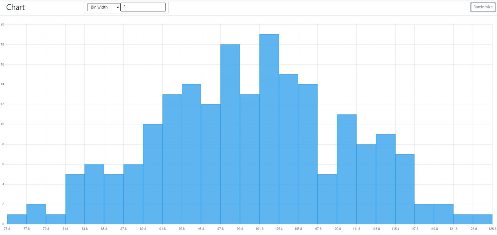
用Bin width=4: