

今天要來做的是垂直的輪播圖,點選「上」「下」箭頭可以反方向切換圖片和圖片的描述,做project順便看看帥哥好快樂≡ω≡
引入 fontAwesome 的cdn,並選擇第一個all.min.css
https://cdnjs.com/libraries/font-awesome
準備3~5張喜歡的圖片
| 知識點 | 使用說明 |
|---|---|
| transform | 調整元素位置 |
| transition | 控制畫面轉變的時間及變化曲線 |
| 知識點 | 使用說明 |
|---|---|
| addEventListener | 為上下箭頭加入事件監聽 |
| clientHeight | 獲取元素內部高度 |
 <div class="container">
        <div class="left-side">
            <!-- 描述一 -->
            <div style="background-color:...;">
                <h1>Thor</h1>
                <p><img src="..." alt="tomato"> Rotten Tomatoes 71%</p>
            </div>

            <!-- 描述二 -->
            <div style="background-color:...;">
                <h1>Loki</h1>
                <p> <img src="..." alt="tomato"> Rotten Tomatoes 92%</p>
            </div>

            <!-- 描述三 -->
            <div style="background-color:...;">
                <h1>Doctor Strange</h1>
                <p><img src="..." alt="tomato"> Rotten Tomatoes 80%</p>
            </div>
        </div>
右邊-圖片
圖片的順續會剛好相反,左邊按照1~3的順序,右邊就3~1,最後的要放在第一個,因為左右兩邊方向相反,所以才這樣寫
        <div class="right-side">
            <!-- 圖片三 -->
            <div style="background-image: url('...');"></div>
            <!-- 圖片二 -->
            <div style="background-image: url('...');"></div>
            <!-- 圖片一 -->
            <div style="background-image: url('...');"></div>
        </div>
按鈕
        <div class="button-group">
              <button class="up-btn">
                <i class="fa-solid fa-arrow-up"></i>
            </button>
            <button class="down-btn">
                <i class="fa-solid fa-arrow-down"></i>
            </button>
        </div>
呈現如下圖,因為還沒有給予寬和高撐起div,所以看不到背景圖片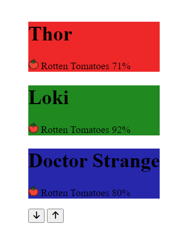
* {
  box-sizing: border-box;
  margin: 0;
  padding: 0;
}

body {
  height: 100vh;
  color: white;
}
外部容器
.container {
  position: relative;
  overflow: hidden;
  width: 100vw;
  height: 100vh;
}
左邊-圖片描述
.left-side {
  height: 100%;
  width: 35%;
  position: relative;
  left: 0;
  top: 0;
}
.left-side > div {
  width: 100%;
  height: 100%;
  display: flex;
  flex-direction: column;
  align-items: center;
  justify-content: center;
}
.left-side h1 {
  font-size: 40px;
  margin-bottom: 10px;
  margin-top: -30px;
}
右邊-圖片
.right-side {
  position: absolute;
  width: 65%;
  height: 100%;
  top: 0;
  left: 35%;
}
.right-side div {
  background: no-repeat center/cover black;
  height: 100%;
  width: 100%;
}
按鈕
.container .button-group button {
  position: absolute;
  left: 35%;
  top: 50%;
  z-index: 100;
  background-color: white;
  border: 0;
  cursor: pointer;
  font-size: 16px;
  padding: 10px;
}
以上都設好,呈現如下圖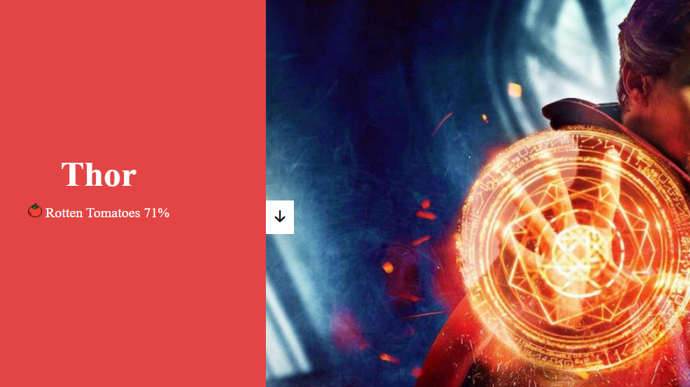
「上」的箭頭不見了,因為被「下」箭頭擋住啦ヽ( ຶ▮ ຶ)ノ
那除了用絕對定位以外,還有什麼方法可以調整它的位子呢?
是裡是用...
Transform
把下箭頭悄悄做個位移(translateX),並把垂直高度調整一下(translateY)
/* 下 */
.container .button-group button.down-btn {
  transform: translateX(-100%) translateY(100%);
}
呈現如下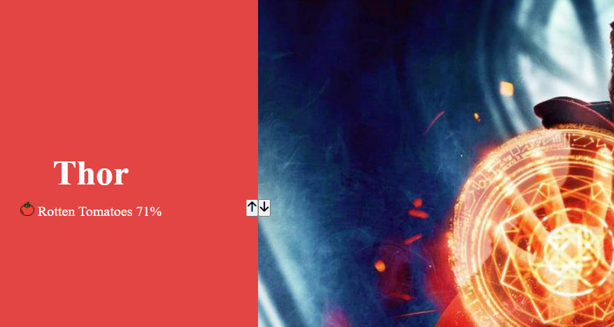
最後再做一點圓角以及按鈕滑過和被點的效果
/* 上 */
.container .button-group button.up-btn {
  border-bottom-right-radius: 10px;
}
/* 下 */
.container .button-group button.down-btn {
  transform: translateX(-100%) translateY(100%);
  border-bottom-left-radius: 10px;
}
.container .button-group button:hover {
  color: #999;
}
.container .button-group button:focus {
  outline: 0; /*或none*/
}
好哩!以上都寫好,呈現如下,接下來要進入JS的部分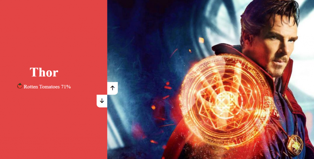
let container = document.querySelector(".container");
let rightSide = document.querySelector(".right-side");
let leftSide = document.querySelector(".left-side");
let upBtn = document.querySelector(".up-btn");
let downBtn = document.querySelector(".down-btn");
let rightSideLength = rightSide.querySelectorAll("div").length;  //圖片數量=3
let activeImgIdx = 0;  //圖片索引
截一張目前的畫面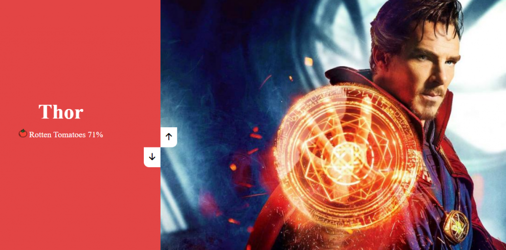
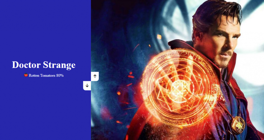
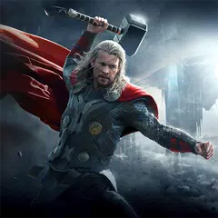
索爾對到的圖片是奇異博士 (。﹏。*) 想把左邊換成奇異博士 Doctor Strange 該怎麼做呢?
可以參考如下寫法
leftSide.style.top = `-${(rightSideLength - 1) * 100}%`; //%也可以用vh代替
leftSide.style.top 是我們針對左側的高度來做調整
rightSideLength - 1 這整個印出來會等於2,rightSideLength代表圖片總數量(=3),-1是因為索引是從0開始以上寫好呈現如下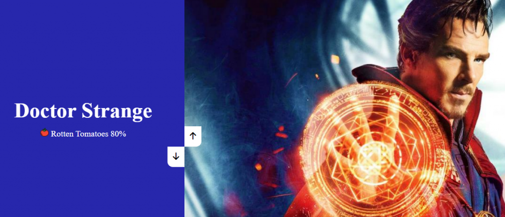
好哩! 奇異博士對到正確的描述了ก็ʕ•͡ᴥ•ʔ ก้ 接下來對按鈕去添加事件監聽
upBtn.addEventListener("click", () => {
  changeImg("up");
});

downBtn.addEventListener("click", () => {
  changeImg("down");
});

changeImg = (direction) => {
  let imgHeight = container.clientHeight;
  console.log(imgHeight);
  //後面還有
};
The Element.clientHeight read-only property is zero for elements with no CSS or inline layout boxes; otherwise, it's the inner height of an element in pixels. It includes padding but excludes borders, margins, and horizontal scrollbars (if present).
擷取至MDN
大致上是說 clientHeight 是唯獨屬性,代表元素的內部高度,單位為px。它包括padding,但不包括border、margin和水平滾動條(如果存在)
簡單來說clientHeight = height + padding - height of horizontal scrollbar(水平滾動條的高度).
繼續接下來的設定
let changeImg = (direction) => {
  let imgHeight = container.clientHeight;
  console.log(imgHeight);
  if (direction === "up") {
    activeImgIdx++;
    if (activeImgIdx > rightSideLength - 1) {
      activeImgIdx = 0;
    }
  }
  rightSide.style.transform = `translateY(-${activeImgIdx * imgHeight}px)`;
};
當「上」的箭頭被點按(direction為up)時,activeImgIdx 圖片索引就要 + 1,圖片到底時會直接回到第一張(activeImgIdx = 0)imgHeight必須是動態的,且要在Y軸上移動,所以到了translateY出馬的時刻,利用圖片的索引 * 元素內部高度計算出要位移的距離
設定好呈現如下,點「上」箭頭圖片會切換了
我想要圖片可以不要那麼死板板的出現,可以加上transition去設定
所以我們回到CSS的部分,加上transition: transform 0.5s ease;,讓滑進效果自然點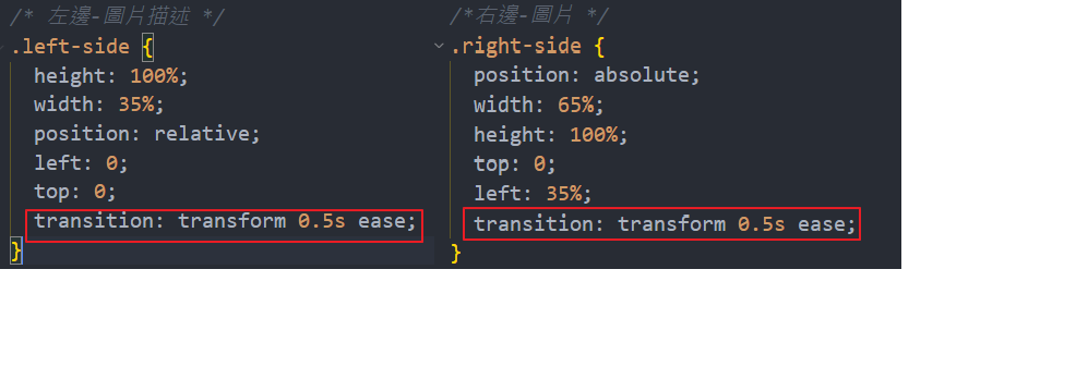
最後最後,終於要結束了 剩左邊的圖片描述和「下」箭頭要處理(為了完整性,截取整段code)
let changeImg = (direction) => {
  let imgHeight = container.clientHeight;
  console.log(imgHeight);
  if (direction === "up") {
    activeImgIdx++;
    if (activeImgIdx > rightSideLength - 1) {
      activeImgIdx = 0;
    }
  } else {
    activeImgIdx--;
    if (activeImgIdx < 0) {
      activeImgIdx = rightSideLength - 1;
    }
  }
  rightSide.style.transform = `translateY(-${activeImgIdx * imgHeight}px)`;
  leftSide.style.transform = `translateY(${activeImgIdx * imgHeight}px)`;
};
左右兩邊設定會相反,所以 leftSide.style.transform = translateY(${activeImgIdx * imgHeight}px)為正數,「下」箭頭的部分就把activeImgIdx++改為activeImgIdx-- ,如果到了第一張圖片時,再點上箭頭會回到最後一張,就這樣一直循環
附上codepen連結 https://codepen.io/hangineer/pen/OJZOgzK
今天的介紹到這裡(✿◡‿◡)若有解說不夠詳盡或是錯誤歡迎指教,感激不盡!那明天見囉
50 Projects In 50 Days - HTML, CSS & JavaScript
MDN-clientHeight
索爾圖片參考
洛基圖片參考
奇異博士圖片參考

 iThome鐵人賽
 看影片追技術