上一篇我們已經對數據做好前處理
現在我們會做兩種回歸
首先我們創建LinearRegression 物件
並呼叫fit()帶入自變量與應變量進行擬合
# Fitting Linear Regression to the dataset
from sklearn.linear_model import LinearRegression
lin_reg = LinearRegression()
lin_reg.fit(x, y)
這裡我們會用到class PolynomialFeatures
PolynomialFeatures 能將自變量x轉換成包含自變量不同次方的矩陣
如程式碼所示
首先創建一個 PolynomialFeature 物件並設定degree = 2
degree 代表此多項方程的最高次數(預設2)
接著呼叫fit_transform():
# Fitting Polynomial Regression to the dataset
from sklearn.preprocessing import PolynomialFeatures
poly_reg = PolynomialFeatures(degree = 2)
x_poly = poly_reg.fit_transform(x)
lin_reg_2 = LinearRegression()
lin_reg_2.fit(x_poly, y)
run 這段程式碼之後可以打開x 和x_poly 做比較
x_poly 矩陣內容分別是 1(因為constant 都要 * 1), x, x^2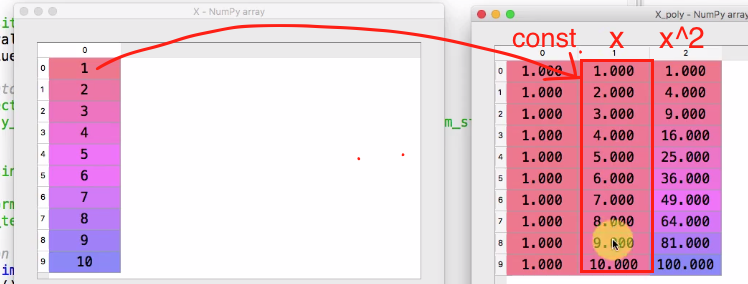
總結來說
多項式線性回歸和多元線性回歸相似
差別在於多項式線性回歸要加入x(自變量) 的更高次數
因此要創造出自變量不同次數的矩陣在套入多元線性回歸模型
現在我們利用下面程式碼畫出兩種方法的結果
scatter() 畫的是散點圖
plot 畫的是線圖
第一張圖用plt.plot(x, lin_reg.predict(x), color='blue')
代表所有的點的x座標為自變量x, y座標為lin_reg 模型套入自變量x得到的預測值
第二張圖用plt.plot(x, lin_reg_2.predict(poly_reg.fit_transform(x)), color='blue')
代表所有的點的x座標為自變量x, y座標為lin_reg_2 模型套入自變量得到的預測值
注意需要先將自變量轉成2次方矩陣才能當作lin_reg_2的自變量
因此predict 裡可帶入x_poly 或是 poly_reg.fit_transform(x) 都行
# Visualizing the Linear Regression results
## show the actual results
plt.scatter(x, y, color = 'red')
## show the predict results with linear regression model
plt.plot(x, lin_reg.predict(x), color='blue')
## title
plt.title('Truth or Bluff(Linear Regression)')
plt.xlabel('Position Level')
plt.ylabel('Salary')
plt.show()

# Visualising the Polynomial Regression results
## show the actual results
plt.scatter(x, y, color = 'red')
## show the predict results with linear regression model
## poly_reg.fit_transform(x) equals to x_poly
plt.plot(x, lin_reg_2.predict(poly_reg.fit_transform(x)), color='blue')
## title
plt.title('Truth or Bluff(Polynomial Regression)')
plt.xlabel('Position Level')
plt.ylabel('Salary')
plt.show()
我們將實際結果用紅色點呈現, 而模型預測值用藍線呈現
第一張圖是使用線性回歸結果, 可以看到大部分的紅色點與模型預測值都有落差
尤其是level 10的差距很大
第二張是使用多項式線性回歸, 可以看到差距有變小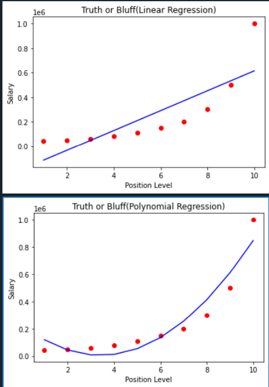
我們可以將degree 設的更大來看模型能否預測的更準確
因此把前面的程式其中一行設定degree的部分改成這樣
poly_reg = PolynomialFeatures(degree = 3)
run 程式碼並查看x_poly 變數會發現多了一行x^3 變數
畫出來的圖形如右圖
可以看到模型預測的準確度已經提升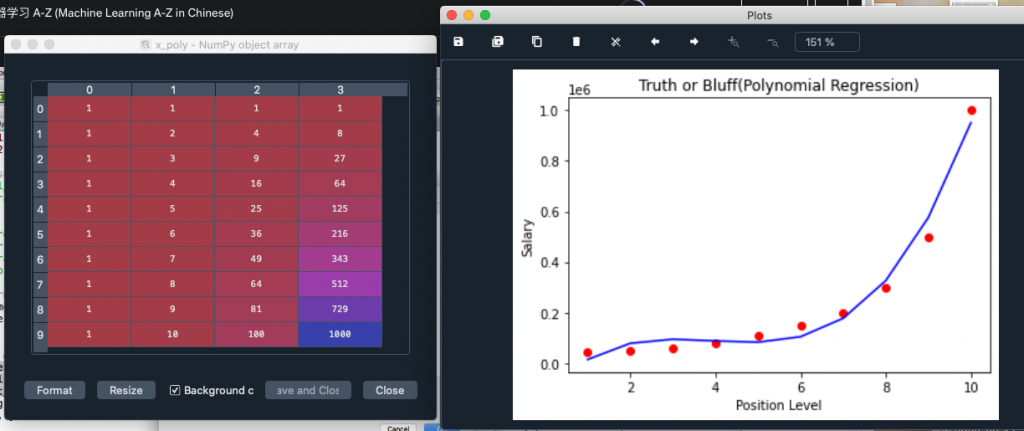
我們可以繼續提升degree直到線與實際值越來越接近
以本題為例, degree=4 就足夠了
因此我會直接以degree=4 來建模型
下一篇我們會用建好的模型直接來預測面試者level=6.5 的salary


 iThome鐵人賽