在前五天介紹了 ggplot2 的基礎後,今天想先暫停技術面,分享一場啟發我許多的演講。
英國資料視覺化顧問 Cara Thompson 在 2023 Shiny in Production 的 Dynamic annotations: tips and tricks 演講中,提出了 十個優化圖表文字呈現的技巧。她透過《英國烘焙大賽》的資料與 R 程式碼範例,示範如何將凌亂的圖表轉化為清晰、易讀且能引發討論的視覺化作品。
👉 影片連結
透過 顏色傳達資訊,降低對圖例與座標軸文字的依賴。例如,用棕色代表巧克力,一眼就能理解資料意涵, 圖例就沒有一定要存在的必要.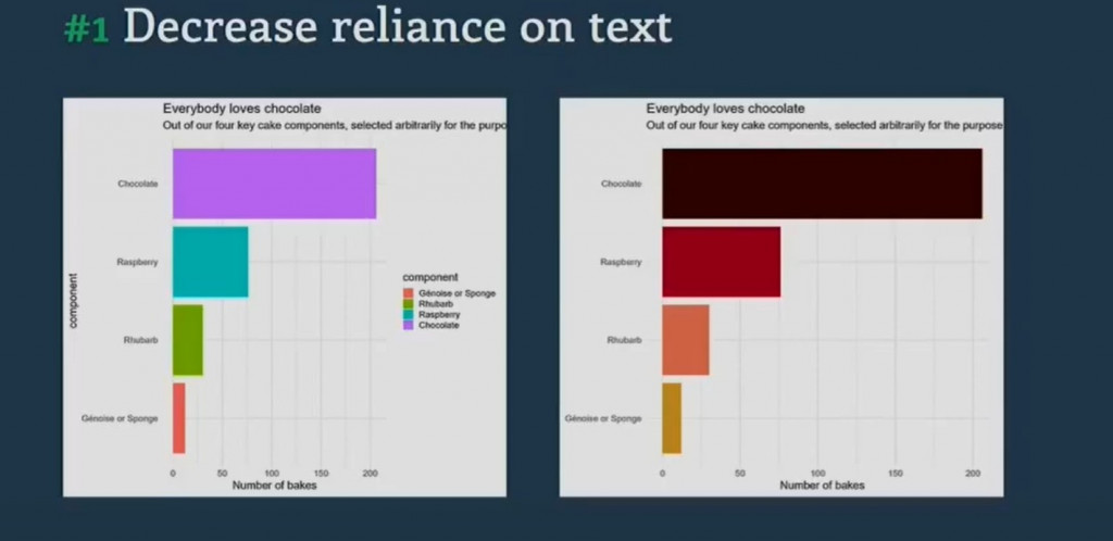
瞭解需要讓讀者清楚的重點資訊為何, 利用 文字大小、顏色、字體 建立層次,讓讀者清楚知道標題、副標題與內文的重點。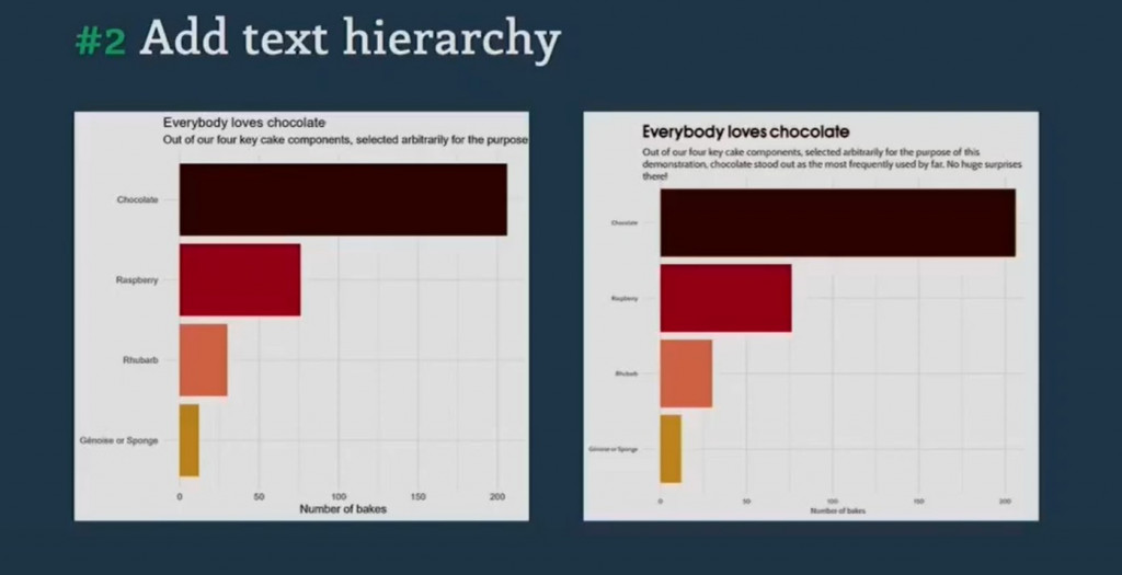
將 標籤直接放在圖形上,避免觀眾來回掃視。結合數字與描述性文字,例如「206 份巧克力烘焙」。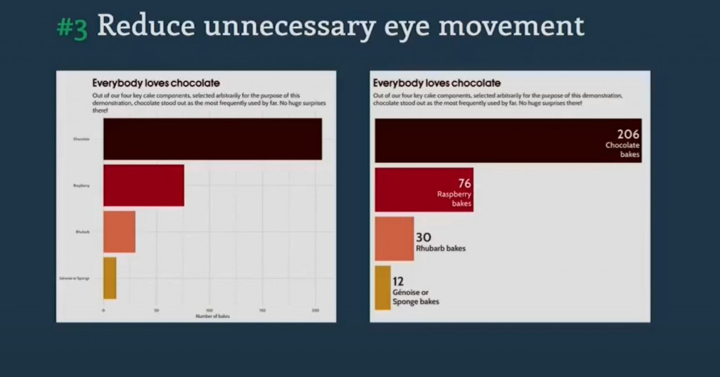
移除雜訊,讓觀眾專注於資料想要傳達的核心。像是用 gghighlight 突顯關鍵線條,或以 geomtextpath 沿曲線顯示文字,減少多餘箭頭。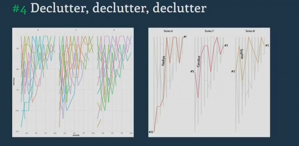
讓 註解動態連結資料,避免每次資料更新都需手動調整,同時保持顏色一致,強化連結感。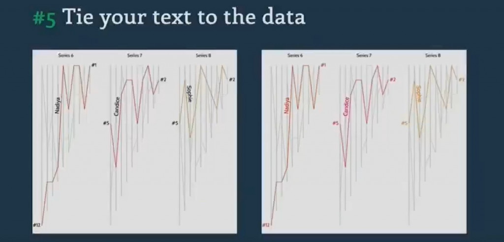
表格也是視覺化的一部分。設計原則包括:清晰標題、統一格式、對齊數字。互動表格可加上斑馬條紋或資料條來增強可讀性。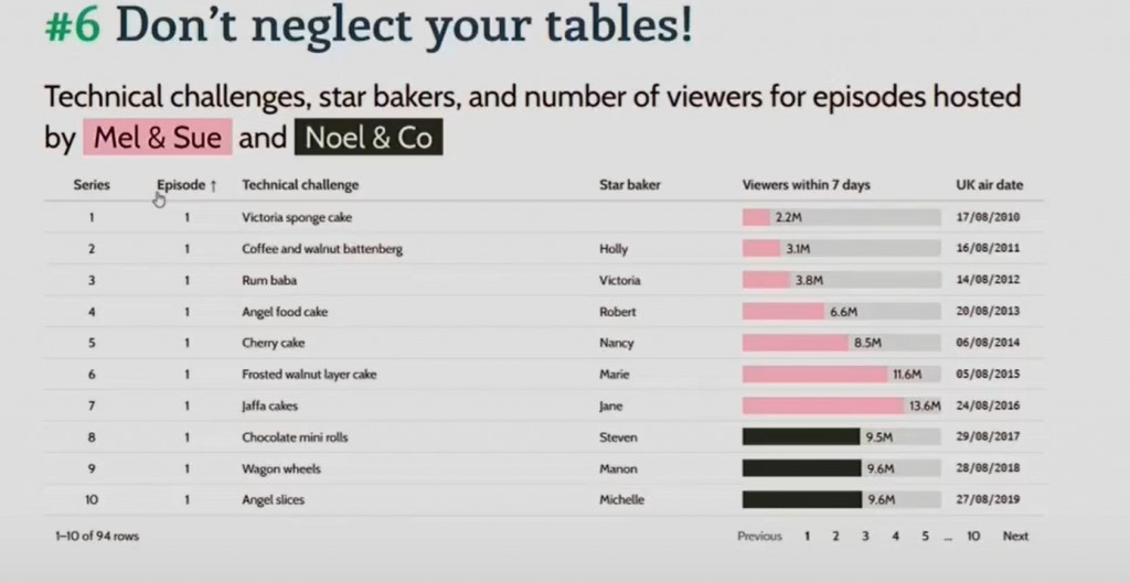
用 互動式圖表 提供工具提示,讓使用者按需探索更多細節,而不是一次塞入所有資訊。分享圖表者, 也可以藉著互動點選過程, 摘要地選擇需要的訊息給予觀眾。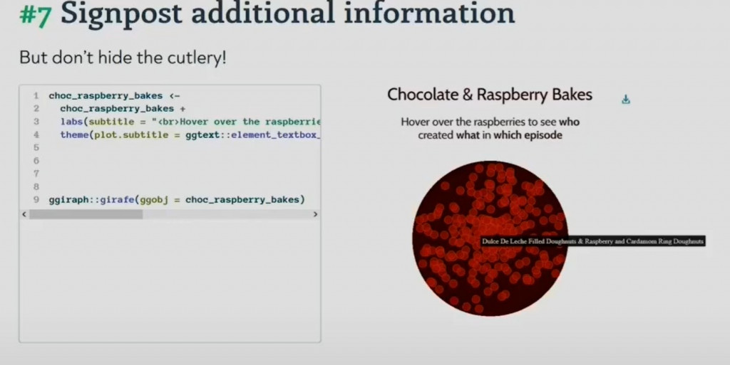
在資料結構內整理好文字,特別是工具提示的內容。可結合不同變數、清理空格,並透過 CSS 美化格式。
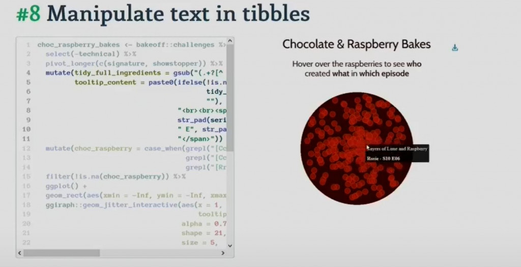
提升互動文字的易讀性,例如設定背景色、字體、邊距與行高,尤其是字體月小時, 可以增加間距, 讓小字也清楚可辨。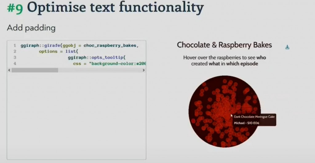
透過 適當的間距與邊距 讓圖表不顯擁擠,提升整體美感與舒適度。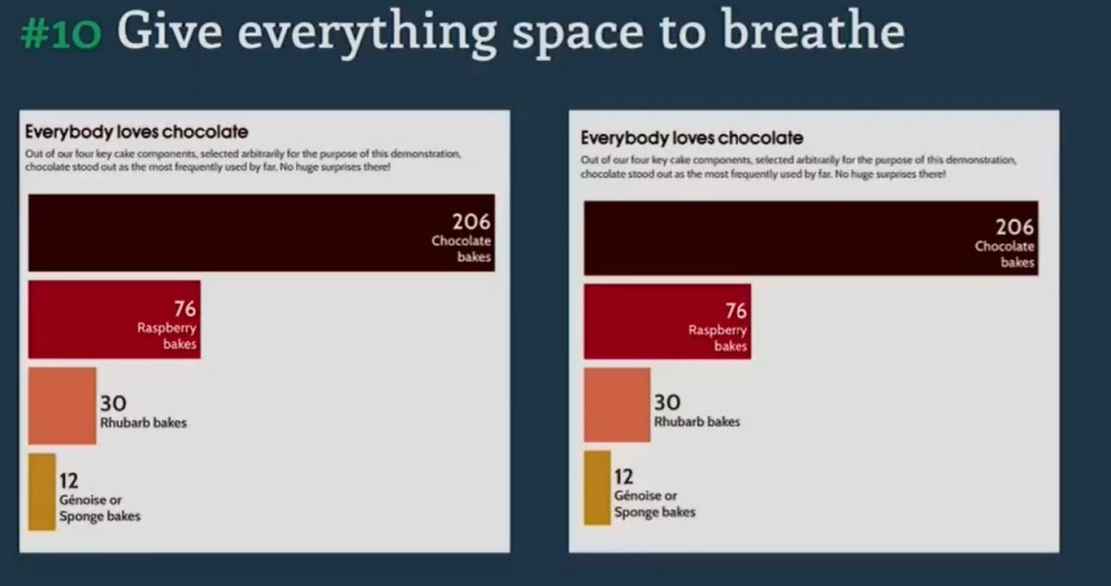
Cara Thompson 的分享提醒我們:好的圖表不只是把資料呈現出來,而是要讓觀眾「一眼就懂」。
從顏色、文字層次到互動設計,這些技巧能幫助我們創造更清晰、專業,且真正能與觀眾對話的資料視覺化作品。
當然, 這是Cara Thompson在分享一個比較生活化主題的內容, 強調這些技巧以當下的條件是可以讓圖表更清楚的表達, 雖然強調的提供10個技巧, 但我認為主要是在傳達一個核心概念-盡可能讓觀眾更清楚所需要表達的資料該如何呈現, 換句話說, 不同情境需要的技巧可能不同,但不變的原則是讓圖表更清楚、更專業,並能與觀眾產生對話。
In Day 6 of my visualization journey, I highlighted lessons from Cara Thompson, a UK-based data visualization consultant. In her Shiny in Production 2023 talk, Dynamic annotations: tips and tricks, she introduced ten practical techniques to refine text in charts. Using The Great British Bake Off dataset with R examples, she showed how cluttered visuals can be transformed into clear and engaging designs. Key tips include reducing reliance on text with color, building text hierarchy, placing labels directly on plots, removing clutter, dynamically binding annotations to data, enhancing tables, and using tooltips for interactivity. She emphasized that effective charts should allow audiences to “get it at a glance.” While the techniques may vary across contexts, the enduring principle is clear: strive for clarity, readability, and meaningful communication in every visualization.

