在資料視覺化的世界裡,「顏色」與「背景主題」往往決定了圖表的第一印象。今天的分享將從 ggplot2 的內建顏色配置開始,逐步介紹 自訂顏色 與 主題套件 的應用,最後以行政院主計總處的「2020–2025 年服務類別型產業每人每月平均薪資」為例,示範如何將長條圖調整得更易讀。
ggplot2 本身提供了預設的顏色組合,在 aes(color=...) 或 aes(fill=...) 放入分類變數時,就會自動分配不同顏色。這些顏色固然方便,但未必符合需求(例如品牌色、產業固定色),因此常需要客製化。
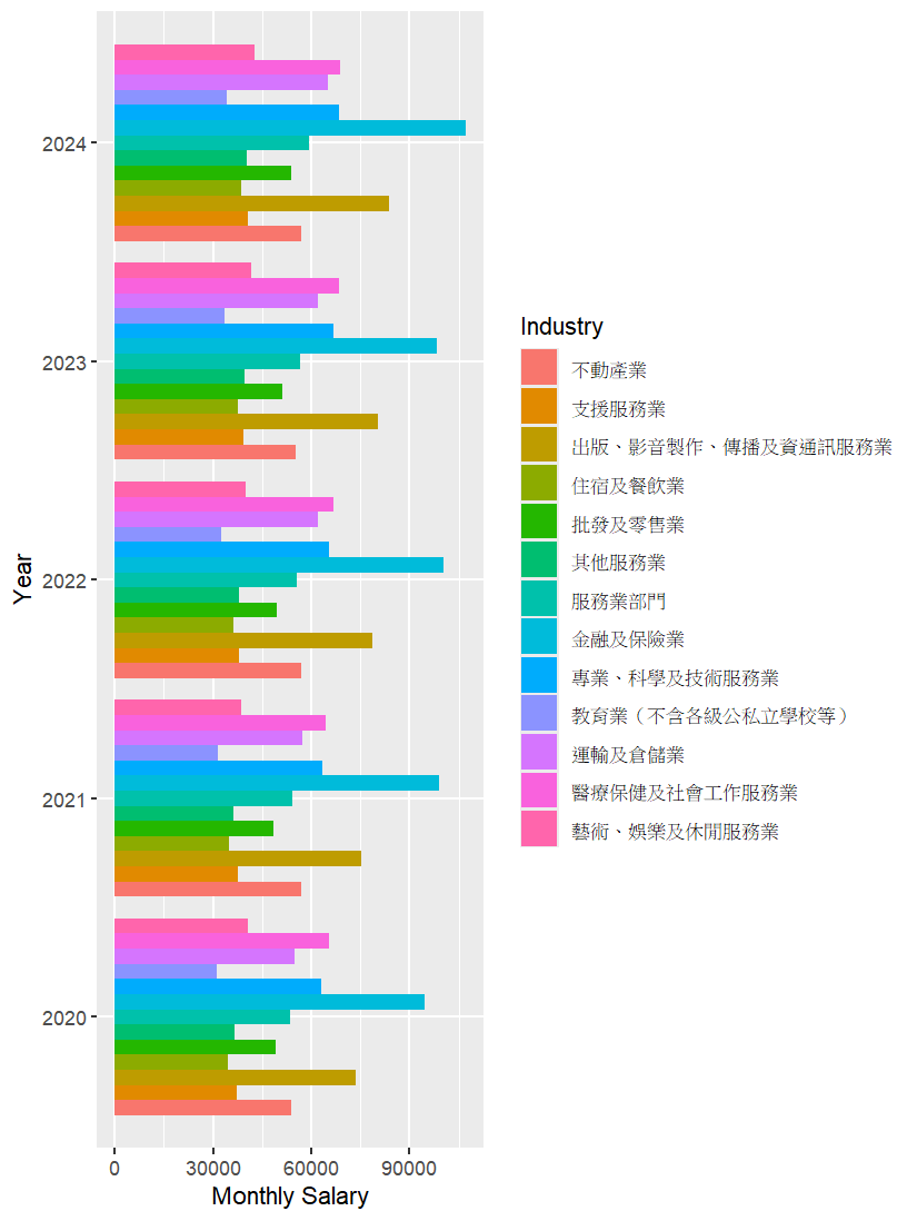
這裡我以行政院主計總處的公開資料作為範例,製作一張「服務類別型產業每人每月平均薪資」的長條圖。
file_path <- "D:/05_R/ggplot2/Day7/salary.xlsx"

salary <- read_excel(file_path)

salary$Year <- as.factor(salary$Year)

salary_plot <- ggplot(data = salary,
       aes(x = Year, y = Salary, fill = Industry)) +
  geom_col(position = "dodge") +
  coord_flip() +
  labs(x = "Year",
       y = "Monthly Salary",
       fill = "Industry")

salary_plot
這裡使用 geom_col(position = "dodge") 做出並排長條圖,再加上 coord_flip() 轉為橫向呈現,讓產業名稱更容易閱讀。
scale_color_manual()
scale_fill_manual()
以下將每個產業指定到固定顏色:
salary_plot_2 <- salary %>%
  group_by(Year, Industry) %>%
  summarise(Salary = mean(Salary), .groups = "drop") %>%
  group_by(Year) %>%
  mutate(Industry = fct_reorder(Industry, Salary, .desc = F)) %>%
  ggplot(aes(x = Year, y = Salary, fill = Industry)) +
  geom_col(position = "dodge") +
  coord_flip()+
  labs(x = "Year",
       y = "Monthly Salary",
       fill = "Industry")+

  scale_fill_manual(values = c(
    "不動產業" = "#e41a1c",   # 紅
    "支援服務業" = "#ff7f00", # 橙
    "出版、影音製作、傳播及資訊通訊服務業" = "#984ea3", # 紫
    "住宿及餐飲業" = "#a65628", # 棕
    "批發及零售業" = "#4daf4a", # 綠
    "其他服務業" = "#f781bf",   # 粉紅
    "服務業部門" = "#999999",   # 灰
    "金融及保險業" = "#ffd92f", # 黃
    "專業、科學及技術服務業" = "#377eb8", # 藍
    "教育業(不含各級公私立學校等)" = "#a6cee3", # 淺藍
    "運輸及倉儲業" = "#1f78b4", # 深藍
    "醫療保健及社會工作服務業" = "#33a02c", # 深綠
    "藝術、娛樂及休閒服務業" = "#fb9a99"  # 淡紅
  ))

salary_plot_2
這樣設定後,不論資料順序如何變動,每個產業都能對應到固定顏色,避免誤解。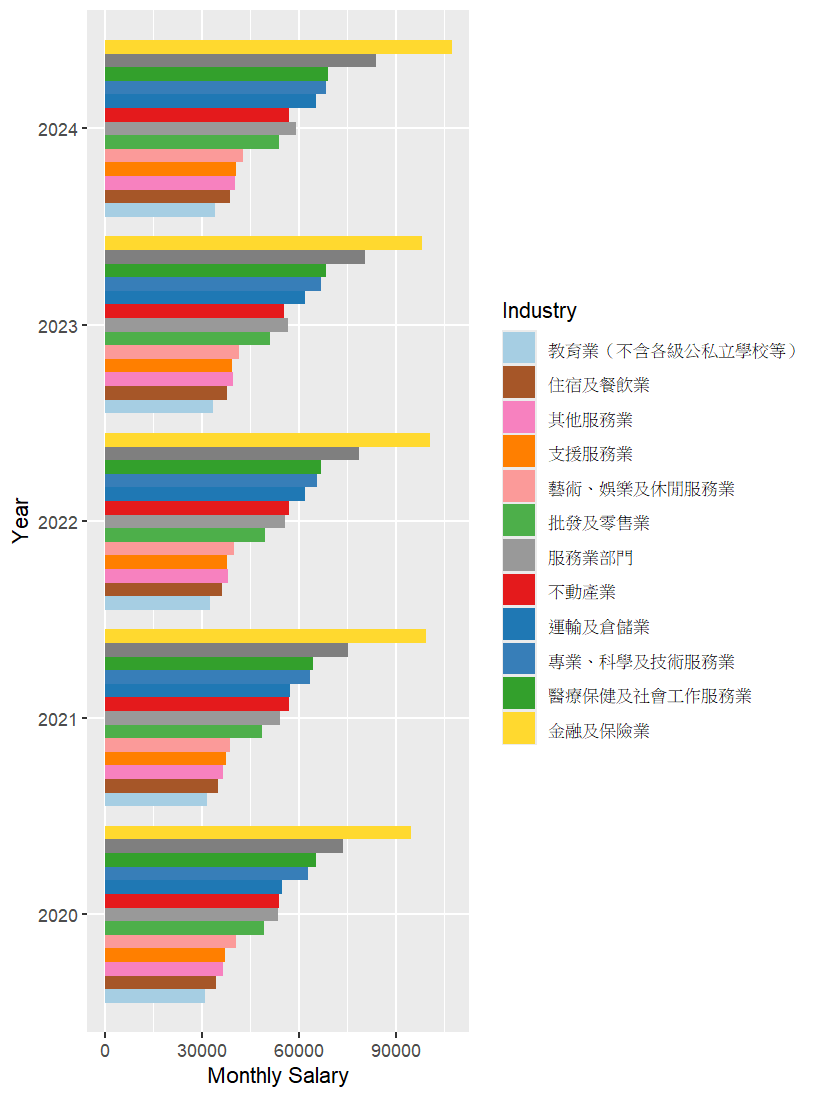
除了顏色之外,背景與整體風格也很重要。
ggplot2 內建了多種主題:
salary_plot + theme_bw()     # 白底、適合印刷
salary_plot + theme_dark()   # 深色背景,投影好讀
salary_plot + theme_void()   # 極簡風格
而 ggthemes 套件提供更多雜誌風格或文件風格:
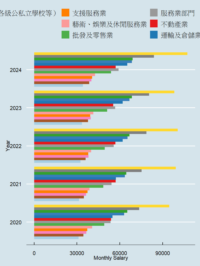
salary_plot + theme_economist()  # 《Economist》雜誌風格
salary_plot + theme_gdocs()      # Google 文件風格
salary_plot + theme_calc()       # 試算表風格
下圖以theme_economist()調整為例:
這些主題能直接套用,也能再透過 theme() 函數細部調整,例如:
salary_plot +
  theme(panel.background = element_rect(fill = "lightgray"),
        plot.background = element_rect(fill = "aliceblue"))
In data visualization, colors and themes strongly influence how charts are perceived. This article introduces ggplot2’s default color palettes, then explains how to customize them with scale_color_manual() and scale_fill_manual() to assign consistent colors to categories, such as industries in salary data. Using real data from Taiwan’s Directorate-General of Budget, Accounting and Statistics (2020–2025 average monthly salaries by service industries), we demonstrate how to build a bar chart with geom_col() and coord_flip() for clarity. Beyond colors, themes also improve readability and style: ggplot2 provides built-in options like theme_bw() and theme_dark(), while the ggthemes package offers styles inspired by publications and documents such as The Economist. By combining custom color mapping and flexible themes, charts can be both professional and audience-friendly, ensuring consistent presentation across reports and presentations.

