延續昨天的 箱型圖(Box Plot),小提琴圖(Violin Plot)同樣能呈現資料的集中趨勢與離散程度。不同的是,小提琴圖直接用「密度形狀」表現分布趨勢,而不是箱子的形狀。
此外,過去 ggplot2 的小提琴圖在分位數(quantile)的處理上,是以密度估計後的資料來計算,與真實原始資料略有誤差;自 ggplot2 4.0.0 釋出,分位數可直接由原始資料計算,並能在圖上以量化線條顯示。
本文以 ggplot2 內建的 diamonds 資料為例,觀察 Carat(克拉) 與 Price(價格) 的關係。
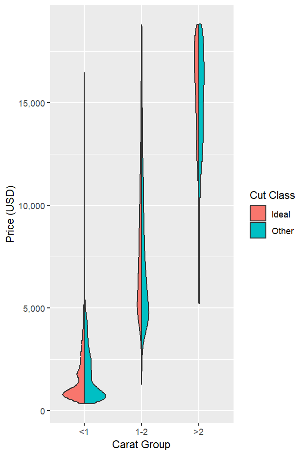
將鑽石依克拉分為 <1、1–2、>2 三組(方便比較不同克拉的價格分布);另外把切工(cut)分成 Ideal 與 Other 兩組。
library(tidyverse)
library(scales)

data(diamonds)

diam_new_cuts <- diamonds %>%
  mutate(
    carat_group = cut(
      carat,
      breaks = c(-Inf, 1, 2, Inf),
      labels = c("<1", "1-2", ">2"),
      right  = TRUE
    ),
    cut_group = if_else(cut == "Ideal", "Ideal", "Other")
  )
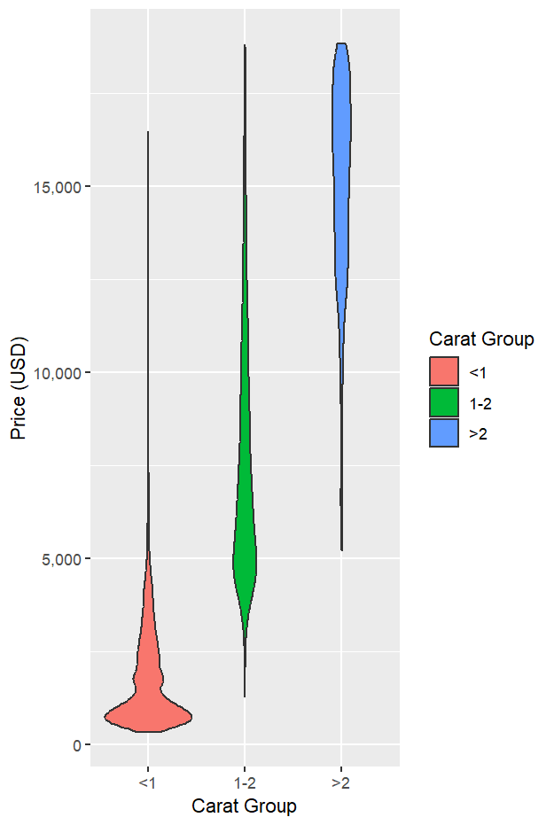
下圖以 carat_group 區分小提琴,能清楚看到克拉越大,價格整體越高(資料集中處上移,分布向上推)。
ggplot(diam_new_cuts, aes(x = carat_group, y = price, fill = carat_group)) +
  geom_violin() +
  scale_y_continuous(labels = comma) +
  labs(x = "Carat Group", y = "Price (USD)", fill = "Carat Group")
在 4.0.0 中,分位數由 stat_ydensity() 直接對原始資料計算;是否顯示、如何顯示,交由 geom_violin() 的參數控制。下例把 25%、50%、75% 三條分位數線顯示在小提琴圖上:
ggplot(diam_new_cuts, aes(carat_group, price, fill = carat_group)) +
  geom_violin(
    quantiles         = c(0.25, 0.50, 0.75),
    quantile.linetype = 1,
    quantile.colour   = "yellow",
    quantile.linewidth= 1
  ) +
  scale_y_continuous(labels = comma) +
  labs(x = "Carat Group", y = "Price (USD)", fill = "Carat Group")
觀察結果
<1 克拉:價格較低且分布較集中。1–2 克拉:價格顯著上移,分布較寬。>2 克拉:價格最高且樣本較少,密度較窄但整體位置更高。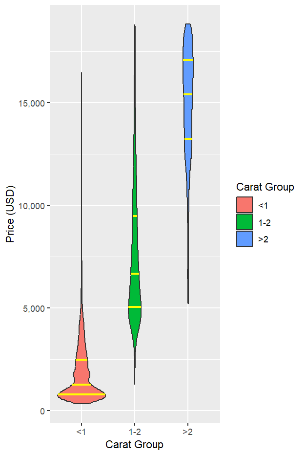
用左右半小提琴對比同一克拉內不同切工的價格分布。可觀察到兩組分布相近,Ideal 在大多數情況下略高,但差異不大。
ggplot(diam_new_cuts, aes(carat_group, price, fill = cut_group)) +
  # 左半邊:Ideal
  geom_half_violin(
    data = subset(diam_new_cuts, cut_group == "Ideal"),
    side = "l", trim = FALSE, alpha = 0.8
  ) +
  # 右半邊:Other
  geom_half_violin(
    data = subset(diam_new_cuts, cut_group == "Other"),
    side = "r", trim = FALSE, alpha = 0.8
  ) +
  scale_y_continuous(labels = comma) +
  labs(x = "Carat Group", y = "Price (USD)", fill = "Cut Class")
carat_group 呈現出克拉越高、價格越高的整體趨勢。quantile.* 參數直接控制顯示與樣式,實務更精準、語法更一致。This post introduces the violin plot as a complement to the box plot for showing both central tendency and dispersion while revealing the full shape of a distribution. Using ggplot2’s built-in diamonds dataset, diamonds are grouped by carat into three bands (<1, 1–2, >2) to compare price distributions. The violins clearly show a strong size–price relationship: as carat increases, the price distribution shifts upward and typically broadens, with <1 carat concentrated at lower prices, 1–2 carats higher and wider, and >2 carats highest with fewer observations. A key update in ggplot2 4.0.0 is highlighted: quantiles for violin layers are now computed from the input data by stat_ydensity(). Whether and how these quantiles are drawn is controlled by the geom via quantile.linetype, quantile.colour, and quantile.linewidth; setting a non-blank linetype enables the lines (e.g., 25th/50th/75th). The article also demonstrates side-by-side comparisons of cut grouped into Ideal vs Other using half-violins; within each carat band their shapes are broadly similar, with Ideal only slightly higher on average—indicating carat drives price more than cut in this dataset. Practical tips include labeling, readable axes, and a fallback approach to draw quantile markers when a half-violin layer lacks native quantile.* support.

