在統計分析的情境中,箱型圖(Box Plot) 幾乎是最常見的圖形之一。它能以簡潔的圖像,同時呈現資料的集中趨勢與離散程度:包含箱體高低(IQR)、箱體上下緣(Q1 與 Q3)、箱內的中位數線(Median)、以及延伸出去的鬚(Whiskers)與末端小橫線(Staples)。因此,無論在期刊或一般文章,Box Plot 的出鏡率都非常高。本文以 ggplot2 內建的 diamonds 資料集為例,透過 Box Plot 觀察 Carat(克拉) 與 Price(價格) 的關係。
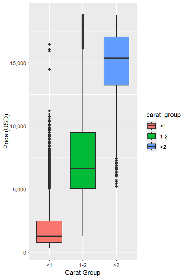
先將鑽石依克拉數分成 <1、1–2、>2 三組(方便比較不同克拉的價格分布)。
library(tidyverse)

data(diamonds)

diam_cuts <- diamonds %>%
  mutate(carat_group = cut(
    carat,
    breaks = c(-Inf, 1, 2, Inf),
    labels = c("<1", "1-2", ">2"),
    right = TRUE
  ))
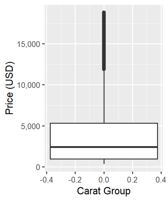
先看整體價格分布。因為此圖沒有指定 x,所有資料會視為同一組集中呈現,能快速感覺到價格的大致落點與極端值情況。
library(ggplot2)
library(scales)  # 用於 y 軸 comma 標籤

ggplot(diam_cuts, aes(y = price)) +
  geom_boxplot() +
  scale_y_continuous(labels = comma) +
  labs(x = NULL, y = "Price (USD)")
註:此處僅提供「整體」分布輪廓;價格受到多種因素影響(切工、顏色、淨度與克拉等),尚未分層比較前,解讀以概覽為主。
引入 carat_group 之後,可以清楚看到不同克拉區間的價格分布差異;克拉越高,中位數價格越高,而且高價的長尾也更明顯。
ggplot(diam_cuts, aes(x = carat_group, y = price, fill = carat_group)) +
  geom_boxplot() +
  scale_y_continuous(labels = comma) +
  labs(x = "Carat Group", y = "Price (USD)") +
  guides(fill = "none")
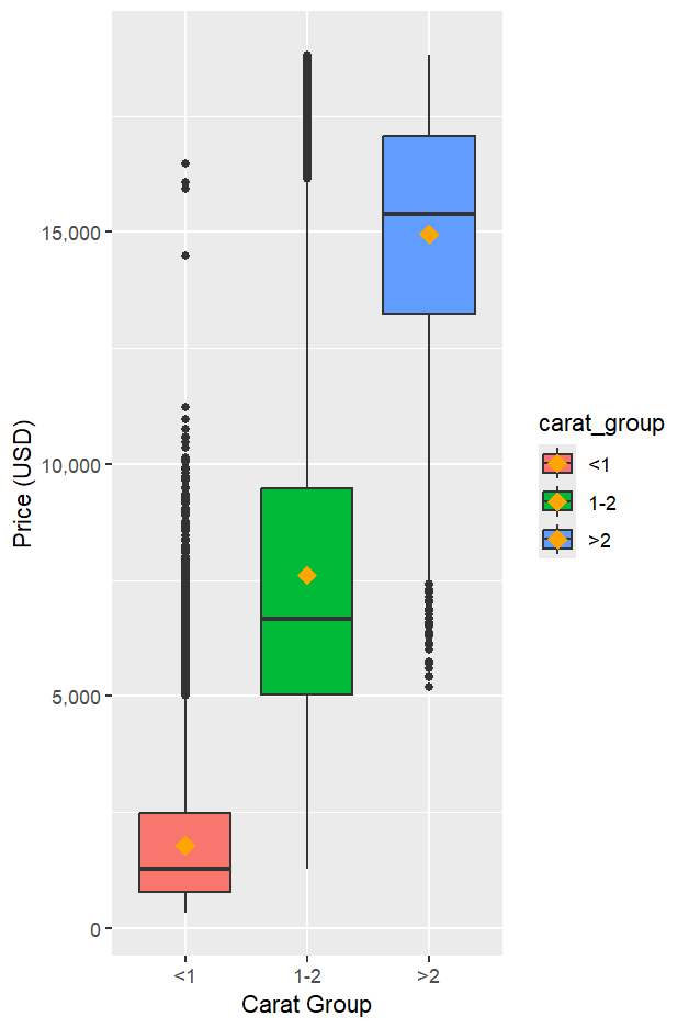
中位數(Median)較不受極端值影響;平均數(Mean)則會被長尾拉動。兩者一起看,更能掌握分布的偏態與尾部狀況。
ggplot(diam_cuts, aes(x = carat_group, y = price, fill = carat_group)) +
  geom_boxplot() +
  stat_summary(fun = mean, geom = "point",
               color = "orange", size = 4, shape = 18) +
  scale_y_continuous(labels = comma) +
  labs(x = "Carat Group", y = "Price (USD)") +
  guides(fill = "none")
在新版4.0.0 ggplot2 中,箱型圖的各組件可分別調整(如鬚線、箱體邊框、中位數線、鬚末端小橫線 staples 等),有助教學或出版時做更清晰的視覺標示。
ggplot(diam_cuts, aes(x = carat_group, y = price, colour = carat_group)) +
  geom_boxplot(
    whisker.linetype = "dashed",  # 鬚線線型
    box.colour      = "red",      # 箱體邊框顏色
    median.linewidth= 2,          # 中位數線寬
    staplewidth     = 0.5,        # 鬚末端小橫線寬度
    staple.colour   = "grey50"    # 鬚末端小橫線顏色
  ) +
  stat_summary(fun = mean, geom = "point",
               color = "orange", size = 4, shape = 18) +
  scale_y_continuous(labels = comma) +
  labs(x = "Carat Group", y = "Price (USD)") +
  guides(colour = "none")
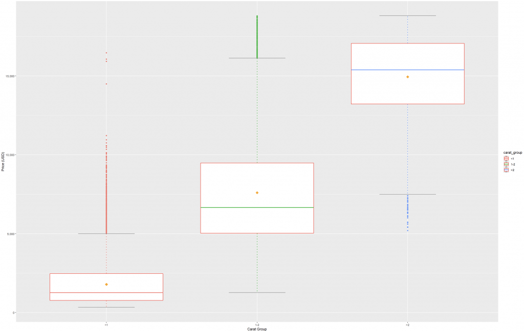
diamonds 範例中,克拉數越高,價格中位數整體越高,分布也更拉長。ggplot2 對組件的細緻參數控制,讓教學、報告與出版的圖形更易讀、更專業。This post demonstrates how box plots concisely encode rich summary statistics, using the diamonds dataset to explore the relationship between Carat and Price. We first show an overall box plot to reveal the global distribution of prices. Next, we group diamonds into three carat ranges (<1, 1–2, >2) and plot prices by group. The result highlights a clear pattern: as carat increases, the median price rises, and distributions become more skewed with heavier upper tails. To complement the median, we overlay the mean to illustrate how long tails influence average values relative to the median. We also leverage recent enhancements in ggplot2 that allow fine-grained styling of box plot components—including whiskers, box outlines, median lines, and the small terminal bars (“staples”)—which makes didactic and publication graphics clearer and more consistent. Finally, we recap the interpretation of each box plot element: the IQR box, median line, whiskers, staples, and outliers beyond 1.5×IQR from the quartiles. Overall, box plots provide a compact and effective way to compare distributions across groups and to communicate central tendency and variability at a glance.

