Density plot(密度圖) 是一種常見用來呈現資料分布的圖形。它透過 核密度估計(Kernel Density Estimation, KDE),將每個資料點估計為一條小曲線,最後再加總成一條平滑的分布曲線。影響曲線平滑程度的參數稱為 帶寬(bandwidth, bw),在 ggplot2 中可透過 geom_density(bw = ...) 來控制。
本篇範例資料來自 palmerpenguins 套件 的 penguins,該資料包含三種企鵝(Adelie、Chinstrap、Gentoo)的體重、翅膀長度、喙部大小等連續變數。
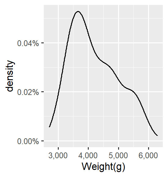
若不考慮品種差異,可以看出企鵝體重主要集中在 3500–4000 g 之間。
ggplot(data = penguins_new,
       aes(x = body_mass_g)) +
  geom_density()+
  scale_y_continuous(labels = percent_format(accuracy = 0.01))+
  scale_x_continuous(labels = comma)+
  labs(
    x = 'Weight(g)'
  )
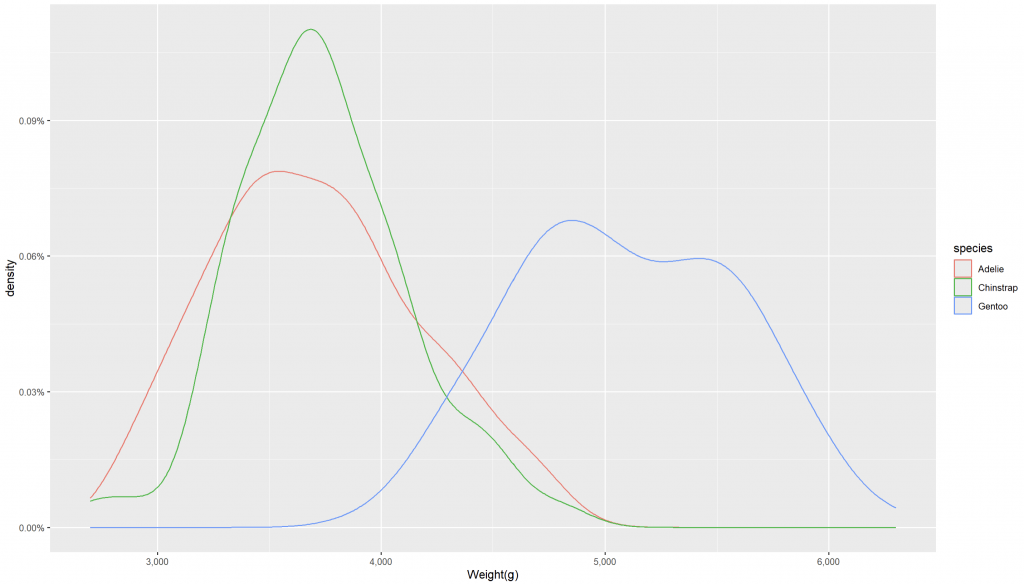
若考慮品種差異,可以看到更清楚的分布差異:
ggplot(data = penguins_new,
       aes(x = body_mass_g,
           color = species)) +
  geom_density()+
  scale_y_continuous(labels = percent_format(accuracy = 0.01))+
  scale_x_continuous(labels = comma)+
  labs(
    x = 'Weight(g)'
  )
透過密度圖,我們可以直觀比較不同企鵝種類的體重差異,從中發現 Gentoo 體型明顯較大,而 Adelie 與 Chinstrap 則有高度相似性。
This article demonstrates the use of density plots with the palmerpenguins dataset in R. Density plots apply Kernel Density Estimation (KDE) to visualize the overall distribution of continuous variables. Using body mass data, we observe that penguin weights cluster between 3500–4000 g overall. When grouped by species, Gentoo penguins show higher body mass values, while Adelie and Chinstrap penguins overlap in range but Chinstrap exhibits a sharper concentration. Density plots provide an intuitive way to compare species-specific distributions.


 iThome鐵人賽