Histogram(直方圖)是最直觀呈現連續型數據整體分布的圖形之一,也常常與 Density Plot(密度圖)搭配使用,讓「數量」與「機率密度」的概念能夠同時呈現。本文延續昨日使用的 penguins 資料集,觀察直方圖的基本呈現,以及直方圖與密度圖如何互補。
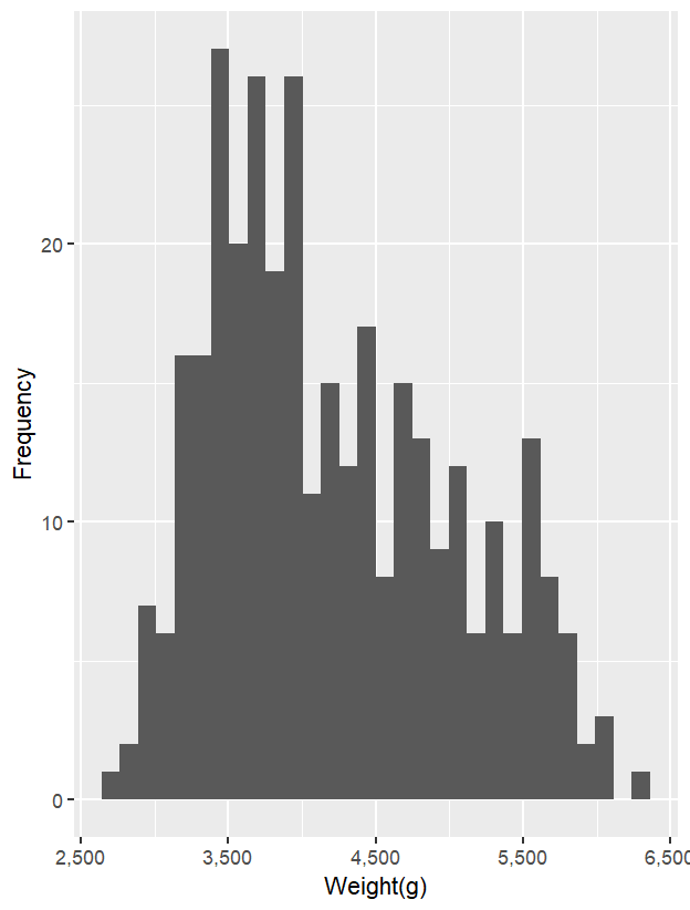
首先,以 geom_histogram() 畫出企鵝體重的分布情況。與密度圖的結果一致,數據主要集中在 3500–4000 g 之間。
ggplot(data = penguins_new,
       aes(x = body_mass_g)) +
  geom_histogram()+
  scale_x_continuous(labels = comma)+
  labs(
    x = 'Weight(g)',
    y = 'Frequency'
  )
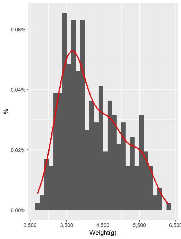
若需要同時呈現數量與機率密度,可以在 geom_histogram() 中加入 y = after_stat(density),將 y 軸由原本的「計數」轉換成「機率密度」。如此一來,直方圖與密度圖就能共用同一個 y 軸,並以機率的方式表達分布。
ggplot(data = penguins_new,
       aes(x = body_mass_g)) +
  geom_histogram(aes(y = after_stat(density)))+
  scale_x_continuous(labels = comma)+
  scale_y_continuous(labels = percent_format(accuracy = 0.01))+
  labs(
    x = 'Weight(g)',
    y = '%'
  )+
  geom_density(color = 'red',
               linewidth = 1)
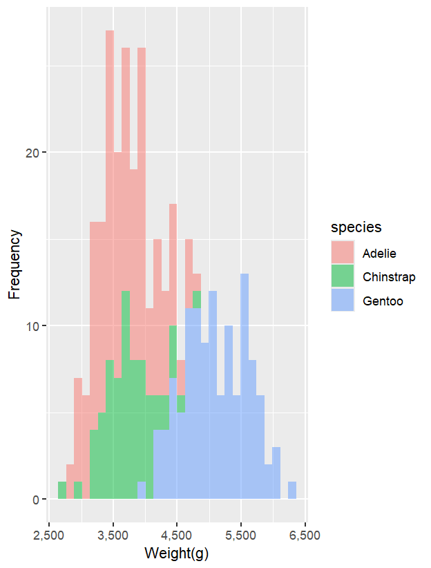
觀察不同品種企鵝的體重分布時,需注意直方圖的堆疊方式。以下程式碼採用 fill = species,預設的 geom_histogram() 是 stack 模式,會將數量累加:
ggplot(data = penguins_new,
       aes(x = body_mass_g,
           fill = species)) +
  geom_histogram(alpha = 0.5)+
  scale_x_continuous(labels = comma)+
  labs(
    x = 'Weight(g)',
    y = 'Frequency'
  )
若不想累加,而希望每個分組獨立呈現,需加入 position = "identity",這樣不同群組會重疊在同一張圖上,常搭配透明度 alpha 使用:
ggplot(data = penguins_new,
       aes(x = body_mass_g,
           fill = species)) +
  geom_histogram(position = "identity",
                 alpha = 0.5)+
  scale_x_continuous(labels = comma)+
  labs(
    x = 'Weight(g)',
    y = 'Frequency'
  )
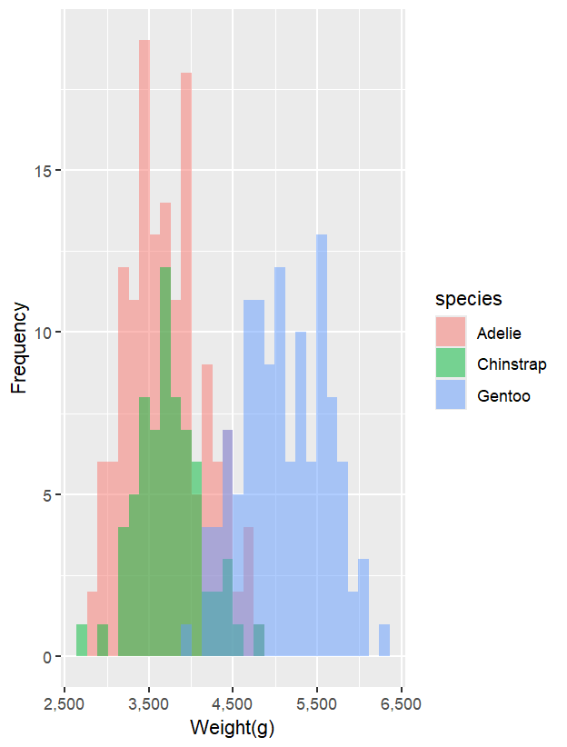
因此,在呈現連續數據且包含分組時,直方圖需要先確認是否採用「累加」或「重疊」。相對而言,密度圖則不會有這樣的困擾。
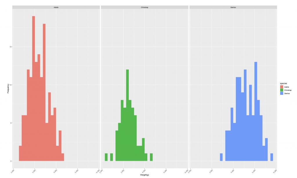
若想要更清楚比較各組的數量分布,可以透過 facet_wrap() 將不同品種分開顯示:
ggplot(data = penguins_new,
       aes(x = body_mass_g,
           fill = species)) +
  geom_histogram()+
  facet_wrap(~ species)+
  scale_x_continuous(labels = comma)+
  labs(
    x = 'Weight(g)',
    y = 'Frequency'
  )+
  theme(axis.text.x = element_text(angle = 45, hjust = 1))+
  theme_sub_panel(
    widths = unit(50, "cm"),
    heights = unit(30, "cm")
  )
直方圖的基礎與限制:直方圖是最直覺的分布視覺化方式,透過將資料依區間(bin)分組並計算數量,藉由長條高度與區間寬度表達分布情況。然而,直方圖的解讀高度依賴區間寬度的設定。如果區間過窄,圖形會顯得尖銳且雜亂,容易掩蓋整體趨勢;若區間過寬,則會使得細部特徵消失。因此,在使用直方圖時,必須嘗試不同的區間寬度以確保結果能真實反映數據。
密度圖與核密度估計:密度圖的核心概念是透過核密度估計(KDE)將離散的資料平滑化,形成連續的曲線,以模擬資料背後的機率分布。這個方法利用核函數(最常見為高斯核)在每個資料點加上一個曲線,再疊加而成完整的分布線條。與直方圖類似,密度圖的呈現效果也依賴帶寬(bandwidth)的選擇,帶寬過小會導致圖形過於尖銳、難以捕捉趨勢,而帶寬過大則可能抹去細微的結構。
潛在陷阱:雖然密度圖能提供更平滑的分布呈現,但也存在潛在風險。例如,在資料尾端,密度估計可能會延伸至不存在甚至不合理的範圍(如負年齡),造成誤導性的視覺效果。因此,在繪製密度圖後,需檢視是否出現「虛構資料」的情況,避免將不存在的訊息錯誤解讀為真實趨勢。
多分布比較挑戰:在比較不同群體的分布時,直方圖的堆疊或重疊往往會造成混淆,因為觀眾難以分辨每個群體的相對大小與差異。雖然透明度或顏色變化能部分改善,但仍可能讓圖形顯得複雜。相對地,密度圖透過連續的曲線能更清楚地區分不同群體的分布,但在分布高度重疊或樣本數差異極大的情況下,仍可能導致判讀困難。
替代方式:密度圖因為可同時呈現多條曲線,會比直方圖更適合。此外,若想進一步檢視分布特性,也可以考慮使用累積分布函數(CDF)或 Q-Q plot 等替代方法,以避免直方圖與密度圖的限制。
Histograms and density plots are complementary tools for visualizing continuous data distributions. Using the penguins dataset, this article first demonstrates how histograms illustrate the overall body mass distribution, while density plots smooth the data into probability curves. By applying after_stat(density), histograms can be converted from counts to probability density, allowing them to share the same axis with density plots for direct comparison. When visualizing grouped data, histograms by default stack counts across groups, which can be misleading. Adding position = "identity" avoids stacking, but overlapping bars may occur, so transparency is often needed. Faceted plots (facet_wrap) provide another clear way to separate and compare group-specific distributions. While histograms are intuitive, they depend heavily on bin width, and density plots on bandwidth choice. Both have limitations—histograms can obscure details, and density plots may extend into unrealistic ranges. Therefore, combining them and considering alternative methods such as cumulative distribution functions (CDFs) or Q-Q plots can lead to more reliable insights.


 iThome鐵人賽