在資料分析中,常見的挑戰是如何清楚呈現不同族群的差異。今天我嘗試用 熱圖 (heatmap) 來觀察「收縮壓 > 140」的數據分布狀況,並依照 生活型態 (抽菸/酗酒) 與 年齡層 (依照 WHO 規範分類) 做交叉比對。熱圖主要強調觀察二維數據之間的關係,因此在觀察的組別設定需考量是否符合研究需求。
熱圖的特色是利用顏色深淺來表達數值大小,非常適合用在「二維交叉比較」的情境。例如:
這樣就能快速看出 哪個年齡層 + 哪種生活型態 的族群風險最高。
先把人群依照 抽菸與酗酒行為 分成四類:
再依照 WHO 的建議,將年齡切分為:
若直接用「人數」畫熱圖,會出現基數偏差。例如 沒有抽菸也沒有酗酒 (Neither) 的群組因為人數多,顏色會最深,容易誤導解讀。
因此,必須將人數轉換成 比例 (高血壓人數 ÷ 總人數),才能公平比較不同群組的風險。
library(dplyr)
library(ggplot2)

# 建立生活型態與年齡分組
health_1 <- health %>%
  mutate(
    lifestyle_group = case_when(
      smoker == 1 & alcohol == 0 ~ "Only Smoker",
      smoker == 0 & alcohol == 1 ~ "Only Drinker",
      smoker == 1 & alcohol == 1 ~ "Smoker & Drinker",
      smoker == 0 & alcohol == 0 ~ "Neither"
    ),
    age_group = case_when(
      age >= 10 & age <= 19 ~ "Adolescents (10–19)",
      age >= 20 & age <= 24 ~ "Youth (20–24)",
      age >= 25 & age <= 44 ~ "Adults (25–44)",
      age >= 45 & age <= 59 ~ "Middle-aged (45–59)",
      age >= 60             ~ "Elderly (60+)",
      TRUE ~ "Unknown"
    )
  )

# 計算比例
result_prop <- health_1 %>%
  group_by(lifestyle_group, age_group) %>%
  summarise(
    total = n(),
    high_bp = sum(systolic_bp > 140),
    prop_high_bp = high_bp / total
  ) %>%
  mutate(
    age_group = factor(age_group,
                       levels = c("Adolescents (10–19)",
                                  "Youth (20–24)",
                                  "Adults (25–44)",
                                  "Middle-aged (45–59)",
                                  "Elderly (60+)"))
  )

# 基本熱圖
ggplot(data = result_prop,
       aes(x = age_group,
           y = lifestyle_group,
           fill = prop_high_bp)) +
  geom_tile()

# 美化:旋轉標籤 + 三色梯度
ggplot(data = result_prop,
       aes(x = age_group,
           y = lifestyle_group,
           fill = prop_high_bp)) +
  geom_tile() +
  theme(axis.text.x = element_text(angle = 40,
                                   hjust = 1)) +
  scale_fill_gradientn(colors = c("#1a9850", "#ffffbf", "#d73027"))
第一張圖(藍色漸層):顯示各組 (年齡分組 × 生活型態) 的高血壓比例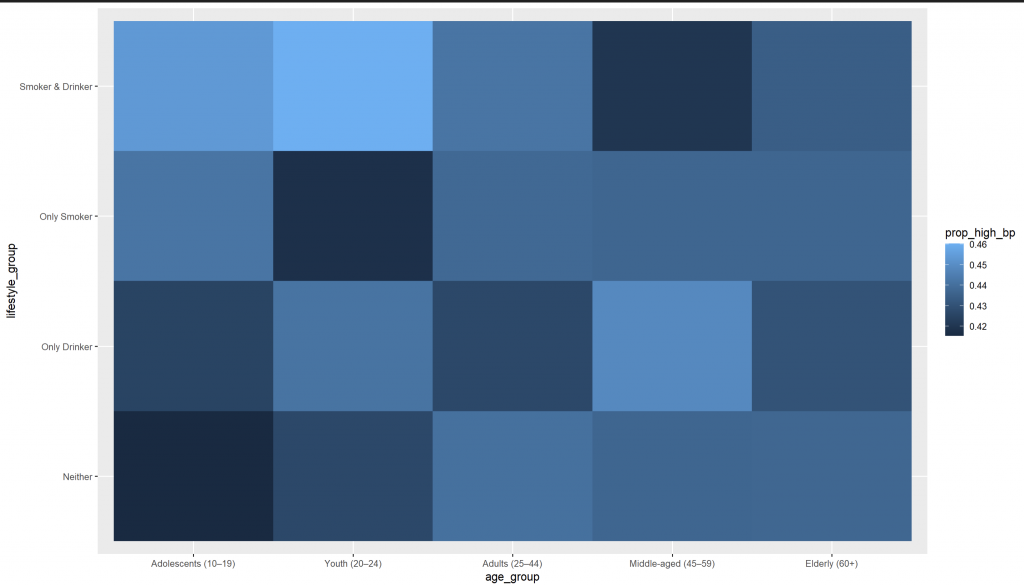
第二張圖(綠–黃–紅漸層):更直觀表達 健康 → 警告 → 危險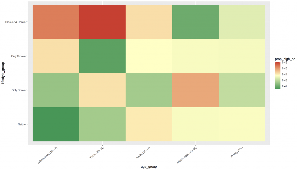
This post demonstrates how heatmaps can effectively reveal patterns in health data by comparing age groups and lifestyle factors (smoking/drinking). Instead of using raw counts, which are biased by group size, we calculate the proportion of individuals with systolic blood pressure >140. By transforming counts into proportions, we avoid misleading interpretations and highlight relative risks across groups. The heatmap clearly shows that older adults and those with combined risky behaviors (smoking and drinking) have higher prevalence of high blood pressure. This visualization approach helps identify high-risk populations quickly, supporting public health analysis and clinical decision-making.


 iThome鐵人賽