今天將透過 ggplot2 來繪製台灣在2024年政黨票得票數的圓餅圖,並進一步整理出 前三大政黨 + 其他小黨 的版本,最後再將結果改成甜甜圈圖(donut chart)。這樣的流程能讓我們從原始數據到資訊濃縮,逐步展現資料視覺化的設計思考。不過,個人建議採用圓餅圖時,組別盡可能不要超過5組,避免無法從圖中看出占比資訊。
首先,直接使用原始資料 (政黨名稱 Party.Name、投票數 Votes、票數占比 Vote.Share) 畫出最基本的圓餅圖:
ggplot(vote ,
       aes(x = 0,
           y = Votes,
           fill = Party.Name)) +
  geom_col() +
  coord_polar(theta = "y") +
  theme_void()
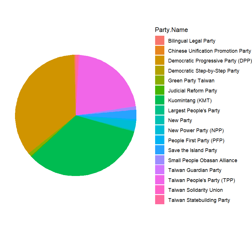
雖然圖形能完整呈現資料,但由於需要呈現的政黨數量過多,顏色區塊顯得雜亂,不僅無法比較占比資訊,且標籤難以閱讀。
接著,我們先嘗試只挑選 民進黨 (DPP)、國民黨 (KMT)、民眾黨 (TPP) 三個主要政黨:
vote2 <- vote %>%
  filter(Party.Name %in% c("Democratic Progressive Party (DPP)",
                           "Taiwan People's Party (TPP)",
                           "Kuomintang (KMT)")) %>%
  mutate(label = paste0(Party.Name, "\n",Vote.Share)) %>%
  arrange(desc(Votes))
不過這樣做會捨棄掉其他小黨占比的訊息,因此調整成 前三大政黨 + 其他小黨整併 的策略來製圖。
我們可以用 row_number() 搭配 if_else(),將前三名以外的政黨合併成 Others,並重新計算 summarise() 總得票數與得票率:
vote2 <- vote %>%
  arrange(desc(Votes)) %>%
  mutate(group = if_else(row_number() <= 3, Party.Name, "Others")) %>%
  group_by(group) %>%
  summarise(
    Votes = sum(Votes, na.rm = TRUE),
    Vote.Share = sum(readr::parse_number(Vote.Share)),
    .groups = "drop"
  ) %>%
  mutate(label = paste0(group, "\n", round(Vote.Share, 1), "%")) %>%
  arrange(desc(Votes))
並加入標籤與自訂顏色:主要三大政黨顏色採用其代表色,另以棕色來代表其他小黨整併的數據。
ggplot(vote2,
       aes(x = 0, y = Votes, fill = group)) +
  geom_col() +
  coord_polar(theta = "y") +
  theme_void() +
  geom_text(
    aes(label = label),
    position = position_stack(vjust = 0.5),
    color = "white",
    fontface = "bold",
    size = 2.5
  ) +
  scale_fill_manual(values = c(
    "Democratic Progressive Party (DPP)" = "#00A94E",
    "Kuomintang (KMT)"                   = "#000095",
    "Taiwan People's Party (TPP)"        = "#00BFFF",
    "Others"                             = "#A52A2A"
  )) +
  theme(legend.position = "none")
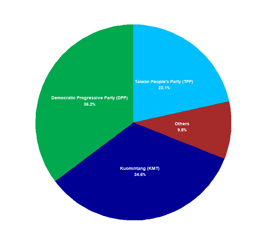
這樣圖面乾淨許多,且資訊量集中在主要政黨與其他小黨整併的數據的比較。
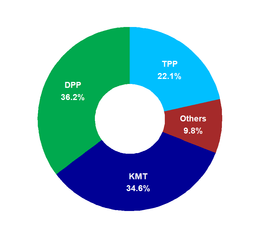
另外,將圓餅圖圓心挖空,製作甜甜圈圖,並同時簡化政黨名稱(若名稱中有括號,就取縮寫,如 DPP、KMT、TPP):
vote3 <- vote2 %>%
  mutate(
    group2 = ifelse(
      grepl("\\(", group),
      sub(".*\\((.*)\\).*", "\\1", group),
      group
    )
  ) %>%
  mutate(label2 = paste0(group2, "\n", round(Vote.Share, 1), "%")) %>%
  arrange(desc(Votes))

ggplot(vote3,
       aes(x = 0,
           y = Votes,
           fill = group2)) +
  geom_col() +
  coord_polar(theta = "y") +
  theme_void() +
  geom_text(
    aes(label = label2),
    position = position_stack(vjust = 0.5),
    color = "white",
    fontface = "bold",
    size = 5
  ) +
  xlim(- 1, 0.5) +
  scale_fill_manual(values = c(
    "DPP"       = "#00A94E",
    "KMT"       = "#000095",
    "TPP"       = "#00BFFF",
    "Others"    = "#A52A2A"
  )) +
  theme(legend.position = "none")
This article demonstrates how to create pie charts with ggplot2 using Taiwan’s 2024 party votes. A basic pie chart with all parties was first produced, but the result appeared cluttered due to too many categories. To improve readability, the visualization was simplified by focusing on the top three parties while grouping the rest into an “Others” category. This approach keeps the key information clear while still acknowledging smaller parties. The chart was further refined into a donut chart by hollowing out the center, which offers a cleaner and more modern design. In addition, party names were shortened by extracting acronyms from parentheses (e.g., DPP, KMT, TPP), making labels more concise. The process illustrates a common visualization workflow: starting from raw data, reducing complexity through grouping, and applying design choices that highlight essential insights. The main takeaway is that pie charts should not be overloaded with categories; ideally, they should be limited to a few groups. When there are too many categories, alternatives like bar charts sorted by values provide a more effective way to communicate data. Overall, donut charts can be an elegant option for comparing proportions when the number of groups is small.


 iThome鐵人賽