

今天是中秋節,應景一下就做了一個很陽春的導覽列,本篇的重點會放在CSS 2D Transform的部分
中秋圖片參考自iStock
fontAwesome6.2.0(目前最新版本)的cdn或使用@import url("")把連結引入至你的專案
| 知識點 | 使用說明 |
|---|---|
| semantic Tag | 定義語意標籤(如:導覽列、時間戳記) |
| 知識點 | 使用說明 |
|---|---|
| 2D Transform | 導覽列的旋轉(rotate)、導覽列的顯示 |
| Transition | 讓轉場效果更順暢 |
| Selector | 範例中的同層相鄰選擇器(+)使用的很經典 |
| 知識點 | 使用說明 |
|---|---|
| classList.renove( )/add( ) | 新增或移除class="show-nav" |
| addEventListener( ) | 用來監聽開啟跟關閉導覽列 |
container、circle-container、content、nav這幾個區塊,class="show-nav"預設導覽列為open的狀態 <div class="container show-nav">
<div class="circle-container">
<div class="circle">
<button id="close">
<i class="fa-sharp fa-solid fa-xmark"></i>
</button>
<button id="open">
<i class="fa-solid fa-bars"></i>
</button>
</div>
</div>
<div class="content">
<h1>中秋節由來</h1>
<time datetime="2022-09-10">2022年9月10日星期六</time>
<p>...</p>
<img src="..." alt="中秋節">
<p>...</p>
</div>
</div>
<!-- 導覽列 -->
<nav>
<ul>
<li><i class="fa-sharp fa-solid fa-house"></i>首頁</li>
<li><i class="fa-solid fa-user"></i>關於我們</li>
<li><i class="fa-solid fa-envelope"></i>聯絡資訊</li>
</ul>
</nav>
若以上都設定好了,呈現如下圖,恩..醜醜的,那接下來就把該旋轉的部分旋轉,該隱藏的部份隱藏起來吧!(廢話)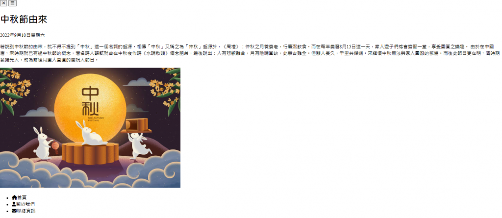
@import url("https://cdnjs.cloudflare.com/ajax/libs/font-awesome/6.2.0/css/all.min.css");

* {
  box-sizing: border-box;
}

body {
  margin: 0;
  padding: 0;
  overflow-x: hidden;
}
外部容器
div.container {
  transform-origin: top left; /*改變旋轉中心到左上角,原預設為(50%,50%)*/
  transition: transform 0.5s linear;
  width: 100vw;
  height: 100vh;
  padding: 50px;
}

div.container.show-nav {
  transform: rotate(-20deg); /*負值為逆時針旋轉*/
}
左上角的圈圈
這部分只是在做版面的調整,transform: rotate()若為負數,則代表逆時針旋轉
div.container.show-nav .circle {
  transform: rotate(-70deg);
}

div.circle-container {
  position: fixed;
  /* icon因以下設置不會顯示 */
  top: -100px; /*調成200試試看*/
  left: -100px; /*調成200試試看*/
}

.circle {
  background-color: rgb(75, 36, 75);
  height: 200px;
  width: 200px;
  border-radius: 50%;
  position: relative;
  transition: transform 0.5s linear;  /*跟container設定是一樣的*/
}
.circle button {
  position: absolute;
  top: 50%;
  left: 50%;
  height: 100px;
  background: transparent;
  color: white;
  border: 0; /*醜醜的框線不見了*/
  font-size: 26px;
  cursor: pointer;
}
.circle button:focus {
  outline: 0; /*或none*/
}
.circle button#open {
  left: 60%;
}
.circle button#close {
  top: 60%;
  transform: rotate(90deg);
  transform-origin: top left;
}
若以上都設定好了,呈現如下圖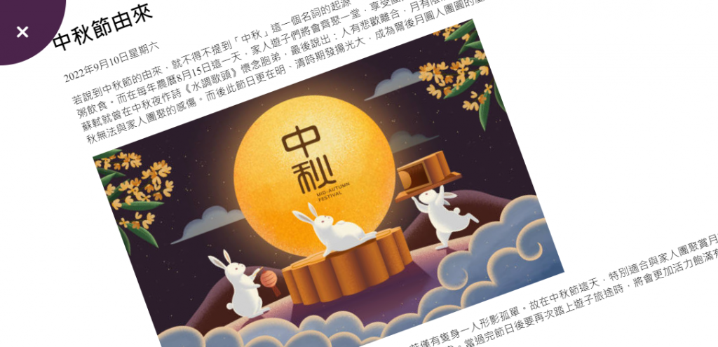
主要內容
max-width的設置,可以參考這兩篇文章,min-width & max-width - 金魚都能懂的CSS必學屬性和min-width、max-width 到底怎麼用,簡單來說max-width 可以確保「最大寬度」,並在容器縮小後自適應容器的大小
.content {
  max-width: 1000px;
  margin: 30px auto;
}
.content img {
  max-width: 100%;
}
.content h1 {
  margin: 0;
}
.content time {
  font-style: italic;
}
.content p {
  line-height: 1.5;
}
導覽列
提醒一下,這部分用到adjacent sibling combinator (+)同層相鄰選擇器,也可以用:nth-child()選擇器來代替,效果是一樣的
nav {
  position: fixed;
  bottom: 40px;
  left: 0;
  z-index: 100;
}
nav ul {
  list-style-type: none;
  padding-left: 40px;
}
nav ul li {
  margin: 40px 0;
  transform: translateX(-100%);
  transition: transform 0.5s ease-in;
}
nav ul li i {
  margin-right: 10px;
  font-size: 20px;
}
/* 第二個li */
nav ul li + li {
  margin-left: 15px;
  transform: translateX(-150%);
}

/* 最後一個li */
nav ul li + li + li {
  margin-left: 30px;
  transform: translateX(-200%);
}
/* 全部li 展開導覽列後延遲出現*/
div.container.show-nav + nav li {
  transform: translateX(0);
  transition-delay: 0.3s;
}
let open = document.getElementById("open");
let close = document.getElementById("close");
let container = document.querySelector(".container");

open.addEventListener("click", () => {
  container.classList.add("show-nav");
});

close.addEventListener("click", () => {
  container.classList.remove("show-nav");
});
附上codepen連結https://codepen.io/hangineer/pen/GRdZyvN
此project會用到很大量的CSS Transform,在實作的過程中,一下translate,一下rotate,混雜在一起自己看了都眼花撩亂,另外,如果有疑問,可以底下留言討論,我會盡我所能的回答你。
所學不精,若有解說不夠詳盡或是錯誤歡迎指教,感激不盡!那明天見囉
50 Projects In 50 Days - HTML, CSS & JavaScript
Font Awesome
中秋節由來
中秋節圖片
min-width & max-width - 金魚都能懂的CSS必學屬性
min-width、max-width 到底怎麼用

 iThome鐵人賽
 看影片追技術