延續之前實作的「登錄頁面」在Day05~Day07學會MDC的Icon Buttons、Segmented Buttons和MaterialCardView、AppBarLayout (Top app bars)
參考了官方的教學MDC-102 Android:Material Structure and Layout (Kotlin),然後改用Material Design 3的Components 實作,以及新增前幾天的 Icon Button和Segmented Button的使用,以下就是這次要完成的畫面。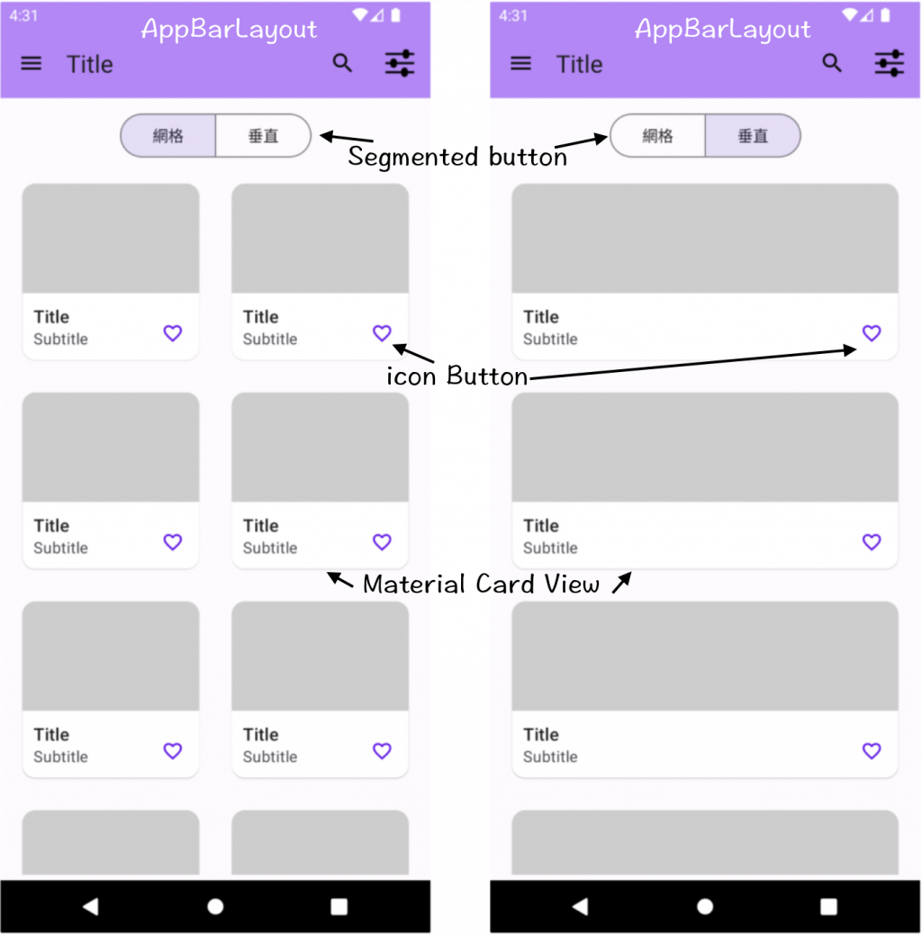
新增AppBarLayout、MaterialToolbar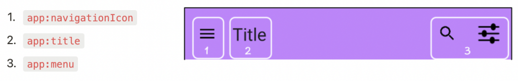
<androidx.constraintlayout.widget.ConstraintLayout xmlns:android="http://schemas.android.com/apk/res/android"
    xmlns:app="http://schemas.android.com/apk/res-auto"
    xmlns:tools="http://schemas.android.com/tools"
    android:layout_width="match_parent"
    android:layout_height="match_parent"
    tools:context=".ProductGridFragment">

		<!--Top App Bar -->
		<com.google.android.material.appbar.AppBarLayout
        android:id="@+id/app_bar_layout"
        android:layout_width="match_parent"
        android:layout_height="wrap_content"
        android:background="@color/purple_200"
        app:layout_constraintEnd_toEndOf="parent"
        app:layout_constraintStart_toStartOf="parent"
        app:layout_constraintTop_toTopOf="parent">

        <com.google.android.material.appbar.MaterialToolbar
            android:id="@+id/top_app_bar"
            android:layout_width="match_parent"
            android:layout_height="?attr/actionBarSize"
            app:menu="@menu/top_app_bar"
            app:navigationIcon="@drawable/ic_menu"
            app:title="Title" />
    </com.google.android.material.appbar.AppBarLayout>
</androidx.constraintlayout.widget.ConstraintLayout>
res/menu/top_app_bar.xml
<menu xmlns:android="http://schemas.android.com/apk/res/android"
    xmlns:app="http://schemas.android.com/apk/res-auto">

    <item
        android:id="@+id/search"
        android:icon="@drawable/ic_search"
        android:title="搜尋"
        app:showAsAction="ifRoom" />

    <item
        android:id="@+id/filter"
        android:icon="@drawable/ic_filter"
        android:title="篩選"
        app:showAsAction="ifRoom" />

</menu>
Toolbar上的menu和NavigationIcon的點擊事件:
menu:setOnMenuItemClickListenerNavigationIcon:setNavigationOnClickListenerbinding?.topAppBar?.setOnMenuItemClickListener { menu ->
when(menu.itemId){
R.id.search -> {
Toast.makeText(context, "測試 menu item search", Toast.LENGTH_LONG).show()
true
}
R.id.filter -> {
Toast.makeText(context, "測試 menu item filter", Toast.LENGTH_LONG).show()
true
}
else -> false
}
}
binding?.topAppBar?.setNavigationOnClickListener {
Toast.makeText(context, "測試Navigation", Toast.LENGTH_LONG).show()
}
新增MaterialButtonToggleGroup、MaterialButton
必選擇單個選項:用於選擇單個選項,在檢視之間切換。
單選設定app:singleSelection="true"
必選設定app:selectionRequired="true"
預設呈現網格:設定Button ID,app:checkedButton="@+id/btn_grid"
MaterialButton 的style style="?attr/materialButtonOutlinedStyle"
<androidx.constraintlayout.widget.ConstraintLayout
		xmlns:android="http://schemas.android.com/apk/res/android"
    xmlns:app="http://schemas.android.com/apk/res-auto"
    xmlns:tools="http://schemas.android.com/tools"
    android:layout_width="match_parent"
    android:layout_height="match_parent"
    tools:context=".ProductGridFragment">

		<!--Top App Bar -->
    <com.google.android.material.appbar.AppBarLayout
        .....>

	        <com.google.android.material.appbar.MaterialToolbar
	            ...../>

    </com.google.android.material.appbar.AppBarLayout>

		<!--Segmented buttons -->
		<com.google.android.material.button.MaterialButtonToggleGroup
        android:id="@+id/toggle_button"
        android:layout_width="wrap_content"
        android:layout_height="wrap_content"
        android:layout_margin="10dp"
        app:singleSelection="true"
        app:selectionRequired="true"
        app:checkedButton="@+id/btn_grid"
        app:layout_constraintTop_toBottomOf="@id/app_bar_layout"
        app:layout_constraintStart_toStartOf="parent"
        app:layout_constraintEnd_toEndOf="parent">

	        <com.google.android.material.button.MaterialButton
	            android:id="@+id/btn_grid"
	            style="?attr/materialButtonOutlinedStyle"
	            android:layout_width="wrap_content"
	            android:layout_height="wrap_content"
	            android:text="網格" />

	        <com.google.android.material.button.MaterialButton
	            android:id="@+id/btn_vertical"
	            style="?attr/materialButtonOutlinedStyle"
	            android:layout_width="wrap_content"
	            android:layout_height="wrap_content"
	            android:text="垂直" />

    </com.google.android.material.button.MaterialButtonToggleGroup>
</androidx.constraintlayout.widget.ConstraintLayout>
點擊切換網格和垂直的卡片
// 點擊初始化RecyclerView和指定不同的LayoutManager
binding?.toggleButton?.addOnButtonCheckedListener { _, checkedId, isChecked ->
   if (isChecked) {
         when (checkedId) {
              R.id.btn_grid -> {
                        binding?.recyclerView?.adapter = CardRecyclerViewAdapter(listOf(1,2, 3, 4, 5, 6, 7, 8),CardsType.GRID , itemClickListener())
                        binding?.recyclerView?.layoutManager =
                            GridLayoutManager(context, 2, RecyclerView.VERTICAL, false)
                    }
                    R.id.btn_vertical -> {
                        binding?.recyclerView?.adapter = CardRecyclerViewAdapter(listOf(1,2, 3, 4, 5, 6, 7, 8),CardsType.VERTICAL , itemClickListener())
                        binding?.recyclerView?.layoutManager =
                            LinearLayoutManager(context, RecyclerView.VERTICAL, false)
                    }
         }
   }
}
**Add widget.RecyclerView **
<FrameLayout xmlns:android="http://schemas.android.com/apk/res/android"
    xmlns:app="http://schemas.android.com/apk/res-auto"
    xmlns:tools="http://schemas.android.com/tools"
    android:layout_width="match_parent"
    android:layout_height="match_parent"
    tools:context=".ProductGridFragment">

		<!--Top App Bar -->
    <com.google.android.material.appbar.AppBarLayout
        .....>

	        <com.google.android.material.appbar.MaterialToolbar
	            ...../>

    </com.google.android.material.appbar.AppBarLayout>

		<!--Segmented buttons -->
		<com.google.android.material.button.MaterialButtonToggleGroup
		    ......>

			    <com.google.android.material.button.MaterialButton
			       ....../>

			    <com.google.android.material.button.MaterialButton
			        ....../>

		</com.google.android.material.button.MaterialButtonToggleGroup>


		<!--widget.RecyclerView-->
		<androidx.core.widget.NestedScrollView
        android:layout_width="match_parent"
        android:layout_height="0dp"
        android:layout_margin="5dp"
        app:layout_behavior="@string/appbar_scrolling_view_behavior"
        app:layout_constraintBottom_toBottomOf="parent"
        app:layout_constraintEnd_toEndOf="parent"
        app:layout_constraintStart_toStartOf="parent"
        app:layout_constraintTop_toBottomOf="@id/toggle_button">

        <androidx.recyclerview.widget.RecyclerView
            android:id="@+id/recycler_view"
            android:layout_width="match_parent"
            android:layout_height="match_parent"
            app:layoutManager="androidx.recyclerview.widget.GridLayoutManager"
            app:spanCount="2"
            tools:itemCount="6"
            tools:listitem="@layout/item_cards_grid" />

    </androidx.core.widget.NestedScrollView>
</FrameLayout>
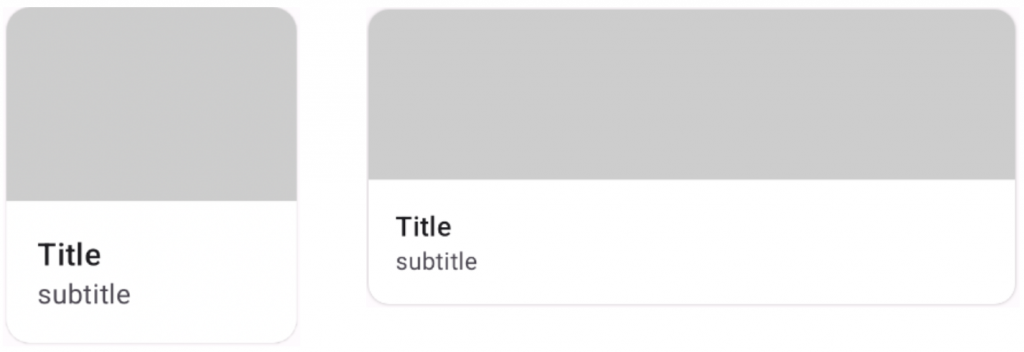
Elevated Card style="@style/Widget.Material3.CardView.Elevated"
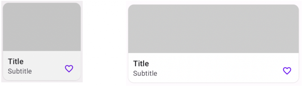
網格 item_cards_grid.xml
<androidx.constraintlayout.widget.ConstraintLayout xmlns:android="http://schemas.android.com/apk/res/android"
    xmlns:app="http://schemas.android.com/apk/res-auto"
    android:layout_width="match_parent"
    android:layout_height="wrap_content"
    android:layout_gravity="center_horizontal"
    xmlns:tools="http://schemas.android.com/tools">

    <!--Elevated card-->
    <com.google.android.material.card.MaterialCardView
        android:id="@+id/filledCard"
        style="@style/Widget.Material3.CardView.Elevated"
        android:layout_width="150dp"
        android:layout_height="wrap_content"
        android:layout_margin="15dp"
        app:layout_constraintStart_toStartOf="parent"
        app:layout_constraintTop_toTopOf="parent"
        app:layout_constraintBottom_toBottomOf="parent"
        app:layout_constraintEnd_toEndOf="parent">

        <LinearLayout
            android:layout_width="match_parent"
            android:layout_height="wrap_content"
            android:orientation="vertical">

            <ImageView
                android:id="@+id/image"
                android:layout_width="match_parent"
                android:layout_height="100dp"
                android:scaleType="centerCrop"
                app:srcCompat="@color/gray" />

            <androidx.constraintlayout.widget.ConstraintLayout
                android:layout_width="match_parent"
                android:layout_height="wrap_content"
                android:background="@color/white"
                android:orientation="vertical">

                <TextView
                    android:id="@+id/tvTitle"
                    android:layout_width="wrap_content"
                    android:layout_height="wrap_content"
                    tools:text="Title"
                    android:layout_marginTop="10dp"
                    android:layout_marginStart="10dp"
                    android:textAppearance="?attr/textAppearanceTitleMedium"
                    app:layout_constraintTop_toTopOf="parent"
                    app:layout_constraintStart_toStartOf="parent"/>

                <TextView
                    android:id="@+id/tvSubtitle"
                    android:layout_width="wrap_content"
                    android:layout_height="wrap_content"
                    tools:text="subtitle"
                    android:layout_marginStart="10dp"
                    android:layout_marginBottom="10dp"
                    android:textAppearance="?attr/textAppearanceBodyMedium"
                    android:textColor="?android:attr/textColorSecondary"
                    app:layout_constraintTop_toBottomOf="@id/tvTitle"
                    app:layout_constraintBottom_toBottomOf="parent"
                    app:layout_constraintStart_toStartOf="parent"/>

                <com.google.android.material.button.MaterialButton
                    android:id="@+id/iconButton"
                    style="@style/Widget.Material3.Button.IconButton"
                    android:layout_width="wrap_content"
                    android:layout_height="wrap_content"
                    app:icon="@drawable/ic_favorite"
                    app:layout_constraintEnd_toEndOf="parent"
                    app:layout_constraintBottom_toBottomOf="parent"/>

            </androidx.constraintlayout.widget.ConstraintLayout>

        </LinearLayout>

    </com.google.android.material.card.MaterialCardView>
</androidx.constraintlayout.widget.ConstraintLayout>
垂直 item_cards_vertical.xml
<androidx.constraintlayout.widget.ConstraintLayout xmlns:android="http://schemas.android.com/apk/res/android"
    xmlns:app="http://schemas.android.com/apk/res-auto"
    xmlns:tools="http://schemas.android.com/tools"
    android:layout_width="match_parent"
    android:layout_height="wrap_content">

    <!--Elevated card-->
    <com.google.android.material.card.MaterialCardView
        android:id="@+id/filledCard"
        style="@style/Widget.Material3.CardView.Elevated"
        android:layout_width="match_parent"
        android:layout_height="wrap_content"
        android:layout_margin="15dp"
        app:layout_constraintBottom_toBottomOf="parent"
        app:layout_constraintEnd_toEndOf="parent"
        app:layout_constraintStart_toStartOf="parent"
        app:layout_constraintTop_toTopOf="parent">

        <LinearLayout
            android:layout_width="match_parent"
            android:layout_height="wrap_content"
            android:orientation="vertical">

            <ImageView
                android:id="@+id/image"
                android:layout_width="match_parent"
                android:layout_height="100dp"
                android:scaleType="centerCrop"
                app:srcCompat="@color/gray" />

            <androidx.constraintlayout.widget.ConstraintLayout
                android:layout_width="match_parent"
                android:layout_height="wrap_content"
                android:background="@color/white"
                android:orientation="vertical">

                <TextView
                    android:id="@+id/tvTitle"
                    android:layout_width="wrap_content"
                    android:layout_height="wrap_content"
                    android:layout_marginStart="10dp"
                    android:layout_marginTop="10dp"
                    android:textAppearance="?attr/textAppearanceTitleMedium"
                    tools:text="Title"
                    app:layout_constraintTop_toTopOf="parent"
                    app:layout_constraintStart_toStartOf="parent" />

                <TextView
                    android:id="@+id/tvSubtitle"
                    android:layout_width="wrap_content"
                    android:layout_height="wrap_content"
                    android:layout_marginStart="10dp"
                    android:layout_marginBottom="10dp"
                    android:textAppearance="?attr/textAppearanceBodyMedium"
                    android:textColor="?android:attr/textColorSecondary"
                    tools:text="subtitle"
                    app:layout_constraintTop_toBottomOf="@id/tvTitle"
                    app:layout_constraintStart_toStartOf="parent"
                    app:layout_constraintBottom_toBottomOf="parent"/>

                <com.google.android.material.button.MaterialButton
                    android:id="@+id/iconButton"
                    style="@style/Widget.Material3.Button.IconButton"
                    android:layout_width="wrap_content"
                    android:layout_height="wrap_content"
                    app:icon="@drawable/ic_favorite"
                    app:layout_constraintEnd_toEndOf="parent"
                    app:layout_constraintBottom_toBottomOf="parent"/>

            </androidx.constraintlayout.widget.ConstraintLayout>
        </LinearLayout>
    </com.google.android.material.card.MaterialCardView>
</androidx.constraintlayout.widget.ConstraintLayout>
Adapter: CardRecyclerViewAdapter
class CardRecyclerViewAdapter(
    private val productList: List<Int>,
    private val type: CardsType,
    private var mItemButtonClickListener: ((position: Int) -> Unit)? = null
) :
    RecyclerView.Adapter<RecyclerView.ViewHolder>() {


    override fun onCreateViewHolder(parent: ViewGroup, viewType: Int): RecyclerView.ViewHolder {
        return when (type) {
            CardsType.GRID -> {
                GridViewHolder(
                    ItemCardsGridBinding.inflate(LayoutInflater.from(parent.context), parent, false),
                    mItemButtonClickListener
                )
            }
            CardsType.VERTICAL -> {
                GridViewHolder(
                    ItemCardsVerticalBinding.inflate(LayoutInflater.from(parent.context), parent, false),
                    mItemButtonClickListener
                )
            }
        }
    }

    override fun getItemCount(): Int = productList.size

    override fun onBindViewHolder(holder: RecyclerView.ViewHolder, position: Int) {
        (holder as GridViewHolder).bind(position)
    }

}
ViewHolder:CardsViewHolderCardViewHolder:建構子傳入兩個參數
class GridViewHolder(
		private val binding: ViewBinding,
		private val onItemClickListener: ((position: Int) -> Unit)?)
: RecyclerView.ViewHolder(binding.root) {


    private var isCanFavorite = true // 是否可以被收藏

    fun bind(position: Int){

        when (binding) {
            is ItemCardsGridBinding -> {
                // 呈現網格狀的
                binding.image.setBackgroundResource(R.color.gray)
                binding.tvTitle.text = "Title"
                binding.tvSubtitle.text = "Subtitle"

								binding.filledCard.setOnClickListener {
										// 點擊第幾格Cards,將傳遞給View層
                    onItemClickListener?.invoke(position)
                }
            }

            is ItemCardsVerticalBinding -> {
                // 呈現垂直狀的
                binding.image.setBackgroundResource(R.color.gray)
                binding.tvTitle.text = "Title"
                binding.tvSubtitle.text = "Subtitle"

								binding.filledCard.setOnClickListener {
										// 點擊第幾格Cards,將傳遞給View層
                    onItemClickListener?.invoke(position)
                }

            }
        }
    }
}
View頁面可接收點擊後的position實作對應流程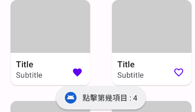
private fun itemClickListener(): ((position: Int) -> Unit) {
        return { position ->
						//可以實作點擊後續流程
            Toast.makeText(context,"點擊第幾項目 : $position", Toast.LENGTH_SHORT).show()
        }
 }
style="@style/Widget.Material3.Button.IconButton"
<com.google.android.material.button.MaterialButton
	android:id="@+id/iconButton"
	style="@style/Widget.Material3.Button.IconButton"
	android:layout_width="wrap_content"
    android:layout_height="wrap_content"
    app:icon="@drawable/ic_favorite"
    app:layout_constraintEnd_toEndOf="parent"
    app:layout_constraintBottom_toBottomOf="parent"/>
點擊切換愛心顏色邏輯,會寫在CardViewHolder中。
private var isCanFavorite = true // 是否可以被收藏

binding.iconButton.setOnClickListener {
		 if (isCanFavorite) {
       binding.iconButton.icon = ResourcesCompat.getDrawable(itemView.resources, R.drawable.ic_select_favorite, null)
           isCanFavorite = false
     } else {
       binding.iconButton.icon = ResourcesCompat.getDrawable(itemView.resources, R.drawable.ic_favorite, null)
           isCanFavorite = true
     }
}
以上是這次延續登入頁面後實作卡片資料呈現Demo。
歡迎下載程式碼
感謝您看到這邊
參考資料
MDC-102 Android:Material Structure and Layout (Kotlin)


 看影片追技術