今天要補充的是「分類」機器學習方法的Python code 基礎建模和範例。
主要會使用sklearn套件建立模型,並用裡面的鳶尾花資料(Iris datasets)作範例,提供一些簡單的應用。想更進一步的了解套件即函式可以點擊連結去官網查看 。
常用套件載入:
## import慣例
import pandas as pd
import numpy as np
import matplotlib.pyplot as plt
import seaborn as sns
import statsmodels as sm
## Common imports
import sys
import sklearn
import os

## plot
import matplotlib as mpl
import matplotlib.pyplot as plt
鳶尾花資料的載入(資料集本身是dict格式):
from sklearn import datasets
iris = datasets.load_iris()
list(iris.keys())
可以看到load_iris()裡支援的keys:
['data',
 'target',
 'frame',
 'target_names',
 'DESCR',
 'feature_names',
 'filename']
使用 Python sklearn套件建立機器學習模型時輸入的特徵 X 和結果 Y 常常是兩個參數分別放入模型配適。
使用自己的資料時,自行定義清楚 target(Y) 和 features(X) 即可。
print(iris.DESCR) # data description 資料說明文件
# as_frame=True 會變成 pandas.core.frame.DataFrame
datasets.load_iris(as_frame=True).target_names #看 target Y有哪些類別
datasets.load_iris(as_frame=True).feature_names # 看有哪些X(特徵欄位)

df = datasets.load_iris(as_frame=True).frame #整個資料 DataFrame 包含X、Y
df_x = datasets.load_iris(as_frame=True).data # X(特徵內容)
df_y = datasets.load_iris(as_frame=True).target # Y (分類結果)
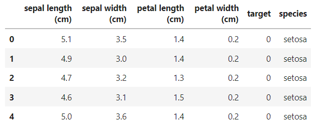
想看到像 R 裡顯示的 DataFrame資料及模式,並顯示清楚 target 編碼實際的值:
#想看完整資料( 透過target標籤,加上新欄位 species names)
iris_raw = datasets.load_iris(as_frame=True).frame
species_name=datasets.load_iris(as_frame=True).target_names
targetlabel_species = {
        'target': [ 0 , 1 , 2 ],
        'species': species_name
        }
species_df=pd.DataFrame(targetlabel_species, columns=['target','species'])
iris_df=pd.merge(iris_raw,species_df, on='target')
iris_df.head()
有了資料後,接下來是各種建立模型的示範程式碼。
今天想見一個羅吉斯迴歸迴歸,分類 Iris data 的花是否為"virginica"這個種類。iris["target"]中, 0為'setosa', 1為'versicolor', 2為'virginica',
所以將y重新編碼:iris["target"] == 2, virginica 類別為1,其餘為0。
from sklearn import datasets
iris = datasets.load_iris()
X = iris["data"][:, (2, 3)]  # petal length, petal width
y = (iris["target"] == 2).astype(np.int)  # 1 if Iris virginica, else 0
羅吉斯迴歸 Logistic regression 模型建立:
from sklearn.linear_model import LogisticRegression
## 羅吉斯迴歸 Logistic regression 模型建立
log_reg = LogisticRegression(solver="lbfgs", random_state=42)
log_reg.fit(X, y)

X_new = np.linspace(0, 3, 1000).reshape(-1, 1)
y_proba = log_reg.predict_proba(X_new)
## 決策邊界
decision_boundary = X_new[y_proba[:, 1] >= 0.5][0]

plt.figure(figsize=(8, 3))
plt.plot(X[y==0], y[y==0], "bs")
plt.plot(X[y==1], y[y==1], "g^")
plt.plot([decision_boundary, decision_boundary], [-1, 2], "k:", linewidth=2)
plt.plot(X_new, y_proba[:, 1], "g-", linewidth=2, label="Iris virginica")
plt.plot(X_new, y_proba[:, 0], "b--", linewidth=2, label="Not Iris virginica")
plt.text(decision_boundary+0.02, 0.15, "Decision  boundary", fontsize=14, color="k", ha="center")
plt.arrow(decision_boundary, 0.08, -0.3, 0, head_width=0.05, head_length=0.1, fc='b', ec='b')
plt.arrow(decision_boundary, 0.92, 0.3, 0, head_width=0.05, head_length=0.1, fc='g', ec='g')
plt.xlabel("Petal width (cm)", fontsize=14)
plt.ylabel("Probability", fontsize=14)
plt.legend(loc="center left", fontsize=14)
plt.axis([0, 3, -0.02, 1.02])

plt.show()
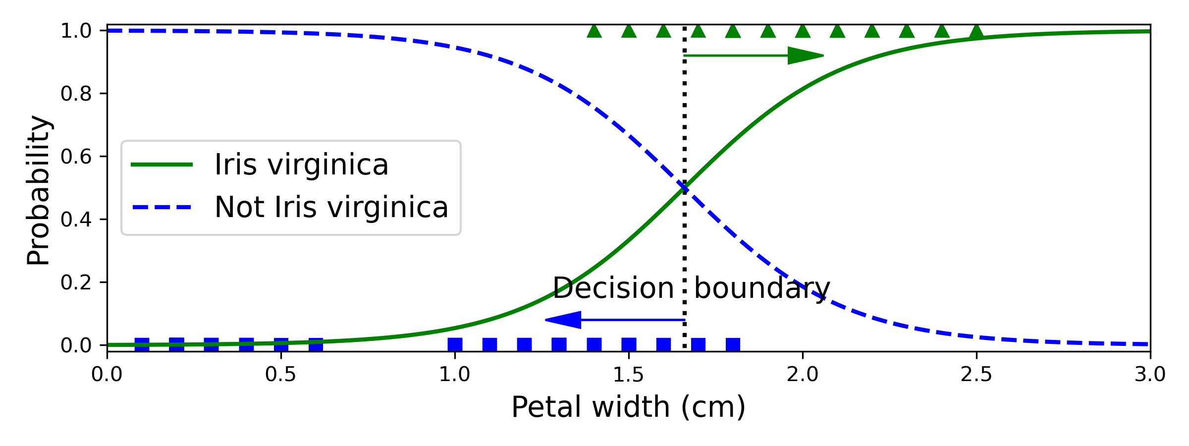
[補充]solver="lbfgs": Limited-memory Broyden–Fletcher–Goldfarb–Shanno Algorithm.
An optimization algorithm in the family of quasi-Newton methods that approximates.
準確率:
accuracy = logistic_regression.score(data_test, target_test)
print(f"Accuracy on test set: {accuracy:.3f}")
Accuracy on test set: 0.974
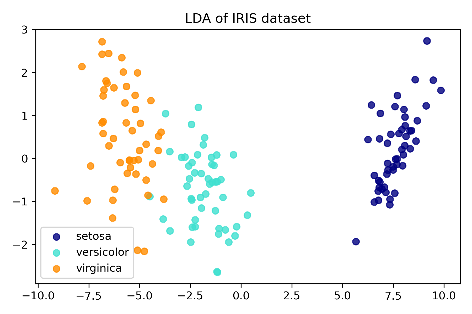
import matplotlib.pyplot as plt
from sklearn import datasets
from sklearn.discriminant_analysis import LinearDiscriminantAnalysis

iris = datasets.load_iris()
X = iris.data
y = iris.target
target_names = iris.target_names

lda = LinearDiscriminantAnalysis(n_components=2)
X_r2 = lda.fit(X, y).transform(X)

plt.figure()
colors = ["navy", "turquoise", "darkorange"]
lw = 2

for color, i, target_name in zip(colors, [0, 1, 2], target_names):
    plt.scatter(
        X_r2[y == i, 0], X_r2[y == i, 1], alpha=0.8, color=color, label=target_name
    )
plt.legend(loc="best", shadow=False, scatterpoints=1)
plt.title("LDA of IRIS dataset")

plt.show()
這裡示範把進行主成分分析,並把資料視覺化呈現在前三個主成分上。
可以看到同種鳶尾花的特性相近,資料點群聚在附近。
import numpy as np
import matplotlib.pyplot as plt
from sklearn import datasets
## PCA
from sklearn import decomposition
np.random.seed(5)

iris = datasets.load_iris()
X = iris.data
y = iris.target

fig = plt.figure(1, figsize=(4, 3))
plt.clf()

ax = fig.add_subplot(111, projection="3d", elev=48, azim=134)
ax.set_position([0, 0, 0.95, 1])

plt.cla()
pca = decomposition.PCA(n_components=3)
pca.fit(X)
X = pca.transform(X)

for name, label in [("Setosa", 0), ("Versicolour", 1), ("Virginica", 2)]:
    ax.text3D(
        X[y == label, 0].mean(),
        X[y == label, 1].mean() + 1.5,
        X[y == label, 2].mean(),
        name,
        horizontalalignment="center",
        bbox=dict(alpha=0.5, edgecolor="w", facecolor="w"),
    )
# Reorder the labels to have colors matching the cluster results
y = np.choose(y, [0, 2, 1]).astype(float)
ax.scatter(X[:, 0], X[:, 1], X[:, 2], c=y, cmap=plt.cm.nipy_spectral, edgecolor="k")

ax.set_title("First three PCA directions")
ax.set_xlabel("1st eigenvector")
ax.w_xaxis.set_ticklabels([])
ax.set_ylabel("2nd eigenvector")
ax.w_yaxis.set_ticklabels([])
ax.set_zlabel("3rd eigenvector")
ax.w_zaxis.set_ticklabels([])
plt.show()

# Percentage of variance explained for each components
print("explained variance ratio (first two components): %s"
    % str(pca.explained_variance_ratio_))
explained variance ratio (first two components): [0.92461872 0.05306648 0.01710261]
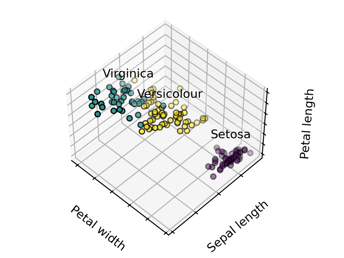
這裡示範把資料分成3類,並設定 20 個初始中心點進行最佳化選擇。
import numpy as np
import matplotlib.pyplot as plt
from sklearn import datasets
## 3D PLOT
import mpl_toolkits.mplot3d
## K-Means
from sklearn.cluster import KMeans

np.random.seed(5)

iris = datasets.load_iris()
X = iris.data
y = iris.target

estimators = [("k_means_iris_3", KMeans(n_clusters=3, n_init=20,init="random"))]

fignum = 1
titles = ["K-Means 3 clusters, nstart=20 (initialization)"]
for name, est in estimators:
    fig = plt.figure(fignum, figsize=(4, 3))
    ax = fig.add_subplot(111, projection="3d", elev=48, azim=134)
    ax.set_position([0, 0, 0.95, 1])
    est.fit(X)
    labels = est.labels_

    ax.scatter(X[:, 3], X[:, 0], X[:, 2], c=labels.astype(float), edgecolor="k")

    ax.w_xaxis.set_ticklabels([])
    ax.w_yaxis.set_ticklabels([])
    ax.w_zaxis.set_ticklabels([])
    ax.set_xlabel("Petal width")
    ax.set_ylabel("Sepal length")
    ax.set_zlabel("Petal length")
    ax.set_title(titles[fignum - 1])
    ax.dist = 12
    fignum = fignum + 1

for name, label in [("Setosa", 0), ("Versicolour", 1), ("Virginica", 2)]:
    ax.text3D(
        X[y == label, 3].mean(),
        X[y == label, 0].mean(),
        X[y == label, 2].mean() + 2,
        name,
        horizontalalignment="center",
        bbox=dict(alpha=0.2, edgecolor="w", facecolor="w"),
    )

fig.show()
logistic_regression
https://inria.github.io/scikit-learn-mooc/python_scripts/logistic_regression.html
plot_pca_vs_lda
https://scikit-learn.org/stable/auto_examples/decomposition/plot_pca_vs_lda.html#sphx-glr-auto-examples-decomposition-plot-pca-vs-lda-py
K-means Clustering
https://scikit-learn.org/stable/auto_examples/cluster/plot_cluster_iris.html#sphx-glr-auto-examples-cluster-plot-cluster-iris-py