基於 ggplot2 的基本架構,相信到這裡大家已經能夠順利完成一張圖表。然而,實際應用情境中,常常需要針對特定目的進行修飾與加工。例如:調整軸距、設定字型大小或樣式、制定標題與副標題、補充資料來源等。這些額外的調整並不影響圖表的核心資料,但卻能有效提升可讀性與專業度。今天將透過幾個常見的利器,展示如何在 ggplot2 中進一步美化圖形。
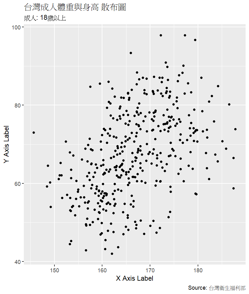
以下範例使用 台灣衛生福利部公布的成人身高與體重資料作為基礎。我們先繪製一張散布圖,接著利用 labs() 加上標題、副標題、座標軸名稱,以及資料來源的註解。這些元素更清楚地理解圖表內容與數據背景。
ggplot(data = HW_data, aes(x = x, y = y)) +
  geom_point() +
  labs(title = "台灣成人體重與身高 散布圖",
       subtitle = "成人: 18歲以上",
       x = "身高 CM",
       y = "體重 KG",
       caption = "Source: 台灣衛生福利部")
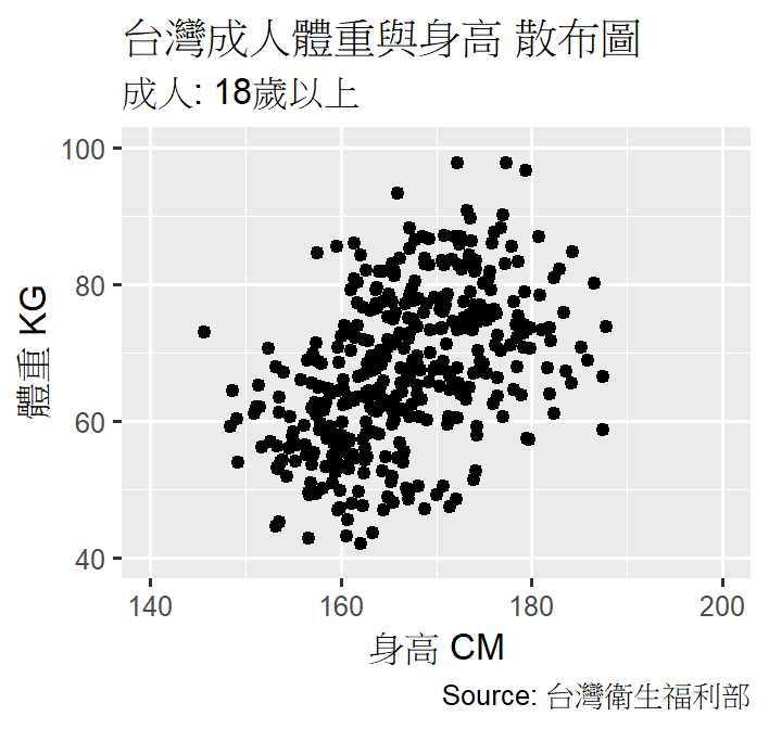
完成散布圖後,往往需要調整座標軸範圍與刻度,以便更聚焦在合理的數值區間。這裡透過 scale_x_continuous() 與 scale_y_continuous() 來設定 x 軸 (身高 140–200 公分) 與 y 軸 (體重 40–100 公斤) 的範圍,同時指定刻度間隔,使讀者能快速讀取關鍵數據。
ggplot(data = HW_data, aes(x = x, y = y)) +
  geom_point() +
  labs(title = "台灣成人體重與身高 散布圖",
       subtitle = "成人: 18歲以上",
       x = "身高 CM",
       y = "體重 KG",
       caption = "Source: 台灣衛生福利部") +
  scale_x_continuous(limits = c(140, 200), breaks = seq(140, 200, 20)) +
  scale_y_continuous(limits = c(40, 100), breaks = seq(40, 100, 20))
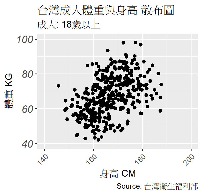
若希望 x 軸標籤能斜角顯示,以避免文字重疊。此時可以使用:
theme(axis.text.x = element_text(angle = 45, hjust = 1))。
此外,也能針對 y 軸標籤 調整字體大小與樣式,例如 italic,讓圖表在視覺上更為清晰。
ggplot(data = HW_data, aes(x = x, y = y)) +
  geom_point() +
  labs(title = "台灣成人體重與身高 散布圖",
       subtitle = "成人: 18歲以上",
       x = "身高 CM",
       y = "體重 KG",
       caption = "Source: 台灣衛生福利部") +
  scale_x_continuous(limits = c(140, 200), breaks = seq(140, 200, 20)) +
  scale_y_continuous(limits = c(40, 100), breaks = seq(40, 100, 20)) +
  theme(axis.text.x = element_text(angle = 45, hjust = 1),
        axis.text.y = element_text(size = 12, face = "italic"))
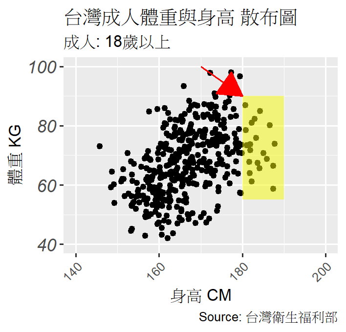
最後,聚焦在 身高 180 公分以上、體重 55–90 公斤 的區域。這裡可透過 annotate("rect", …) 在圖上加上半透明矩形,突出這個範圍,並利用 annotate("segment", …) 畫出箭頭,將視線導向重點區域。這種方式非常適合在簡報或報告中引導觀眾注意資料的特定區塊。
ggplot(data = HW_data, aes(x = x, y = y)) +
  geom_point() +
  labs(title = "台灣成人體重與身高 散布圖",
       subtitle = "成人: 18歲以上",
       x = "身高 CM",
       y = "體重 KG",
       caption = "Source: 台灣衛生福利部") +
  scale_x_continuous(limits = c(140, 200), breaks = seq(140, 200, 20)) +
  scale_y_continuous(limits = c(40, 100), breaks = seq(40, 100, 20)) +
  theme(axis.text.x = element_text(angle = 45, hjust = 1),
        axis.text.y = element_text(size = 12, face = "italic")) +
  annotate("rect", xmin = 180, xmax = 190, ymin = 55, ymax = 90,
           alpha = 0.5, fill = "#f6f805") +
  annotate("segment", x = 170, y = 100, xend = 180, yend = 90,
           arrow = arrow(type = "closed"), color = "red")
今天的重點在於 如何修飾與加工 ggplot2 圖形。透過這些加工,我們能將原本的基礎圖形升級為更具可讀性、專業性與故事性的圖表,讓數據在視覺上更有說服力。
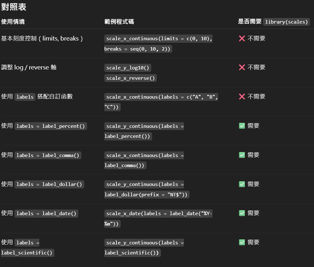
labs() → 標題、副標題、座標軸名稱、資料來源。scale_x/y_continuous() → 調整座標軸範圍與刻度。theme() → 控制字體大小、樣式與角度。annotate() → 標註與強調重點區域。另外,補充今天範例使用的 scale_xxx 語法相關說明:
有些狀況下需要額外呼叫 library(scales),有些則不需要。
In this session, we focus on enhancing and refining ggplot2 visualizations beyond their basic structure. Using Taiwan’s adult height and weight dataset as an example, we demonstrate how to add informative titles, subtitles, axis labels, and data sources with labs(). Next, we adjust axis ranges and breaks with scale_x/y_continuous(), ensuring the visualization highlights meaningful data ranges. We then explore text formatting with theme(), such as rotating x-axis labels and modifying y-axis font size and style to improve clarity. Finally, we illustrate how to emphasize specific regions in the plot using annotate(), highlighting ranges of interest with rectangles and arrows. These adjustments, while not altering the underlying data, significantly improve readability, professionalism, and storytelling impact.

