在資料視覺化中,色彩不只是美觀的裝飾,更是傳遞資訊的重要元素。合適的顏色能幫助快速辨識不同訊息內容,避免混淆,也可以強化資料的解讀。
今天要介紹的 cols4all 套件,提供了大量的色盤選擇,並內建 GUI 介面,讓我們能透過不同條件來挑選合適的顏色。例如:
這些功能都能幫助我們在製作圖表時,更快找出合適的顏色。
cols4all 提供了多種方式來檢視與查詢色盤:這些指令能快速幫助我們找到合適的色盤,並視覺化呈現效果。
# 啟動互動式 GUI
c4a_gui()

# 列出所有可用色盤
c4a_palettes()

# 只看分類型色盤
c4a_palettes(type = "cat")

# 只看 RColorBrewer 系列
c4a_palettes(series = "brewer")

# 同時篩選:分類型 + RColorBrewer 系列
c4a_palettes(type = "cat", series = "brewer")

# 預覽 brewer.set3 色盤(含缺漏值顏色)
c4a_plot_hex("brewer.set3", n = 7, include.na = TRUE)
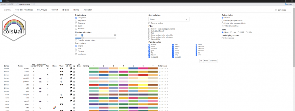
Overview 畫面簡介:
Palette type (色盤類型)
Number of colors (顏色數量)
Sort colors (排序)
Palette series (色盤來源)
Color vision (色覺模式)
Normal(正常)
Deutan(紅綠色盲)
Protan(另一種紅綠色盲)
Tritan(藍黃色盲)
👉 可以即時檢查顏色對不同色覺使用者是否友善。
下方表格 (色盤清單)
library(ggplot2)
library(cols4all)
df <- data.frame(
category = c("A", "B", "C", "D", "E"),
value = c(23, 45, 12, 67, 34)
)
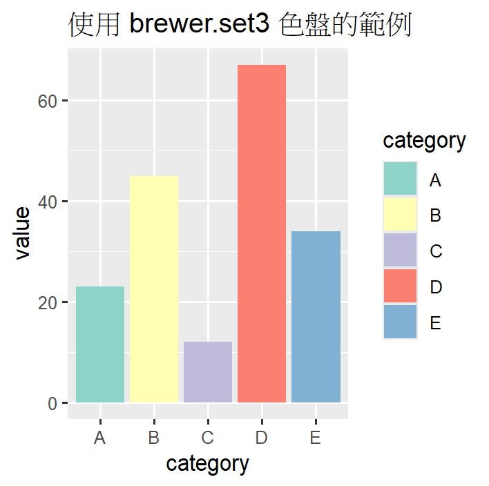
# 套用 brewer.set3 色盤
ggplot(df, aes(x = category, y = value, fill = category)) +
geom_col() +
scale_fill_manual(values = c4a("brewer.set3")) +
labs(title = "使用 brewer.set3 色盤的範例")
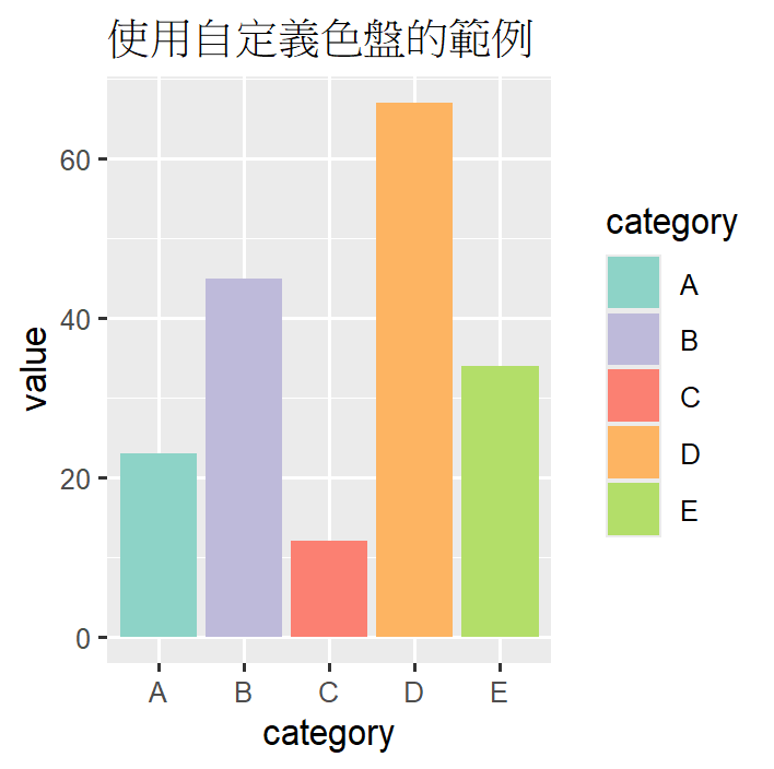
# 取出 brewer.set3 的顏色
brewer_colors <- c4a("brewer.set3", n = 7)
brewer_colors

# 挑選第 1, 3, 4, 6, 7 個顏色
my_colors <- brewer_colors[c(1, 3, 4, 6, 7)]

# 繪製圖表
ggplot(df, aes(x = category, y = value, fill = category)) +
  geom_col() +
  scale_fill_manual(values = my_colors) +
  labs(title = "使用自定義色盤的範例")
今天介紹了 cols4all 的核心功能:
c4a_gui() 與 c4a_palettes() 快速找到合適配色。scale_fill_manual() 套用完整色盤。色彩是一種資訊的語言,選對色盤不只能讓圖表更美觀,也能讓數據更容易被理解。製圖時,建議可先打開 c4a_gui(),為圖形挑選合適的色彩。
Colors in data visualization are not just decorative but essential for conveying information. The R package cols4all offers a wide variety of palettes and a GUI tool to help users find suitable color schemes. Palettes can be filtered by type—categorical, sequential, diverging, cyclic, or bivariate—and adjusted by the number of colors. Users can also sort palettes by hue, chroma, or luminance, and check accessibility for people with color vision deficiency. Each palette includes details such as maximum colors, contrast, and whether it is colorblind-friendly.
Beyond the overview, the GUI provides specialized tabs: Color Blind Friendliness for accessibility checks, HCL Analysis for color structure, Contrast for background testing, 3D Blues for visualizing color attributes, Naming for identifying colors, and Application for examples in ggplot2. Palettes can be applied directly using scale_fill_manual() or customized by selecting specific colors. With cols4all, users can make charts that are visually appealing, accessible, and effective in communicating data insights.

