在資料視覺化的基礎圖形中,Bar Chart(長條圖) 可以說是最常見也最直覺的一種。它能清楚地呈現不同類別之間的數值差異。本篇文章將以 台灣能源署公布的2024年煤炭進口來源國資料 為例,示範如何透過 ggplot2 建構不同形式的 Bar Chart,並探討在不同需求下的呈現方式。
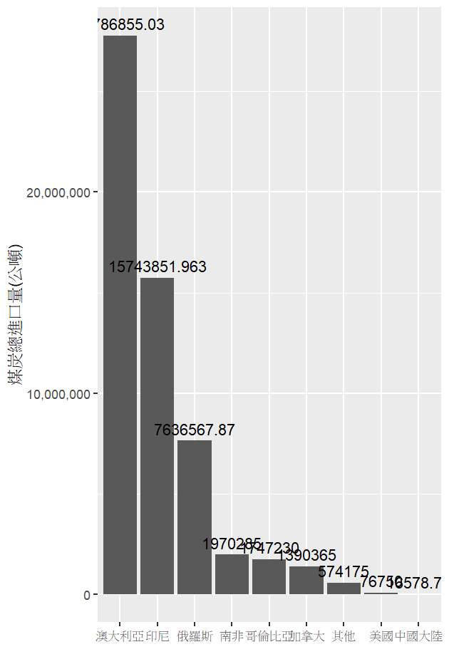
我們先來觀察台灣自不同國家的煤炭進口狀況。以下程式碼將進口量依國家加總,並繪製總量長條圖:
coal_summary <- coal %>%
  group_by(來源國家) %>%
  summarise(總進口量 = sum(`煤炭進口量`, na.rm = TRUE))

ggplot(data = coal_summary,
       aes(x = reorder(來源國家, -總進口量),
           y = 總進口量)) +
  geom_col() +
  scale_y_continuous(labels = comma) +
  geom_text(aes(label = 總進口量),
            vjust = -0.5) +
  labs(x = '',
       y = '煤炭總進口量 (公噸)')
從結果可以看到,澳大利亞以超過 2,700 萬公噸居冠,是台灣煤炭進口的主要來源。
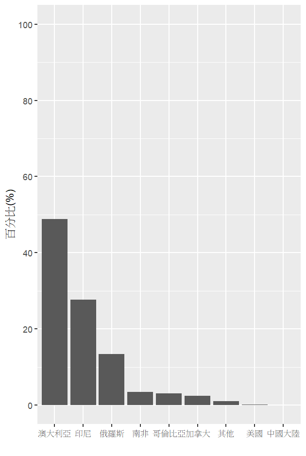
若我們想更直觀比較各國在進口結構中的占比,可以將數據轉換為百分比:
coal_pct <- coal_summary %>%
  mutate(比例 = 總進口量 * 100 / sum(總進口量, na.rm = TRUE))

ggplot(data = coal_pct,
       aes(x = reorder(來源國家, -比例),
           y = 比例)) +
  geom_col() +
  scale_y_continuous(limits = c(0, 100),
                     breaks = seq(0, 100, 20)) +
  labs(x = '',
       y = '百分比 (%)')
結果顯示:澳大利亞、印尼以及俄羅斯三國的煤炭進口量比例,領先其他國家許多。
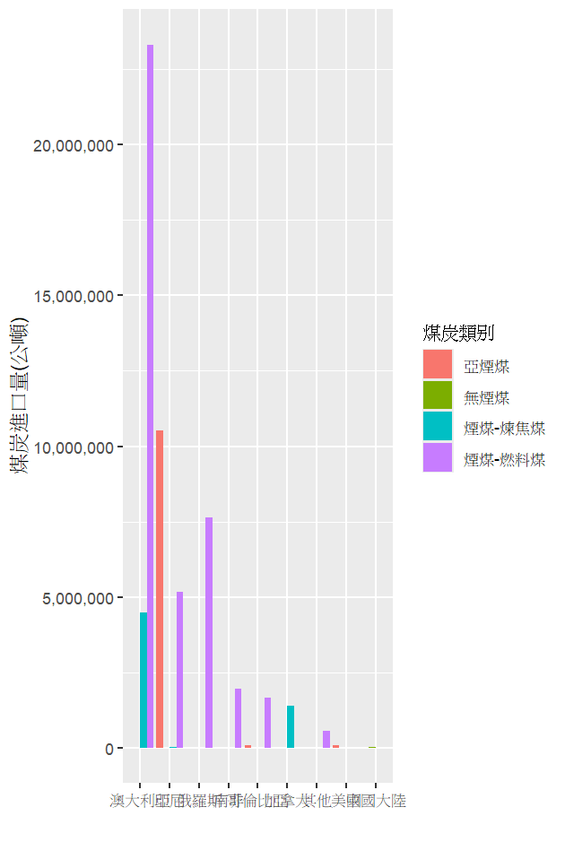
進一步拆解數據,觀察不同來源國家進口的煤炭類型,發現台灣主要進口的是 「煙煤-燃料煤」:
ggplot(data = coal,
       aes(x = reorder(來源國家, -煤炭進口量),
           y = 煤炭進口量,
           fill = 煤炭類別)) +
  geom_col(position = "dodge") +
  scale_y_continuous(labels = comma) +
  labs(x = '',
       y = '煤炭進口量 (公噸)')
這種拆分讓我們能同時看到「國家 × 類型」的交互資訊。
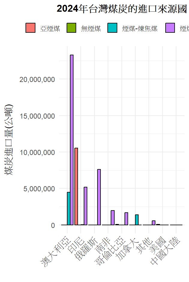
在實務應用中,Bar Chart 往往會被用於正式報告或簡報中,因此我們可以透過 主題設定、顏色調整、字型與標籤設計,讓圖表更清晰、專業。例如:
theme_minimal() 提升整體簡潔度以下是一個客製化範例:
ggplot(coal,
       aes(x = reorder(來源國家, -煤炭進口量),
           y = 煤炭進口量,
           fill = 煤炭類別)) +
  geom_col(position = "dodge", color = "black") +
  scale_y_continuous(labels = comma) +
  labs(
    title = '2024年台灣煤炭的進口來源國',
    x = '',
    y = '煤炭進口量 (公噸)'
  ) +
  theme_minimal(base_size = 15) +
  theme(
    plot.title = element_text(hjust = 0.5,
                              face = "bold",
                              size = 16),
    axis.title.x = element_text(margin = margin(t = 10)),
    axis.title.y = element_text(margin = margin(r = 10)),
    axis.text.x  = element_text(angle = 45,
                                hjust = 1,
                                size = 12),
    axis.text.y  = element_text(size = 12),
    legend.position = "top",
    legend.title = element_blank()
  )
透過以上四個範例,可以看到 Bar Chart 的多樣應用:
在資料視覺化的過程中,Bar Chart 不只是「畫圖」,更是「說故事」的工具。藉由不同角度的設計,能更有效地傳達數據背後的意涵。
This article explores the versatility of bar charts in data visualization by using Taiwan’s 2024 coal import data released by the Bureau of Energy as an example. We begin by presenting the total import volumes by country, highlighting Australia as the dominant supplier with more than 27 million metric tons. Next, we transform the results into percentages, showing the structural dependence on Australia, Indonesia, and Russia. We then dive deeper into the types of coal imported, illustrating that fuel-grade bituminous coal accounts for the majority. Finally, we demonstrate how to customize bar charts for professional communication by refining themes, labels, and colors. Through these examples, the article emphasizes that bar charts are not only simple graphics but also effective storytelling tools. By choosing between absolute values, percentages, categorical breakdowns, and tailored designs, we can better align our visualizations with different analytical or communication goals. This practice shows how thoughtful visualization design can transform raw data into meaningful insights.

