iT邦幫忙

2025 iThome 鐵人賽

DAY 13
0
自我挑戰組

資料視覺化的探索之旅:從 ggplot2 技術到視覺化設計系列 第 13

選擇適合展現資料的圖形 - 圖形分類總覽

  • 分享至 

  • xImage
  •  

選擇合適的圖表類型往往是製圖表一開始很重要的事情之一。Claus O. Wilke 在《Fundamentals of Data Visualization》的第 5 章,提供了一個快速的「圖表地圖」,根據資料特性找到合適的圖表,這些內容是針對常見圖表用途來分類,是當我們製圖一開始不確定該製作什麼圖形時,一個很好的導覽方式。對於作者建議的圖形內容可以做為參考之一,最後的決策還是要以資料實際呈現需要(例如:資料類內容以及受眾等)作為最終的考量。


數量 (Amounts): 常用於呈現某些類別資料集的數值結果

  • 長條圖:最常見的方式,可以垂直或水平排列。
  • 點圖 (dot plots):將點放在長條圖末端的位置。
  • 群組/堆疊長條圖:用於比較多組類別。
  • 熱圖 (heatmap):利用顏色呈現數量。

https://ithelp.ithome.com.tw/upload/images/20250913/20177964qyrmz2RoPK.png

https://ithelp.ithome.com.tw/upload/images/20250913/201779647z02jqy0Xo.png

分布 (Distributions): 以呈現資料整體變化為主要目的

  • 直方圖與密度圖:直觀,但參數設定會影響結果。
  • 累積分布、Q-Q plot:較難解讀,但更忠實呈現資料。
  • 盒鬚圖、提琴圖、sina plot:適合比較多組分布或整體差異。
  • 堆疊直方圖/密度圖:適合少數分布的比較。
  • Ridgeline plot:大量分布或隨時間變化的好選擇。

https://ithelp.ithome.com.tw/upload/images/20250913/20177964mxcgXbodS3.png

https://ithelp.ithome.com.tw/upload/images/20250913/20177964DF4YdiYrCw.png

比例 (Proportions): 資料佔比狀況呈現

  • 圓餅圖、並排長條圖、堆疊長條圖:基礎方式。
  • 群組長條圖:適合中等數量的比較。
  • 堆疊密度圖:用於連續變數下比例的變化。
  • 馬賽克圖、樹狀圖 (Treemap)、Parallel Sets:適合多層次比例資料。

https://ithelp.ithome.com.tw/upload/images/20250913/20177964XKCc69T9sV.png

X-Y 關係 (x–y relationships): 兩組定性資料的關係呈現

  • 散點圖:屬於最典型的方式。
  • 泡泡圖:第三個變數映射到點大小。
  • Slope Graph:配對資料的線性連結。
  • 等高線圖、2D bins、六角形分箱:解決過度重疊問題。
  • 相關矩陣 (Correlogram):多變數關係的替代方案。
  • 折線圖、連接散點圖、趨勢線:時間序列與趨勢分析。

https://ithelp.ithome.com.tw/upload/images/20250913/20177964y6JxekhhBQ.png

地理資料 (Geospatial data)

  • 地圖:以地球上的座標呈現是最直觀的方式。
  • Choropleth:利用顏色填滿區域。
  • Cartogram:依人口數或其他數值扭曲地圖區域。

https://ithelp.ithome.com.tw/upload/images/20250913/201779646yDPbaHM1w.png

不確定性 (Uncertainty)

  • 誤差棒 (Error bars):常見的表達方法。
  • 漸層誤差棒:同時顯示多個信心水準。
  • 分布可視化 (violins, ridgeline, quantile dot plot):展示個別資料中完整的不確定性分布。
  • 信賴區間帶 (Confidence bands):用於趨勢線。

https://ithelp.ithome.com.tw/upload/images/20250913/20177964vGKPxDDymV.pnghttps://ithelp.ithome.com.tw/upload/images/20250913/20177964eMxWjgUydV.png

小結

總覽不同圖表的應用情境。這系列文章會陸續介紹許多不同類型由 ggplot2 畫出的圖形,不必只依賴慣用的長條圖或折線圖,還能根據資料型態與目的,選擇更合適的呈現方式。


🔎 English Abstract

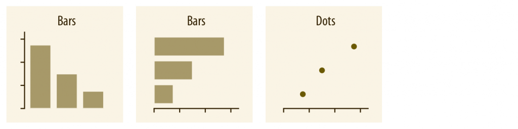
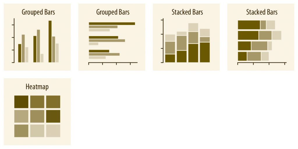
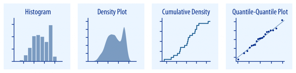
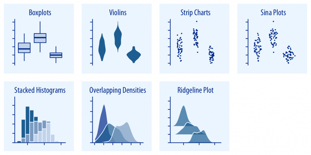
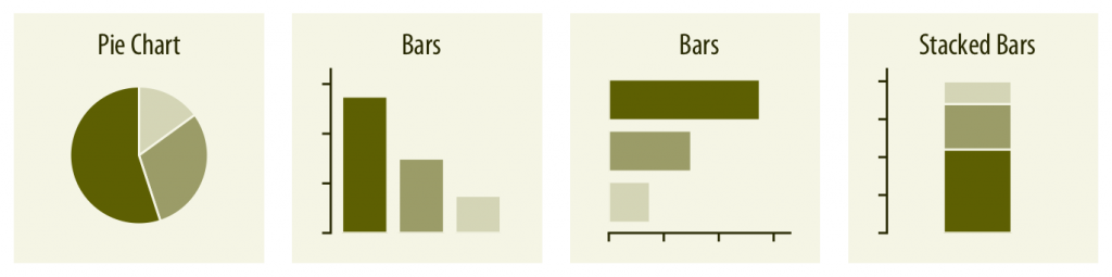
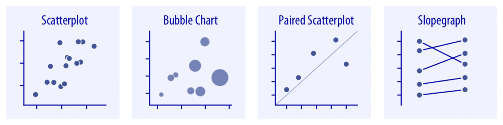
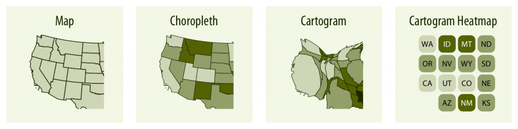
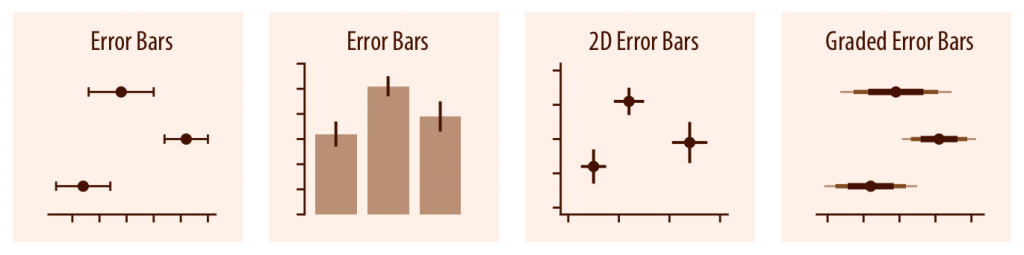
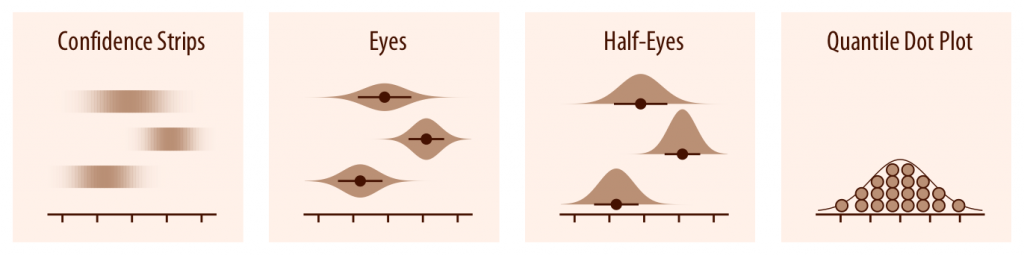
Chapter 5 of Claus O. Wilke’s Fundamentals of Data Visualization provides a comprehensive overview of chart types categorized by their purpose. It emphasizes that choosing the right visualization is often the most crucial step in data communication. The chapter introduces six major categories: amounts, distributions, proportions, x–y relationships, geospatial data, and uncertainty. Amounts are typically shown with bar charts, dot plots, grouped bars, or heatmaps. Distributions can be visualized with histograms, density plots, boxplots, violin plots, or ridgeline plots, depending on the complexity and focus of analysis. Proportions are represented by pie charts, stacked bars, mosaic plots, treemaps, or parallel sets, suitable for varying levels of categorical depth. X–y relationships are best conveyed using scatterplots, bubble charts, slope graphs, correlograms, or line graphs for temporal patterns. Geospatial data relies on maps, choropleths, or cartograms to highlight regional differences. Uncertainty is communicated through error bars, graded confidence intervals, distribution-based plots such as violins or quantile dot plots, and confidence bands for trend lines. This structured taxonomy serves both as a reference and a source of inspiration, helping practitioners move beyond conventional charts and select visualizations that align with the data characteristics and audience needs.


上一篇
Bar Chart - 2024年台灣煤炭的進口來源國
系列文
資料視覺化的探索之旅:從 ggplot2 技術到視覺化設計13
圖片
  熱門推薦
圖片
{{ item.channelVendor }} | {{ item.webinarstarted }} |
{{ formatDate(item.duration) }}
直播中

尚未有邦友留言

立即登入留言