ggplot2 在今年 9 月,推出了 4.0.0 重大更新版本,除了迎來 18 歲生日,也帶來了相當多結構性的更新。這篇文章我會先整理官方的重點,再分享一些我實測與觀察到的影響。
👉 官方完整公告:ggplot2 4.0.0 release note
ggplot2 許多社群提到最大的改動,就是 ggplot2 把許多物件系統轉為 S7。
element_text(hjust = "foo") 這類錯誤會即時被擋下。💡 過去因為小小拼錯字或參數誤用,最後 debug 半天。S7 的改進對避免這種低階錯誤會很有幫助。
theme 一直是 ggplot2 控制「非資料」樣式的核心。4.0.0 帶來幾個亮點:
theme(geom) 或 element_geom() 統一調整。theme_sub_axis() 讓調整更直覺。範例程式碼:
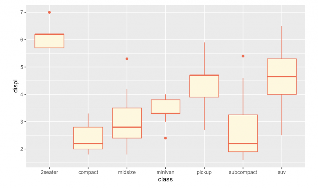
ggplot(mpg, aes(class, displ)) +
  geom_boxplot(aes(colour = from_theme(accent))) +
  theme(geom = element_geom(accent = "tomato", paper = "cornsilk"))
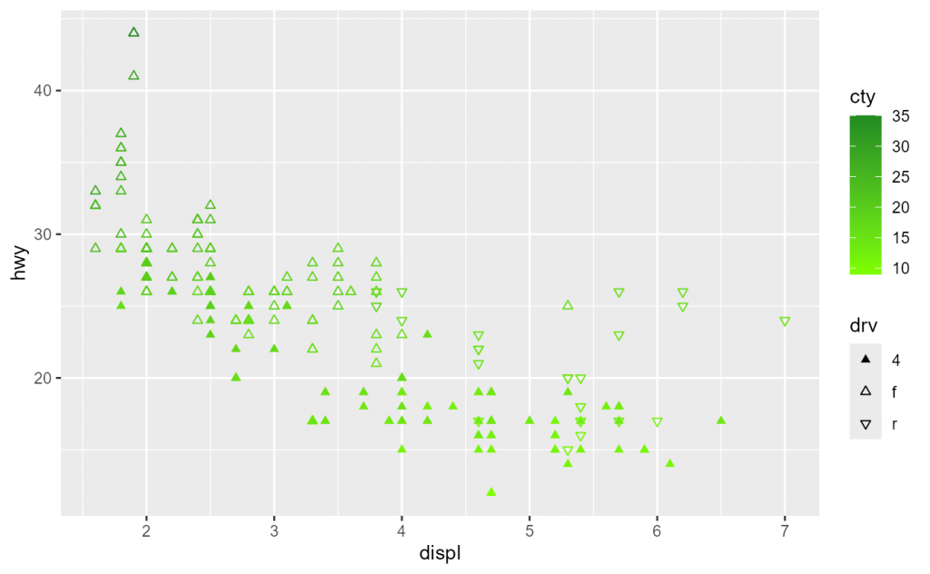
過去 ggplot2 的顏色控制有時候比較零散。現在 palette 系統被納入 theme 管理,例如 palette.colour.continuous、palette.shape.discrete,可以確保整張圖的色彩搭配一致。
範例:
ggplot(mpg, aes(displ, hwy, shape = drv, colour = cty)) +
  geom_point() +
  theme(
    palette.colour.continuous = c("chartreuse", "forestgreen"),
    palette.shape.discrete = c("triangle", "triangle open", "triangle down open")
  )
在過去,theme() 常讓人覺得「參數太多、名稱太長、結構混亂」。例如 axis.minor.ticks.length.x.bottom。
ggplot2 4.0.0 引入了一組 helper functions:
theme_sub_axis()
theme_sub_axis_x()
theme_sub_axis_bottom()
theme_sub_axis_top()
theme_sub_axis_y()
theme_sub_axis_left()
theme_sub_axis_right()
theme_sub_legend()
theme_sub_panel()
theme_sub_plot()
theme_sub_strip()
這些函數的用途,就是把原本冗長的參數,拆解成 更清晰的子模組。
例如:
theme_sub_axis_bottom():設定 x 軸底部(如刻度、次刻度)。theme_sub_legend():處理圖例樣式。theme_sub_panel():處理繪圖面板。範例:
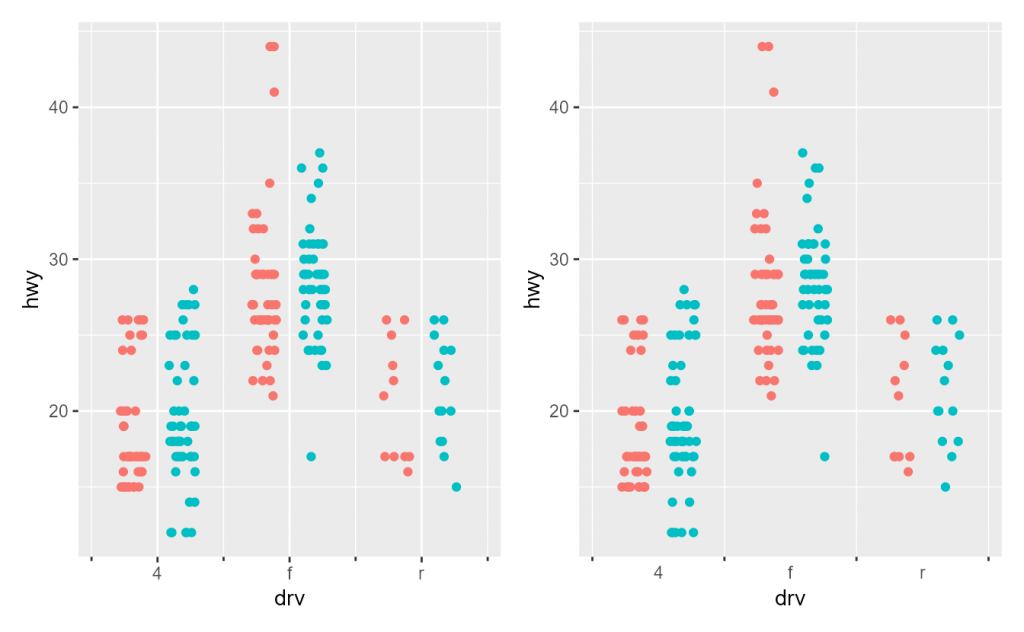
p1 <- ggplot(mpg, aes(drv, hwy, colour = factor(year))) +
  geom_point(position = "jitterdodge") +
  guides(colour = "none") +
  scale_x_discrete(
    minor_breaks = scales::breaks_width(1, offset = 0.5),
    guide = guide_axis(minor.ticks = TRUE)
  )

p2 <- p1 +
  theme(panel.grid.major.x = element_blank()) +
  theme_sub_axis_bottom(ticks = element_blank(), minor.ticks = element_line())

p1 | p2
這次 ggplot2 4.0.0 的更新,我覺得有三個關鍵價值:
雖然不是每項功能都是日常繪圖必須,但客製化空間大幅提升,讓 ggplot2 更專業、更穩定、更易於維護。
The release of ggplot2 4.0.0 marks a major milestone as the package celebrates its 18th anniversary. This update introduces significant structural improvements. The most notable change is the transition from the S3 to the S7 object system, which enforces stricter type checking and supports double dispatch. For everyday users, this reduces common mistakes such as incorrect argument types, while developers gain more flexibility in extending geoms and themes.
Another key area of improvement lies in themes. The new release introduces the concepts of ink, paper, and accent colors, allowing users to distinguish foreground, background, and highlight elements. The theme(geom) and element_geom() functions centralize the styling of geoms, while the new helper functions (e.g., theme_sub_axis_bottom, theme_sub_legend) simplify the previously chaotic theme declarations, replacing lengthy argument names with structured modules.
Additionally, palettes and scales are now integrated into theme management, ensuring consistent styling across layers. Minor breaks are also available for discrete scales, providing more fine-tuned axis control.
In summary, ggplot2 4.0.0 offers three core benefits: greater safety through stricter checks, more consistency in styling, and finer granularity for customization, making the package more professional, stable, and maintainable.

