散點圖 (Scatter Plot) 是探索兩個或以上連續變數關係時,最常見的工具之一。
如同 Claus O. Wilke 在《Fundamentals of Data Visualization》中的例子,若我們擁有動物的多種測量值(體重、頭長、顱骨大小等),最基本的做法就是繪製「體重 vs. 頭長」散點圖。這能讓我們觀察到整體趨勢,例如體重較大的鳥通常也有較長的頭。若再進一步以性別上色,就能揭示系統性差異,例如雄鳥與雌鳥在相同體重下,頭長可能不同。這種方式幫助我們從雜亂的點雲中看出規律,甚至能透過氣泡圖或散點圖矩陣延伸比較更多變數。
換句話說,散點圖是「多變數關係探索」的起點,無論是鳥類頭長與體重,還是房價與面積,皆適用。本篇文章將以 penguins 資料集為例,逐步展示如何利用 ggplot2 與 ggpointdensity 進行探索。
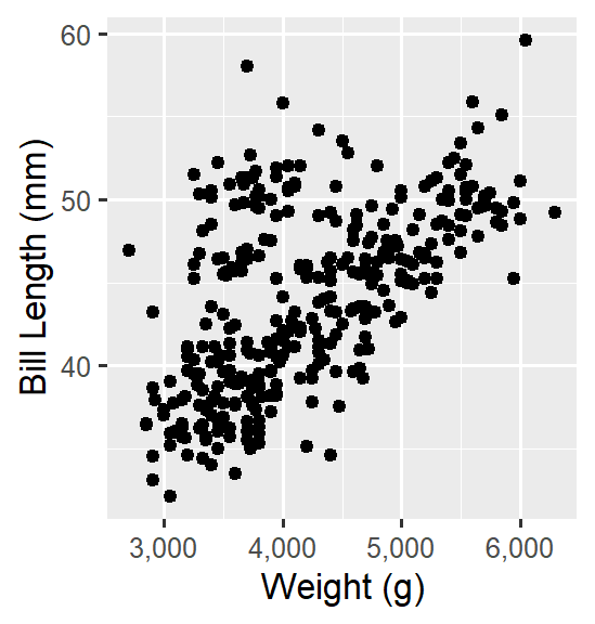
ggplot(data = penguins_new,
       aes(x = body_mass, y = bill_len)) +
  geom_point() +
  scale_x_continuous(labels = comma) +
  labs(x = 'Weight (g)', y = 'Bill Length (mm)')
利用透明度處理重疊問題,並加入性別比較。
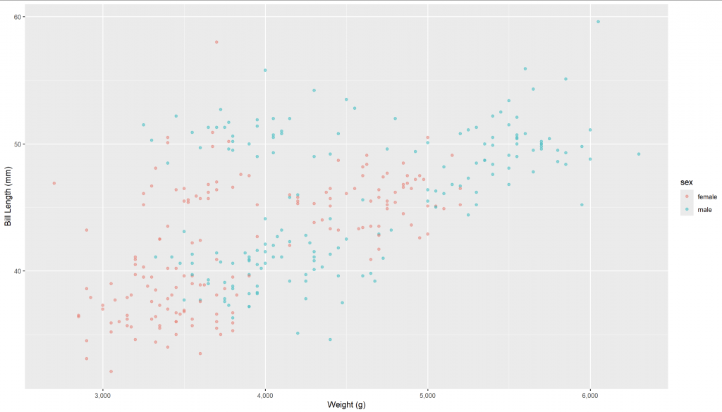
ggplot(data = penguins_new,
       aes(x = body_mass, y = bill_len, color = sex)) +
  geom_point(alpha = 0.5) +
  scale_x_continuous(labels = comma) +
  labs(x = 'Weight (g)', y = 'Bill Length (mm)')
結果顯示:雌性企鵝體重與喙皆略小於雄性,但正相關趨勢依然存在。
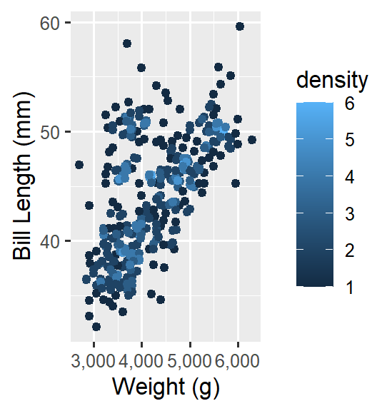
geom_pointdensity()ggplot(data = penguins_new,
aes(x = body_mass, y = bill_len)) +
geom_pointdensity() +
scale_x_continuous(labels = comma) +
labs(x = 'Weight (g)', y = 'Bill Length (mm)')
顏色代表點的密度,顯示體重越大,喙長度也越長,但集中性不明顯,可能受到物種/性別混合的影響。
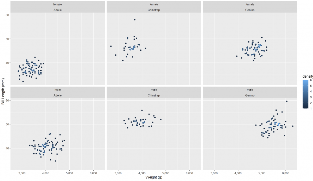
ggplot(data = penguins_new,
       aes(x = body_mass, y = bill_len)) +
  geom_pointdensity() +
  scale_x_continuous(labels = comma) +
labs(x = 'Weight (g)', y = 'Bill Length (mm)') +
facet_wrap(sex ~ species)
分面圖更清楚顯示各組別的分布差異,驗證了前述的推測。
ggplot(data = penguins_new,
       aes(x = body_mass, y = bill_len)) +
  geom_pointdensity() +
  scale_x_continuous(labels = comma) +
  labs(x = 'Weight (g)', y = 'Bill Length (mm)') +
facet_wrap(sex ~ species) +
geom_smooth(method = "lm")
迴歸線進一步凸顯「體重越大,喙越長」的規律。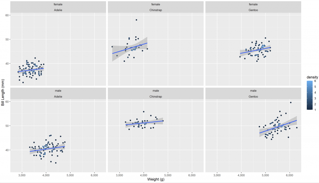
散點圖不僅能揭示連續變數間的基本關係,結合透明度、密度顏色、分面與迴歸線後,能更完整地呈現趨勢與群體差異。本篇以企鵝資料為例,展示了從最簡單的散點圖到多層次視覺化的演進過程,說明散點圖在多變數探索中的基礎地位。
Scatter plots are one of the most common tools to explore relationships between continuous variables. Using the penguins dataset, this article demonstrates how to build scatter plots in ggplot2 and extend them with transparency, density coloring (geom_pointdensity()), faceting, and regression lines. These enhancements not only reduce overplotting but also reveal systematic differences across species and sex. Overall, scatter plots provide a strong starting point for multivariate exploration, offering both general trends and group-specific insights.


 iThome鐵人賽