折線圖 (Line Plot) 是最常用來呈現時間序列 (time series) 資料的工具之一。
折線圖核心用途在於:顯示變數隨著時間或有序資料的變化趨勢。與散點圖不同,折線圖會以線條連接相鄰的資料點,讓我們更容易觀察連續變化的模式,例如上升、下降、週期性或波動幅度。
時間趨勢觀察
折線圖最適合呈現年度、季度或月份等時間序列數據,快速掌握數值的長期變化。
比較多個類別
若同一時間有不同類別(例如:信件、包裹、快捷郵件),可以用不同顏色線條呈現,方便比較各類別的規模與趨勢。
突顯數據特徵
結合標註(labeling)或標記(points),可以強調特定時間點的重要變化,例如高峰或低谷。
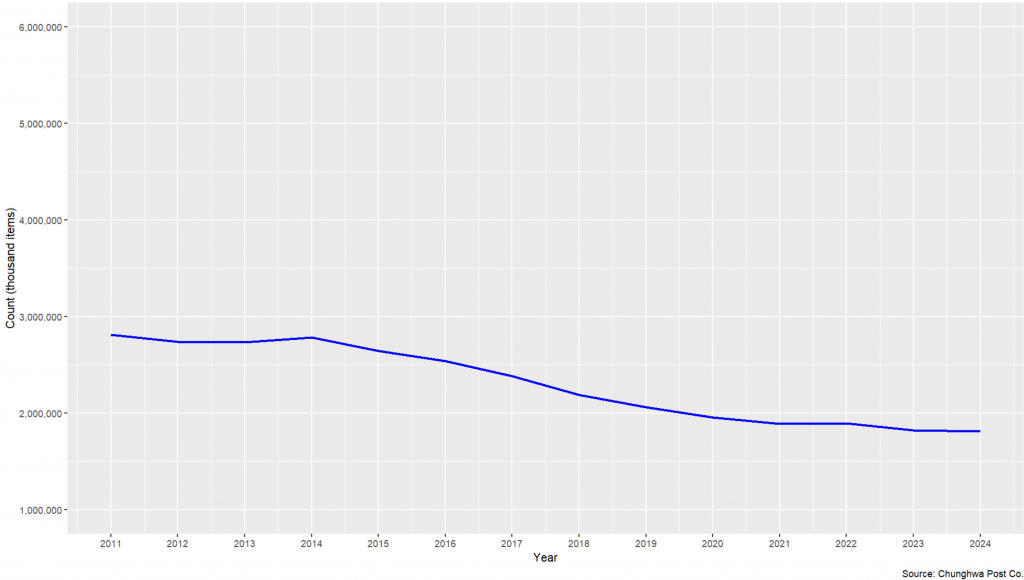
以下範例使用 delivery.xlsx 資料,觀察台灣郵政投遞的數量變化。
delivery_new <- delivery %>%
  filter(class == 'Total')

ggplot(data = delivery_new,
       aes(x = year, y = count)) +
  geom_line(linewidth = 1, color = "blue") +
  labs(
    x = "Year",
    y = "Count (thousand items)",
    caption = "Source: Chunghwa Post Co."
  ) +
  scale_x_continuous(limits = c(2011, 2024),
                     breaks = seq(2011, 2024, by = 1)) +
  scale_y_continuous(labels = comma,
                     limits = c(1000000, 6000000),
                     breaks = seq(1000000, 6000000, by = 1000000))
👉 圖中可觀察到,2011-2014 年的投遞總量算是穩定的趨勢,但在 2014 年後達到高峰,隨後逐年下降。
geom_point() 散點圖呈現ggplot(data = delivery_new,
aes(x = year, y = count)) +
geom_line(linewidth = 1, color = "blue") +
geom_point(color = "red", size = 2) +
labs(
x = "Year",
y = "Count (thousand items)",
caption = "Source: Chunghwa Post Co."
) +
scale_x_continuous(limits = c(2011, 2024),
breaks = seq(2011, 2024, by = 1)) +
scale_y_continuous(labels = comma,
limits = c(1000000, 6000000),
breaks = seq(1000000, 6000000, by = 1000000)) +
theme(legend.position = "none")
👉 紅點讓每一年投遞量更清楚,方便精準對照數值。

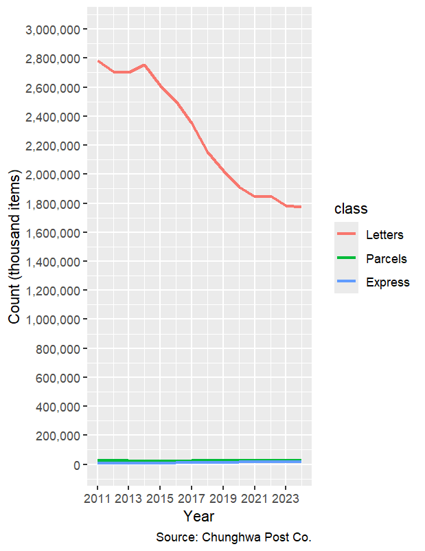
delivery_new2 <- delivery %>%
  filter(class != 'Total') %>%
  mutate(label = if_else(year == '2024', class, NA_character_))

delivery_new2$class <- factor(delivery_new2$class,
                              levels = c("Letters", "Parcels", "Express"))

ggplot(data = delivery_new2,
       aes(x = year, y = count, color = class)) +
  geom_line(linewidth = 1) +
  labs(
    x = "Year",
    y = "Count (thousand items)",
    caption = "Source: Chunghwa Post Co."
  ) +
  scale_x_continuous(limits = c(2011, 2024),
                     breaks = seq(2011, 2024, by = 2)) +
  scale_y_continuous(labels = comma,
                     limits = c(0, 3000000),
                     breaks = seq(0, 3000000, by = 200000))
👉 從圖中可看出:
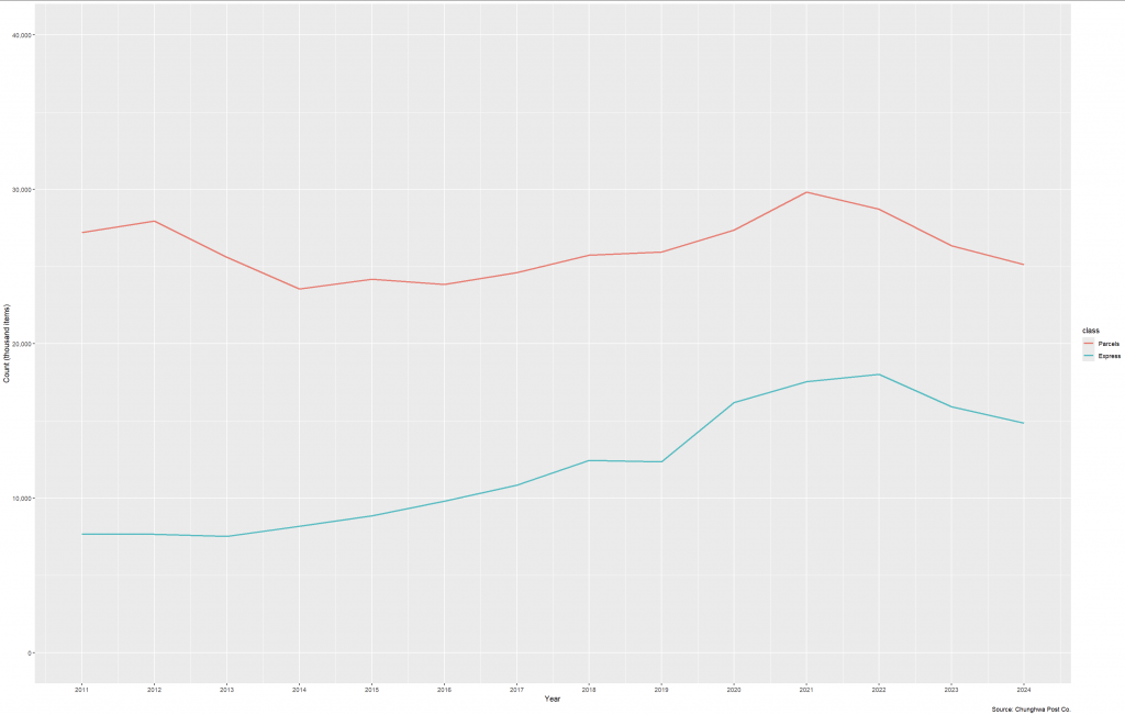
delivery_new3 <- delivery %>%
  filter(class != 'Total' & class != 'Letters') %>%
  mutate(label = if_else(year == '2024', class, NA_character_))

delivery_new3$class <- factor(delivery_new3$class,
                              levels = c("Letters", "Parcels", "Express"))

ggplot(data = delivery_new3,
       aes(x = year, y = count, color = class)) +
  geom_line(linewidth = 1) +
  labs(
    x = "Year",
    y = "Count (thousand items)",
    caption = "Source: Chunghwa Post Co."
  ) +
  scale_x_continuous(limits = c(2011, 2024),
                     breaks = seq(2011, 2024, by = 1)) +
  scale_y_continuous(labels = comma,
                     limits = c(0, 40000),
                     breaks = seq(0, 40000, by = 10000))
👉 這樣避免了擁擠的圖例,讀者能直接在圖中辨識「Parcels」與「Express」。
👉 可以看出:
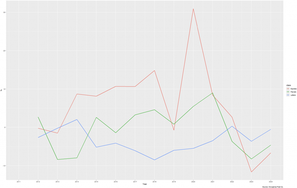
delivery_new4 <- delivery_new2 %>%
  filter(!is.na(pchg))

delivery_new4$class <- factor(delivery_new4$class,
                              levels = c("Express", "Parcels", "Letters"))

ggplot(data = delivery_new4,
       aes(x = year, y = pchg, color = class)) +
  geom_line(linewidth = 1) +
  geom_line() +
  labs(
    x = "Year",
    y = "%",
    caption = "Source: Chunghwa Post Co."
  ) +
  scale_x_continuous(limits = c(2011, 2024),
                     breaks = seq(2011, 2024, by = 1))
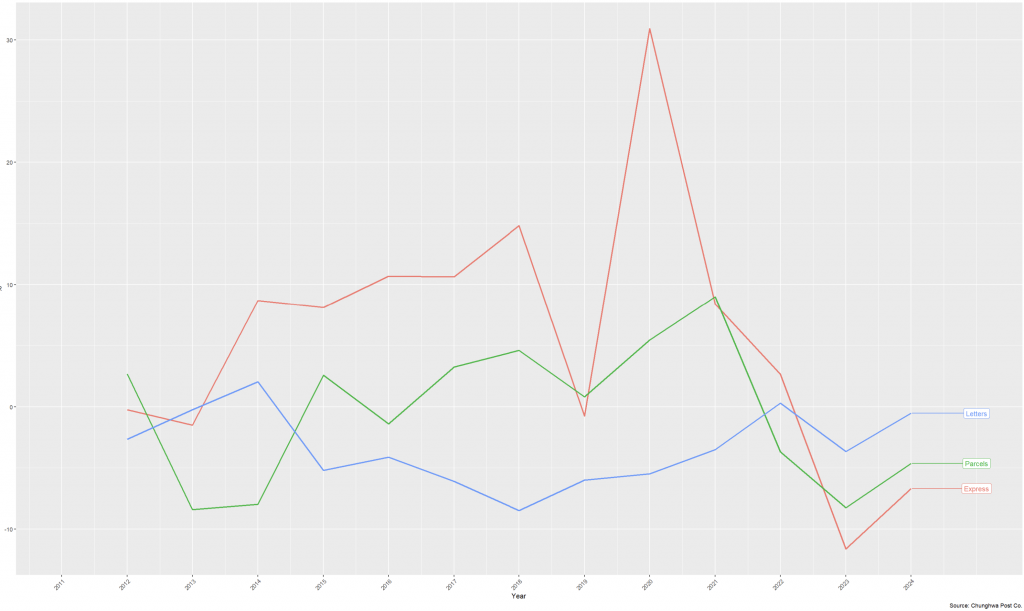
👉 年變化率能清楚看出:
geom_label_repel() 標註類別delivery_new4 <- delivery_new2 %>%
filter(!is.na(pchg))
ggplot(data = delivery_new4,
aes(x = year, y = pchg, color = class)) +
geom_line(linewidth = 1) +
labs(
x = "Year",
y = "%",
caption = "Source: Chunghwa Post Co."
) +
scale_x_continuous(
limits = c(2011, 2025),
breaks = seq(2011, 2024, by = 1)
) +
geom_label_repel(aes(label = label),
nudge_x = 1,
na.rm = TRUE) +
theme(
axis.text.x = element_text(angle = 45, hjust = 1),
legend.position = "none"
)
👉 去除 legend,直接在圖形中呈現類別名稱,減少讀者的眼球移動。
折線圖是觀察趨勢最直觀的方式,特別適合時間序列分析。本次案例展示了:
不論是總體或細分類別,折線圖都能有效幫助理解趨勢與變化。
Line plots are widely used for time series visualization, as they effectively reveal long-term trends and short-term fluctuations. Using Taiwan’s postal delivery data, this article demonstrates different perspectives of analysis. The overall delivery volume peaked in 2014 before steadily declining. Adding points improves clarity of annual comparisons. Breaking data into categories (Letters, Parcels, Express) shows distinct differences: Letters dominate but keep shrinking, while Parcels and Express follow different growth and decline patterns. To avoid scale distortion, focusing only on Parcels and Express highlights their real trends. Analyzing year-over-year percentage changes adds further insights: Express shows sharp volatility around 2019–2020, while Letters continuously decrease, reflecting reduced reliance on traditional mail. By combining line plots with labels and percentage changes, both macro and micro patterns can be communicated in a concise and visual way.


 iThome鐵人賽