iT邦幫忙

2019 iT 邦幫忙鐵人賽

DAY 18
0

導讀

前言

今天是鐵人的第18天,python中繪圖的套件除了Matplotlib還有seaborn,今天要來介紹seaborn。
seaborn:是基於Matplotlib的一個擴展,也是同樣用於實現數據圖表化的一個套件。所以在使用方式上跟Matplotlib有些相似但也有不同的地方。

預先載入套件

介紹底下的圖表之前先預先載入需要的套件

# basic
import numpy as np
import pandas as pd

# matplotlib
import matplotlib.pyplot as plt
%matplotlib inline

# seaborn
import seaborn as sns

載入資料

seaborn github上面找尋一個function load_dataset 可以發現使用seaborn中的這個function他是去載入其他csv檔案,而csv檔案也是放在github seaborn-data,從這個專案可以看到底下有很多csv檔案,假設要使用flights.csv,語法就可以使用

sns.load_dataset('flights')

圖表介紹

直方圖hist 和 密度圖kde

  • matplotlib直方圖hist呈現的方式
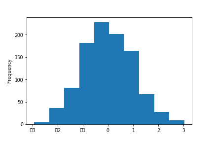
ironman_series = pd.Series(np.random.randn(1000))
ironman_series.plot(kind='hist')
# 或者可以使用plot.hist(ironman_series)

https://ithelp.ithome.com.tw/upload/images/20181029/20111390DbKTjIfcLW.png

  • matplotlib密度圖kde呈現的方式
ironman_series.plot(kind='kde')

https://ithelp.ithome.com.tw/upload/images/20181029/20111390sLl7C8aKDt.png

  • seaborn 預設上會同時畫出直方圖(hist)和密度圖(kde)
    語法:sns.distplot(a, bins=None, hist=True, kde=True, rug=False, fit=None, hist_kws=None, kde_kws=None, rug_kws=None, fit_kws=None, color=None, vertical=False, norm_hist=False, axlabel=None, label=None, ax=None)
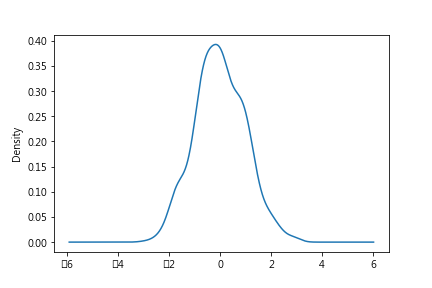
sns.distplot(ironman_series)

(ps:筆者在實作這邊的時候有遇到warning,筆者是直接將seaborn和Matplotlib更新即可)
https://ithelp.ithome.com.tw/upload/images/20181029/20111390MvCDPrsamj.png

  • seaborn的密度圖kde
    語法:sns.kdeplot(data, data2=None, shade=False, vertical=False, kernel='gau', bw='scott', gridsize=100, cut=3, clip=None, legend=True, cumulative=False, shade_lowest=True, cbar=False, cbar_ax=None, cbar_kws=None, ax=None, *kwargs)
    因為畫出的圖一樣就沒有另作出圖

bar()

  • matplotlib使用bar呈現的方式
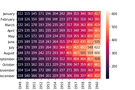
ironman_df = sns.load_dataset('flights')
ironman_df = ironman_df.pivot(index='month', columns='year', values='passengers')
ironman_df.sum().plot(kind="bar")
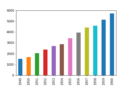
https://ithelp.ithome.com.tw/upload/images/20181029/201113901SGVBTQ2BS.png
可以看到每年乘客的數量

  • seaborn的barplot
    語法:sns.barplot(x=None, y=None, hue=None, data=None, order=None, hue_order=None, estimator=<function mean at 0x0000022974A241E0>, ci=95, n_boot=1000, units=None, orient=None, color=None, palette=None, saturation=0.75, errcolor='.26', errwidth=None, capsize=None, dodge=True, ax=None, *kwargs)
sns.barplot(ironman_df.sum().index,ironman_df.sum().values)

https://ithelp.ithome.com.tw/upload/images/20181029/20111390I7cGuaXTKd.png

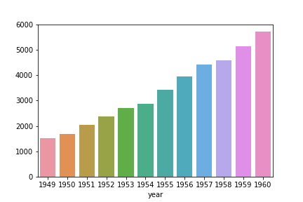
從上面兩個圖表可以看的出來seaborn的圖比matplotlib好看

熱圖:heatmap()

語法:sns.heatmap(data, vmin=None, vmax=None, cmap=None, center=None, robust=False, annot=None, fmt='.2g', annot_kws=None, linewidths=0, linecolor='white', cbar=True, cbar_kws=None, cbar_ax=None, square=False, xticklabels='auto', yticklabels='auto', mask=None, ax=None, **kwargs)

sns.heatmap(ironman_df)

https://ithelp.ithome.com.tw/upload/images/20181029/20111390K9srUy3Nbd.png


上一篇
[Day17]視覺化資料 - Matplotlib - 加上中文字、柱狀圖、boxplot
下一篇
[Day19]seaborn - 樣式設定
系列文
python 入門到分析股市30
圖片
  直播研討會
圖片
{{ item.channelVendor }} {{ item.webinarstarted }} |
{{ formatDate(item.duration) }}
直播中

尚未有邦友留言

立即登入留言