在資料分析前後都需要有視覺化的幫忙,將資料或模型的結果換一個方式來有效率地呈現其中的資訊,使其他人能更容易理解資料的模式、趨勢以及找出異常值。最基本的視覺化方式是利用統計圖表來呈現資料,例如長條圖(Bar Plot)、箱形圖(Box Plot)、直方圖(Histogram)與散步圖(Scatter Plot)等。今天將討論的Python套件Matplotlib是常被拿來進行視覺化的工具。
import numpy as np
import matplotlib.pyplot as plt
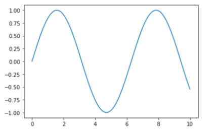
plt.plot()畫圖,接著以plt.show()呈現圖形x = np.linspace(0, 10, 100)
plt.plot(x, np.sin(x))
plt.show()
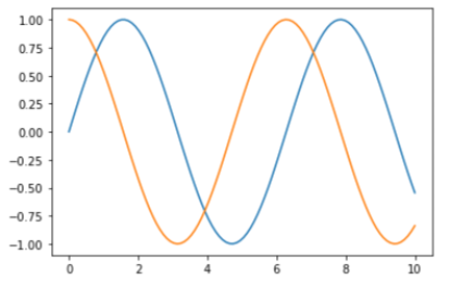
plt.plot()
x = np.linspace(0, 10, 100)

plt.plot(x, np.sin(x))
plt.plot(x, np.cos(x))
plt.show()
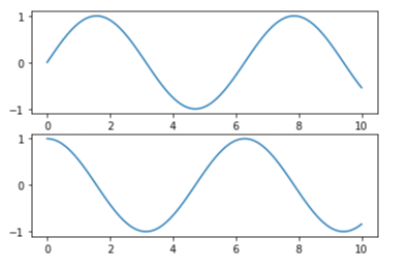
plt.subplot()
x = np.linspace(0, 10, 100)

plt.subplot(2, 1, 1) #(列, 欄, 第幾張圖)
plt.plot(x, np.sin(x))

plt.subplot(2, 1, 2)
plt.plot(x, np.cos(x))
plt.show()
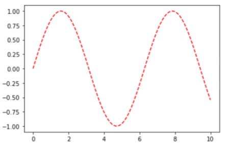
x = np.linspace(0, 10, 100)

plt.plot(x, np.sin(x), color = "red", linestyle = "dashed")
# 也可以使用plt.plot(x, np.sin(x), "--r")
plt.show()
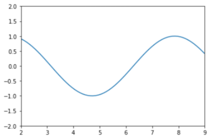
x = np.linspace(0, 10, 100)

plt.plot(x, np.sin(x))
plt.xlim(2, 9)
plt.ylim(-2, 2) #若想把y軸反向顯示,可將參數順序反過來
# 以上兩行也可以使用plt.axis([2, 9, -2, 2])
plt.show()
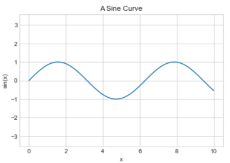
x = np.linspace(0, 10, 100)

plt.style.use("seaborn-whitegrid")       #變更圖表樣式
plt.plot(x, np.sin(x), "-")
plt.axis("equal")                        #使x的單位等於y的單位
plt.title("A Sine Curve", fontsize = 12) #fontsize調整字型大小
plt.xlabel("x")                          #加上x軸標籤
plt.ylabel("sin(x)")                     #加上y軸標籤

plt.show()
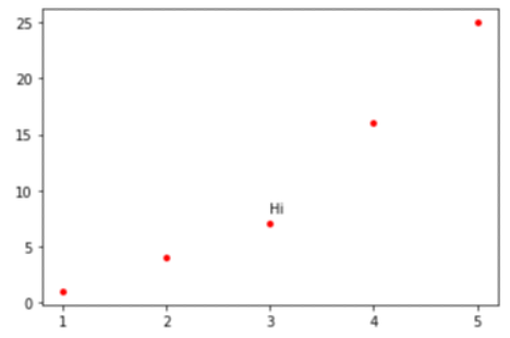
xpt = [1, 2, 3, 4, 5]
ypt = [1, 4, 7, 16, 25]

plt.xticks(xpt)                         #設定x軸刻度
plt.text(3, 8, "Hi")
plt.scatter(xpt, ypt, s = 15, c = "r")  #s點的大小、c為顏色
plt.show()
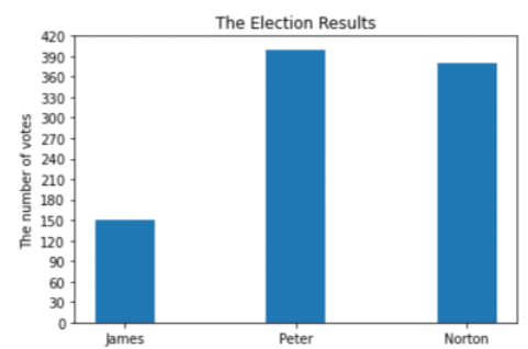
votes = [150, 400, 380]                     #得票數
N = len(votes)                              #計算長度
x = np.arange(N)                            #長條圖x軸做鰾
width = 0.35                                #長條圖寬度
plt.bar(x, votes, width)

plt.ylabel("The number of votes")
plt.title("The Election Results")
plt.xticks(x, ("James", "Peter", "Norton"))
plt.yticks(np.arange(0, 450, 30))
plt.show()
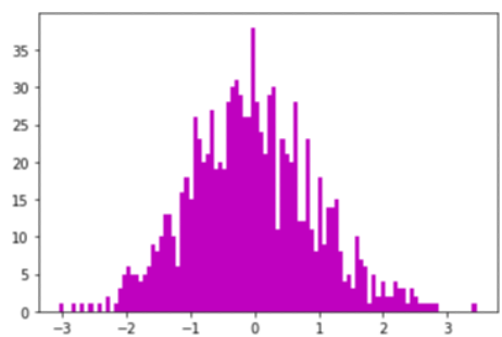
data = np.random.randn(1000)
plt.hist(data, bins = 100, color = "m") #bins可想成組別個數
plt.show()
sorts = ["Travel", "Entertainment", "Eduction", "Transporation", "Food"]
fee = [8000, 2000, 3000, 5000, 6000]

plt.pie(fee, labels = sorts, explode = (0, 0.3, 0, 0, 0), autopct = "%1.2f%%")
# explode可將圓餅圖分離、autopct表示百分比格式
plt.show()

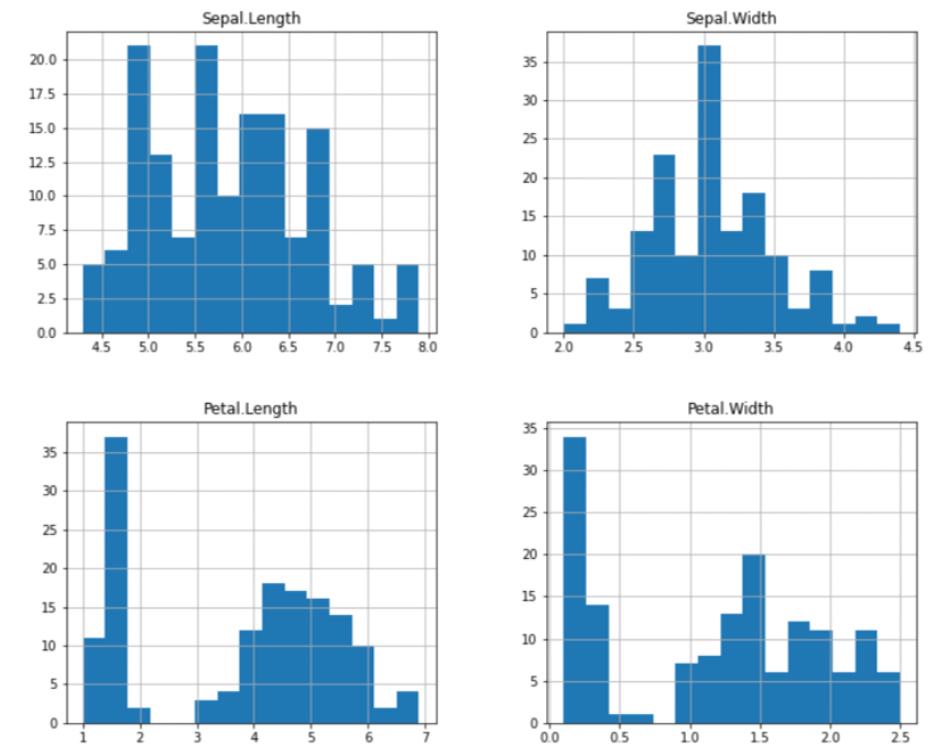
urlprefix = 'https://vincentarelbundock.github.io/Rdatasets/csv/'
dataname = 'datasets/iris.csv'
iris = pd.read_csv(urlprefix + dataname)
iris = iris.drop("Unnamed: 0", 1)

iris.hist(bins = 15, figsize=(12,10))
plt.show()
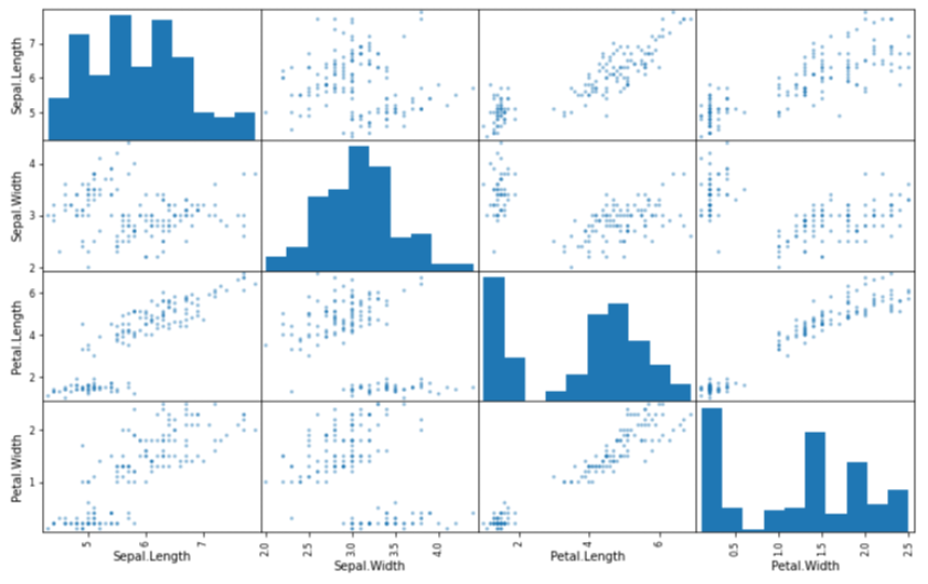
from pandas.plotting import scatter_matrix
attributes = ["Sepal.Length", "Sepal.Width", "Petal.Length","Petal.Width"]
scatter_matrix(iris[attributes], figsize=(13, 8))
plt.show()
| 函數名稱 | 說明 |
|---|---|
plot() |
繪製折線圖 |
scatter() |
繪製散佈圖 |
bar() |
繪製長條圖 |
hist() |
繪製直方圖 |
pie() |
繪製圓餅圖 |
| 函數名稱 | 說明 |
|---|---|
title(標題) |
設定圖表標題 |
axis() |
設定座標軸範圍 |
xlim(min, max) |
設定x軸範圍 |
ylim(min, max) |
設定y軸範圍 |
label(名稱) |
設定圖表標籤圖例 |
legend() |
設定座標圖例 |
xlabel(名稱) |
設定x軸名稱 |
ylabel(名稱) |
設定y軸名稱 |
xticks(刻度值) |
設定x軸刻度值 |
yticks(刻度值) |
設定y軸刻度值 |
tick_params() |
設定座標軸刻度大小及顏色 |
text() |
在指定位置輸出字串 |
show() |
顯示圖表 |


 iThome鐵人賽